Proposal on fonts and text boxes
Hey guys,
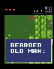
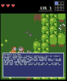
I think you really should do something about the fonts and the text boxes. A friend recently sent me a screenshot of one of my dialogues(not attached), thinking it was a bug. It wasn't but it looked like one, because the text box in mobile view shows way too little text. At the same time the text box in the desktop view shows way too much. I've attached screenshots of the same dialogue in both views, and the comparison speaks for itself. Not only the text windows are way too big, but one shows literally two words while covering the characters, while the other serves a literal wall of text(which is a bad design choice, but that's on me too).
Anyways, I would propose the following changes:
1. Decreasing the font size in mobile view to about the size of your system font(the one you use to write the "LVL1" text in the attached photo). Increasing the font size in full screen to the same font size as the system font(see above).
2. Decreasing the size of the text box to show a maximum of 4 lines of text, thus making sure it does not cover half the screen. The overflow text goes to the next text box. No idea how your code works, but I think the simplest way to implement this will probably be just to put a limit to the number of characters shown in a text box to 64 or so. Note I don't mean limiting the whole dialogue to 64 characters length, albeit some character limitations(like 256 or so characters) on the amount of text you can write in one dialogue might be a good thing to discourage bad design choices(see above) and will be in line with your minimalist design principle.
3.Assigning a keyboard symbol for flow control- assigning a symbol that's not normally used in speech, like "\" to signify "page end", basically moving the following text to the next text box. It would allow for text control when needed for design purposes.
Even implementing only the first point will go very far towards mitigating the problem, but if you're looking for interface uniformity, you should probably think about implementing some version of all 3.