What was wrong with this? 🤔
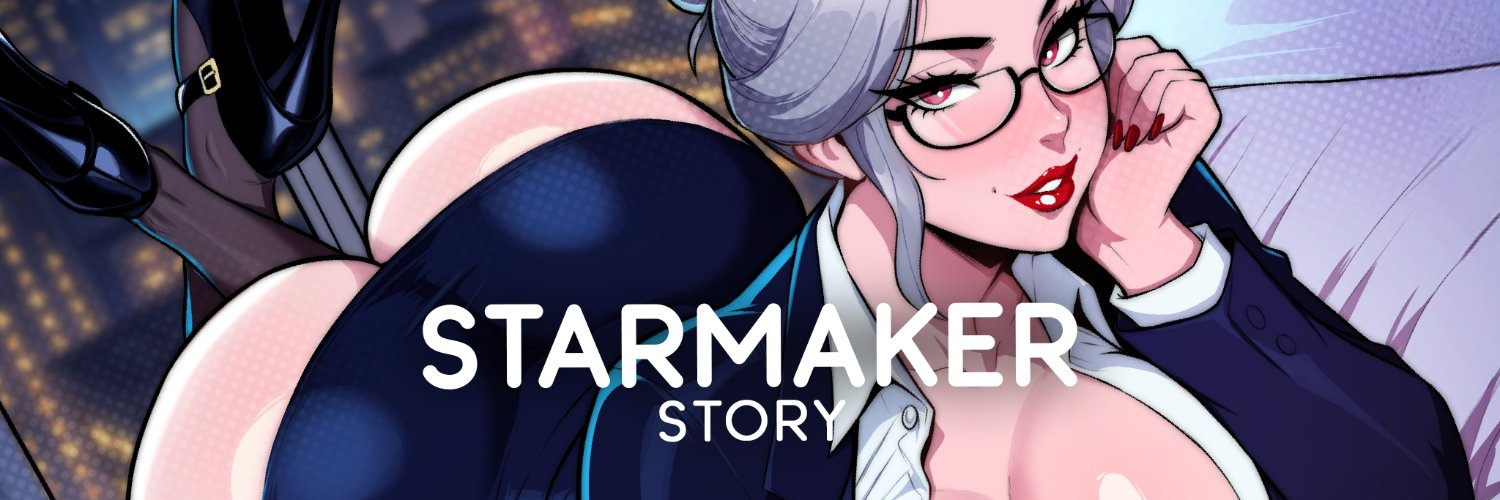
Not a fan of the new banner logo, thought the old one worked better with the text font used in game
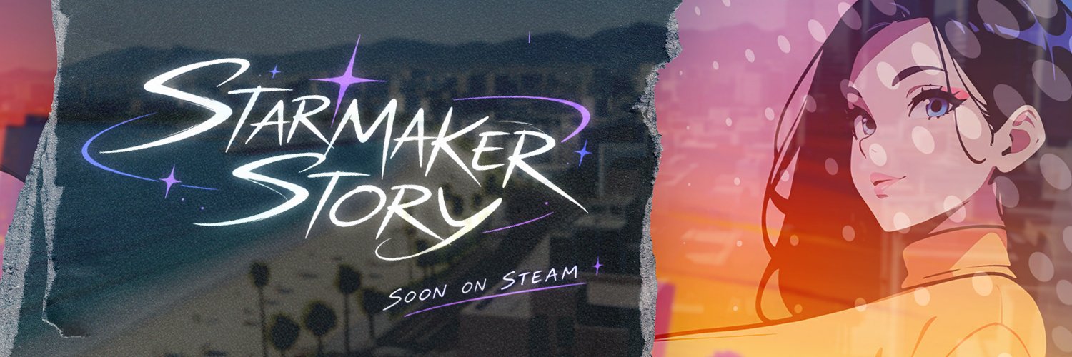
The font in game is one of them things that stands out instantly that makes the game recognisable, it would be cool to have a logo which used the same font and maybe having the S's and M incorporate Anna into it:

Might be on my own here though 😅
The font looks okay to me, but Anna looks like a completely different person - maybe it's because it's not in pixel style.
Hello there,
more of a temporary quick thought out banner to not have it empty. Yua (Ms. Kimura) really did a number for Elon it seems.
Just some time disconnecting from things. I'll add the notice to the planned features but here is the look difference.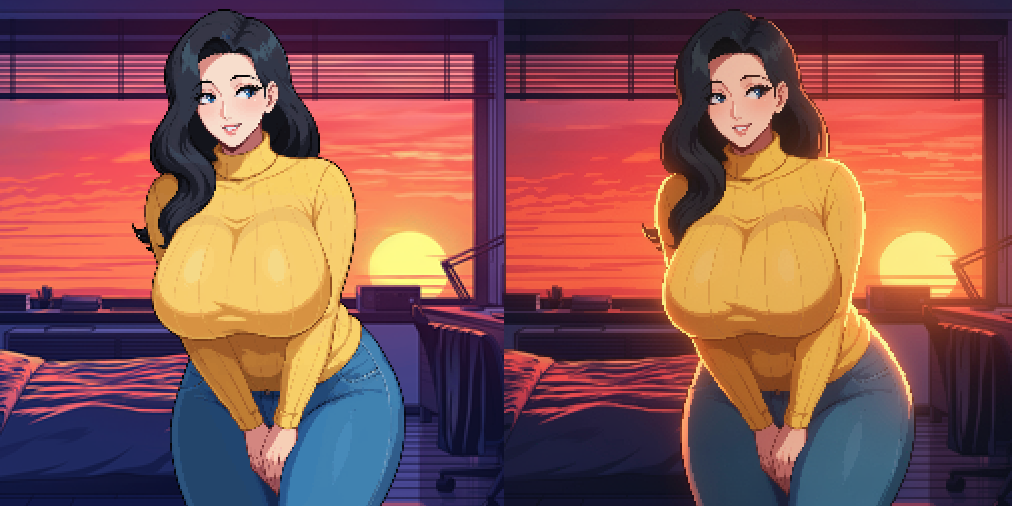
Good to hear, and very nice. The lighting now more represents the shaders Kal added in the last release and has a lot more dimension ❤️ I love it.
If I had to be super picky maybe a little more brush on the left of her hair so it is not clipping through the window behind, and a tiny bit of outer glow and inner shadow would help with the fact she is facing the door and the light is behind, while keeping it true to the original.
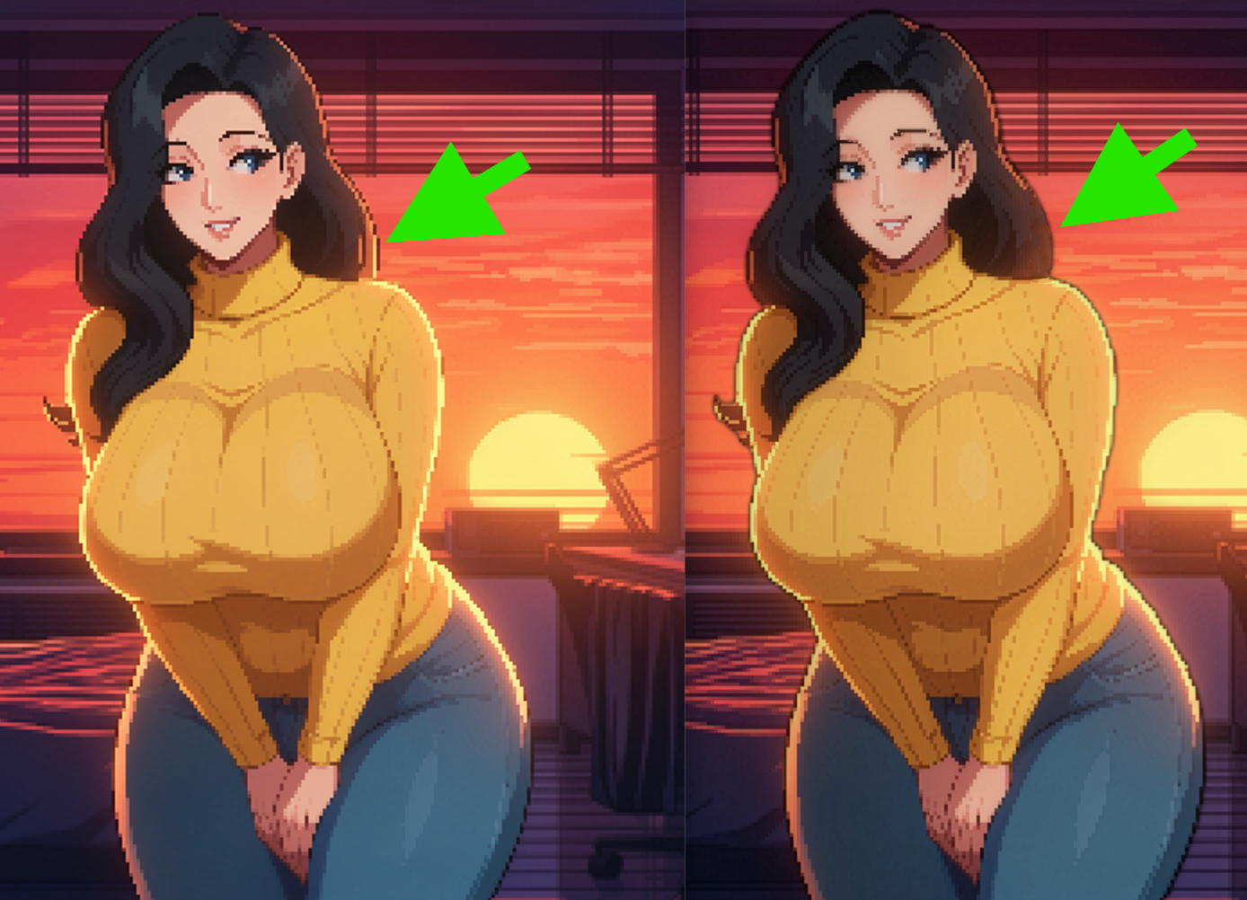
Again complete personal preference though..