

Lemme go into my little bich mode.
Art is great, BUT implementation is ass, style is all over the place. What do I mean by that.
- st- Main menu, there we have gorgeous pixel art, but if we press on Leaderboard, we have this out-of-place font and ugly red button.
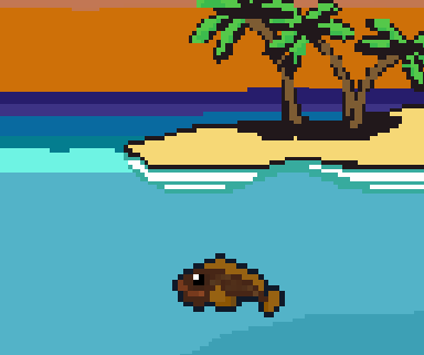
- nd - The Fish. Look at screenshot, PIXELS ARE DIFFERENT SIZES. This fish has twice as thick outline for no reason. You shouldn't have scale that fish, you should redraw it in desired size.
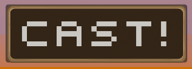
- rd - The button. Game wants to combine hand drawn art and pixel art, and that's fine, but if this button is supposed to be hand drawn, why it has pixelated font then?
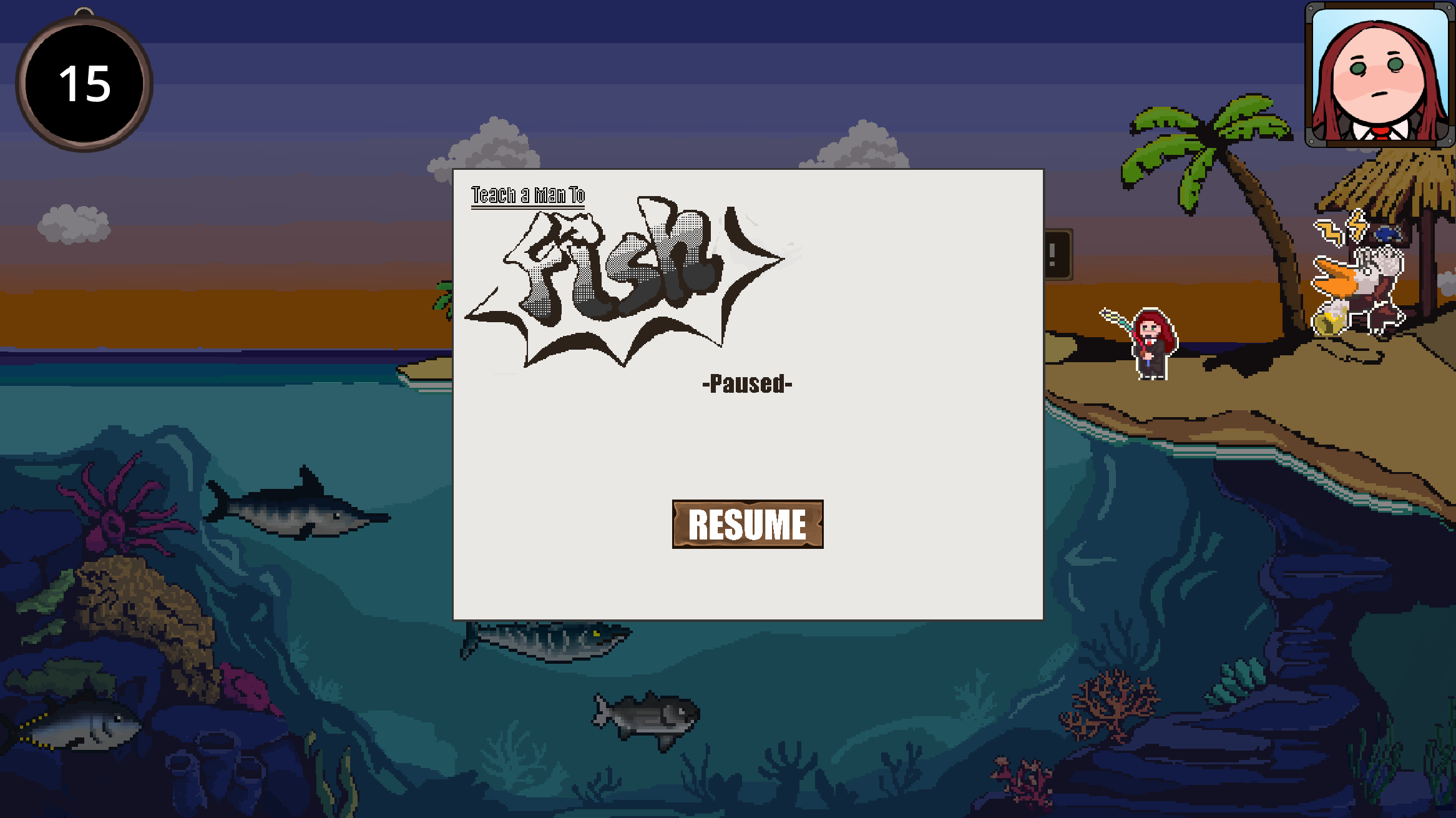
- th - pause menu is below player, yelling someone and clock for no reason and here it is, totally different button with different and ugly font
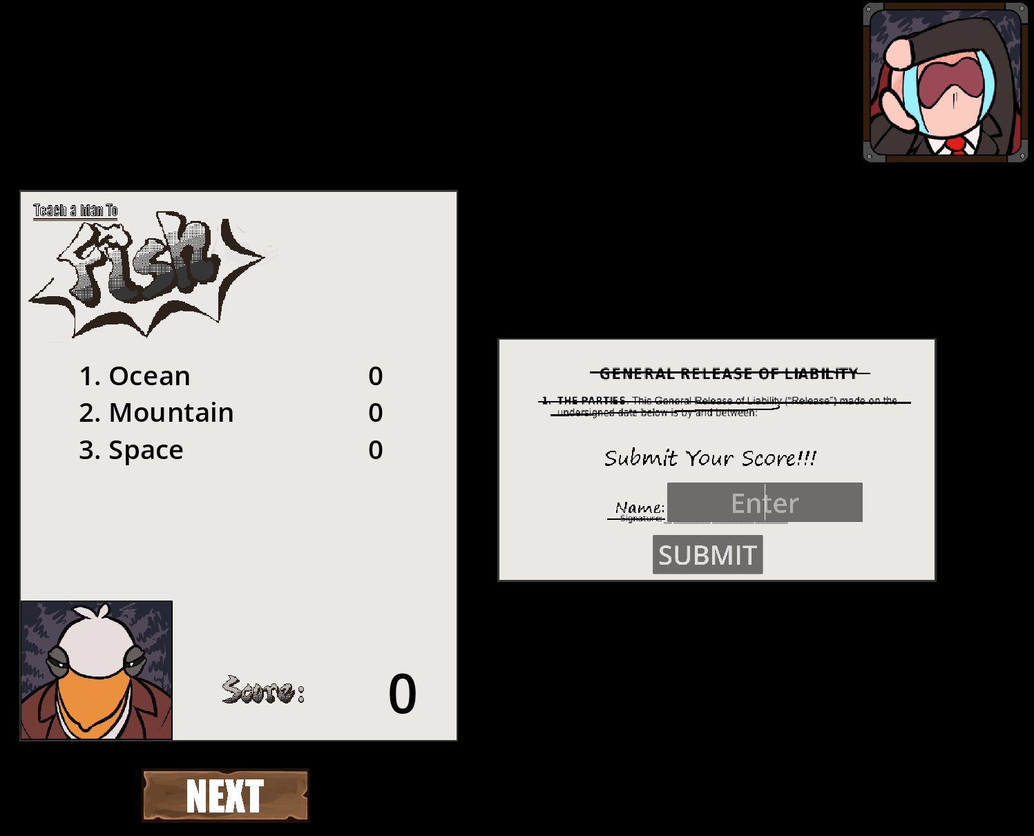
- th - even more ugly buttons and default godot text input which is obviously out of place.
Sound is fine, didn't notice anything too bad about it idea is quite creative and playing this game is pretty fun.