Yeap! I understand the struggle with new user experience all too well >.<
I'm not quite sure what explanations might help, but here's some info from my playthrough.
Until my first battle started, I didn't know my units would be moving straight ahead.
I still don't actually know what the lose condition for the battle is, whether it is having more survivors than the enemy, or if having at least one of mine alive is enough.
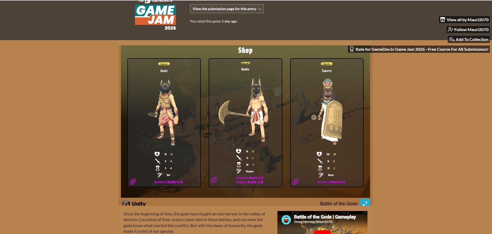
I found the text font a little difficult to read at its current size. Instead of fullscreening the game, my brain just glossed over the text and looked more at the numbers and symbols (I don't have dyslexia I swear). This means I also didn't really read the skills text, I just knew that the purple squares did "something". I didn't realise until now that it has a positive team buff, and negative enemy buff.
I'm not really sure what the timer looking symbol on each unit affects.
Attached is a pic of how the text looked for me, I dunno how much resolution size affects, but yeah a bit more difficult to read.