
The first thing I noticed is that when the game starts it switches to fill the browser window, but the game itself does not scale with the window. Instead it locks to the top left of the window. I can resize and move the window, but it would be nice if it was centered, rather than at the top left. Not a huge issue, but a nice-to-have.
We appreciate being mentioned in the playtesting credits.
The font is much more readable now. While I do like the pixel aesthetic, I think the UI changes will help a lot with conveying information to players. There is so much to learn to be able to enjoy the game, that this should really help with getting people ready to start playing.
I like the popups giving tips spread out over the fight, with more advice the longer it takes. The tips also feel more clear than I remember them being in the past.
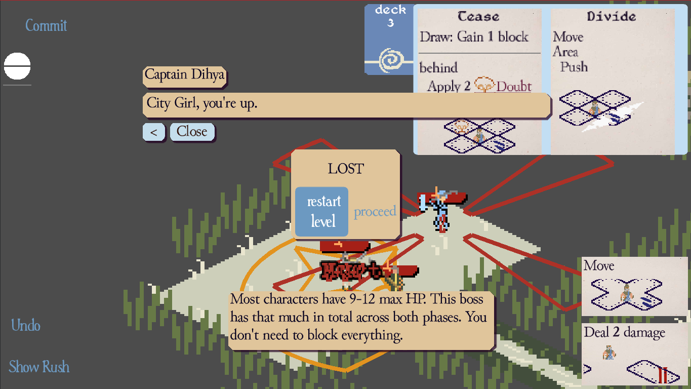
I think that I got notified of both winning and losing the first phase of the first fight. I was next to the enemy and both of us were low on health. They moved, taking enough damage to be at 0 HP. Then I took damage. I got a popup at the center saying I lost, but also see that everyone is healed to full HP, and the second character is being added, along with some dialog. I'll add a screenshot below.
I think that when you gain the second person it would be good to mention how polearms work, specifically how clicking on a diagonal turns them to aim their reaction area.
It took me a few tries to beat the first fight. When I did, it took 9 turns.
I would make the Mechanics Reference panel taller to allow more of the longer sections to be visible at the same time. I'd also suggest making the "close" button be in with the other buttons on the Pause menu, and possibly rename it to "Resume". When I first exited the Mechanics Reference it took me a bit to see it due to be so much smaller than the other buttons. I went through the big ones twice to see if I had missed it before noticing it. I think part of that was size, and part due to the color being close enough to the ground behind it. Personally, I'd also give the Pause menu's panel a content margin of 1-2 pixels all around. Right now it looks like there is a margin on the left, with the right and bottom having the shadow look a bit like a margin.
It would also be nice if you put all the mechanics in there. Things like Doubt do have popup help, but as I'm learning things I may think of something while a mechanic is not on screen and want to double check how it works.
It looks like "Get Ready" cannot be used on someone who has "Trip". I don't recall seeing that mentioned, so not sure if it is intentional or not. I can see it making sense to work this way.
I used an attack on my turn to finish off the last of the enemy's phase three health. They went back to full with no indication of why. At the start of my next turn I got the Endgame text and popup with info on it. It was my last move, so I can't say what else may happen from this, but I could see using it in a strategy to try taking them to the transition at the start of your turn and doing extra damage to their phase 4 state before the limits are in place.
I did not do well on the last phase. The enemy seemed to able to avoid taking damage from my team, either gaining enough block, or having good moves to evade those who could do damage. I had several hurt people and was playing more defensive. I clearly was not positioning people well. The limits added certainly make it extra difficult. Personally, I'm not that good at the game, so after going through 3 other phases, the extra boosts to the boss and limits on your available options made it less fun for me. For those who like this style more it probably works well. I know it is classic in RPGs to have the final boss go through multiple stages and get more powerful, so it does fit. It is just my own skill that makes an already tough fight go just far enough beyond where I my skill allows it to be fun. I did play on the default difficulty. In the future I will try the easier one.