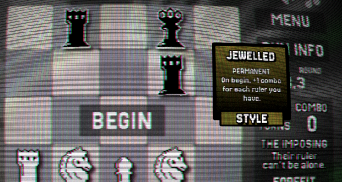
The CRT TV effect is neat, but can make things hard to see. I'd recommend having a setting to disable it, and perhaps an option for keeping the effect, but lessened. Depending on how many settings you want, you could add several options for the different effects and background. The longer I played, the less I liked the effect.
It can be hard to tell what is a clickable button, as they often blend in with the background. A bit more contrast, especially when hovered, would be nice.
It would be nice if you added an icon on your buttons that are external links, identifying them as such. I was not expecting the credits button to be a link.
On the Piece Level screen, the 2 right side columns look to have the # 0, and then missing characters for the font. I am playing on Linux, so my guess is that you are using a Windows system font that is not installed on Linux by default. Based on your screenshot of this screen, perhaps Wingdings? There are free Wingdings fonts you can get if you prefer to use text over an icon, but an image might be easier for compatibility.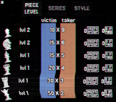
On my last round, after selecting my purchases and clicking continue, one of the popups remained visible over the game board.
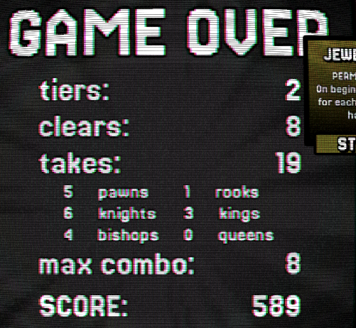
This was an interesting take on Chess. I don't feel like I fully explored all the gameplay mechanics. I didn't really pay much attention to the score or multipliers and mostly went for eliminating all pieces, but the score ended most rounds first. The CRT effect had me narrowing my vision and focusing on the pieces I was working with and game board, while largely ignoring the sides where its effect on the text made it unpleasant to read. Overall this feels like a good start.