Okay first of all, congrats on releasing your first game, you should be proud as this is very well made. I love the darkwood style lighting system, really adds to the atmosphere. Super interesting premise too. I have some feedbacks that might help improve the player experience:
- It was quite unclear what you need to plant seed. I tried pressing E like 50 times before realizing that you need to plant them near a lantern. Things like this might be clear to you as the developer, but you need to communicate it to the player, at least if it's not something intuitively real like "attacked = hurt" type of thing. Off the top of my head, you could communicate that planting requires lantern by adding some sort of highlights in radius around the lanterns. You should also add an error message when pressing E while not close to a lantern, something along the lines of "You need light to plant" or something.
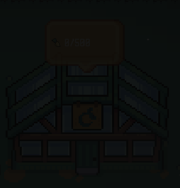
- Super important UI elements should not be obscured at any point. I'm talking about this one in particular:
That screenshot is a little hard to see but that's exactly my point.
- You should make controls that are simple but intuitive. There's no reason to make harvest and plant 2 different buttons. Especially when those two buttons occupy the same finger (index finger for E and F, plus WASD). We're trying to play a farming game, not play twisters with our fingers. Make it contextual. What I mean by this is that try making one button do all the leg work. Or picture this, how about planting by using the mouse seeing as the cursor is always visible instead of planting where your character is at. I truly thing it would make it way more intuitive to plant, you don't have to position your player just right and then having to move your index finger from D to E.
But yeah I don't want to overwhelm you with feedbacks so I will leave it at those. Hope I can be somewhat helpful in your game dev journey and keep grinding, love what I'm seeing so far.


