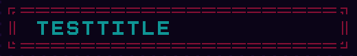
I really like the font! However, I was wondering if the fact that ═, ║, and ╗ do not align was a conscious artistic decision? See the attached image. My idea was to use the characters as a frame. If it’s intentional, it’s completely fine for me. :)
Hmmm, hard to recall. I made those particular glyphs long ago. Happy to work them into the "correct" position though. I can make this change sometime soon, cheers!
Hello again! This should now be fully functional in the way you were expecting. Please use the monospace variation for proper alignment of the border style glpyhs you were using.
Cheers!
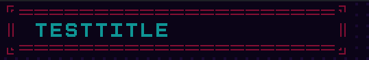
Looks like a slight misalignment on those left 2 corners. I'll have a patch out for that sometime soon.