Hey! Giving my feedback for the update here. First impressions is that I'm not a massive fan of the new UI changes, mostly the coloration difference. The new UI is a bit mixed. The "exit" button and changelog is a lot easier to see, but when the spinning vehicles intersect with the text it becomes much harder to read. It's cool feature and isn't too bad, especially after getting used to it, but combined with the CRT filter, the spinning vehicles, intersecting text and bright red honestly hurts my eyes. The start button is easier to see, at least, and thankfully I can turn the filter off. I also couldn't notice any glitch effects at all while playing, despite glitches turned on, so I don't know if the feature is broken or was reworked to be more subtle. For me it didn't affect visual clarity but added a nice visual fitting the theme. The CRT filter would probably be better to look at if everything wasn't glowing neon.
For mission select, the new UI was generally harder for me to read, with or without CRT filter since it's missing a background. The old UI wasn't great either but different text colors or a transparent background would help. Also RIP old desert music, though I suppose the new UI is less desert themed overall. The tip box being slightly smaller also meant I accidentally missed it the first time around and thought it was removed, but there's a lot of empty space on the mission select, so it could be a little bigger. Same goes for the cityspace, it feels like there's a black void staring into my soul. The tank icon is much clearer to see, but I'm not a fan of the new logo. The old one was simpler and had a clearer outline to it, so it felt more distinct and recognizable, whereas the new one blends together and the outline is mostly just a circle.
The mission select briefings are both easier and harder to read. The larger text makes it easier but the ALL CAPS FONT + no background + text effect makes it harder. CRT filler makes it easier to read, but at the cost of the mission select buttons fading away.
The hangar is also much easier to see, yay! I can actually look at my tanks in great detail! I do still prefer the old hangar's lighting, as it set the mood for the upcoming battle better. Maybe make the base hangar a little darker but brighten the light around a vehicle once you select it to modify. Could also give the rotating camera a "spotlight" to help. I can't tell it if already has one because the hangar is so bright. The hangar camera also doesn't feel like a camera anymore, with or without the CRT filter. Also, I won't be testing the CRT filter from here on because my eyes hurt.
The squad armory section has smaller icons that are harder to see, but the text is easier to read. It also lost some of that aesthetic in the process. The new UI could honestly easily fit another row in the motor pool and still have enough room left over to see the vehicles, so you could make it a little bit bigger for clarity. I noticed the old version had the white line on the left looked like it was slightly curved at each end, which definitely helps with the camera effect.
For vehicle editing, the new UI is cleaner but isn't really any harder or easier to read. Things being brighter makes them easier to see, but the font doesn't make them easier to read. The old UI is harder to see but the font (combined with less light) makes it easier to read. The best example is probably the E80 engine, I struggle to read the module on both versions but for opposite reasons.
The module descriptions are harder to read, but the actual module stats are way easier to read and that's what really matters. The box looks a little out of place when empty compared to the construction lines, but tbh it's overall an improvement. It's also nice that the vehicle stats are in their own box now rather than slapped on to the description. The ammunition tab is a bit of a weird tab as it doesn't feel like it has any purpose, so I would probably move the UI there to the right, just above the armory module guide, but doesn't really affect gameplay so it's likely better to keep in case you have any plans to fill out that tab in the future. Also, vehicle armor and armoury module guide can sometimes be harder to read when the camera is at certain odd angles. Probably the most egregious offender is the blue "ENGINES" text and the "INTERNAL" and "APPLIQUE" sections, but everything else is fine. I'd personally consider adding a transparent background to some of the boxes so they'll always have good contrast, regardless of the camera angle. The old UI did contrast a lot better; with the new UI, you can have some parts hard to read and other parts crisp and clear with the same camera angle.
For crew, the new portraits are really nice and it's good to be able to see actual detail. It removes a bit of the mystery of who they are (aesthetic is cool) but in exchange I can actually see what they look like more clearly, so either way is fine. Hopefully Marrow gets a positive perk, because it does feel like a drag taking her instead of a regular grunt. On one hand, the grunts having perks is nice, but on the other hand, now I want to promote one of my grunts into an anime character because they get better skills than the "notable" characters! Maybe in the future give them fresher icons, randomized names, or the ability to rename them. Custom character creation in the future? The last thing I want to note is it's a little sad seeing the start operation button disappear from the module screen, but maybe it's for the best so that I don't accidentally press it before I'm ready or forget something important the moment I press it. Also, the back button is a godsend for preventing me from accidentally going back to mission select every time I want to swap vehicles. One final note: aww look at the cute little drone in the background, I wanna give him a hug. I didn't even notice him in the old version but I hope he stays visible. I hope he becomes an anime character in a future update... better maintenance perk means better performance for the tank? Also; I'm noticing the smaller sidebar looks much more in place in the modules section than in the larger hangar view. Fits in very nicely, so it just looks a little small when you zoom out.
For actually starting a mission, I like the new loading screen even though it doesn't live long. For the actual mission briefings though? The old version is just better imo.The new screen is much clearer but I honestly never had any issues reading any of the text because it's quite large, and all of the aesthetic is gone. It looks like a boring blackboard rather than an old school computer screen. The vehicle noises in the background feel odd, I'm not looking at a screen in a vehicle as we ride to war but sitting in a briefing room analyzing the mission. The map itself is a lot clearer but still doesn't really give enough detail to plan out the whole mission ahead of time, so while it's an improvement, everything else that was cool abotu it was nuked. I checked this screen with the CRT filter and while it looks better, it just looks like I'm staring into the void and the void is staring back... wait, that's my reflection. Also, the lancer icon looks a lot better here than the mission select screen, but I still prefer the older one. Maybe combine the two, but I am a sucker for simplicity and distinctive outlines for logos. The old one looks like a logo you'd put on the side of a tank as an identification marker, while the new one looks like something you'd stamp on office paperwork or put on a sign outside the building. The glitch effect not working here is probably the most notable instance in the game and also helps to make this screen feel kinda sad.
Now for the gameplay. Immediate impressions are:
1. nooo my cool ring is gone, why :(
2. wow, I can actually see! wait, no. sort of?
3. oh, the mimimap is actually usable now
4. infantry view is a lot better and a little worse
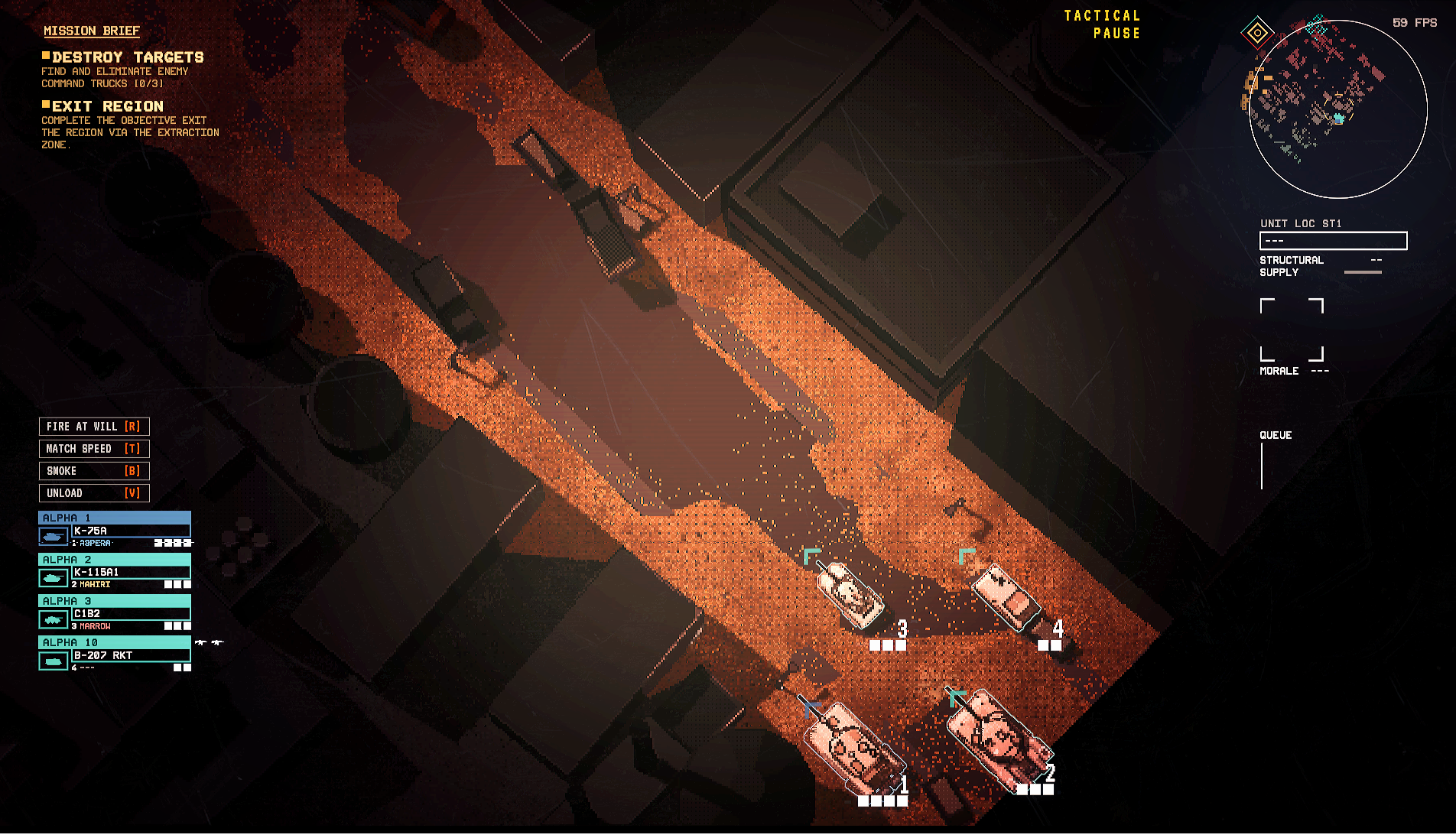
For #1, the old ring was a bit distracting and did lower the field of view a lot but tbh I really liked the aesthetic. It makes you feel like you're an actual commander looking through a UAV to see the situation and command your troops in real time. The new cmaera scratch effect is so subtle I only noticed it when I zoomed out all the way and I also just realized it's also in the mission briefing screen, too. I still prefer the old UI though; you could just zoom out more if you needed to see more. I'm also realizing that the camera zoom is the exact same but now fog on the edge of the screen makes you see far less than you ever did with the ring effect. I don't know if bringing it back would look good but something else on the screen to indicate you're looking through a camera would be good; the zoom lens blur also feels weird now since we aren't looking through a ring like an oldschool camera.
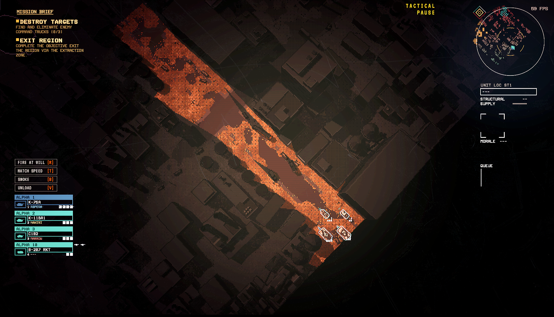
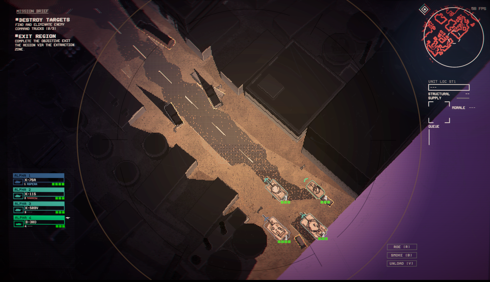
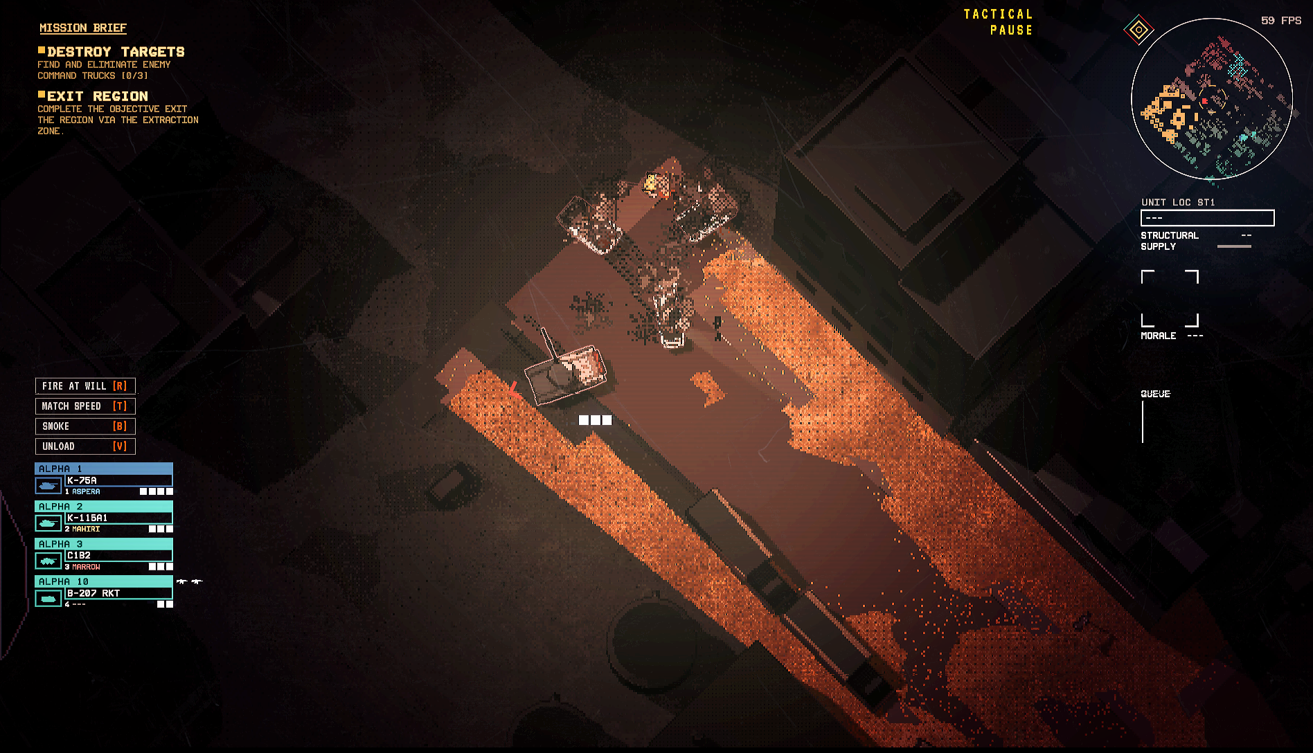
2. The pixelation is still really awful. Vehicle outlines are clearer and so they're much easier to make out, but like... I still can't really see the vehicle, even when I zoom all the way in. If it's in shadow I can see it a lot better, but in the light, vehicles can range from clearer to still blurry. I think it's tied to the detail of the vehicle, the more complicated the model, the more outlines... the more outlines, the harder the blur. The K-50 is crisp and while pixelated, is stylized in a cool way. The K-115 barely looks like a tank and the C1B2 looks more like a family van. On the flip side, the lack of a brown filter means wow! I can see everything else totally fine. Cars on the road? Small buildings? Alleys? Great! The only minor issue is when zoomed farther out, roadside obstacles become harder to see. Maybe look at making outlines for destructable obstacles for cars toggleable so they can stand out more, but even as-is it's still a major improvement over the previous version. Clarity of vehicles is still a meaningful issue when zoomed out, but the pixelation was genuinely just that bad on the older version and I can at least see some of the vehicles when I zoom in.
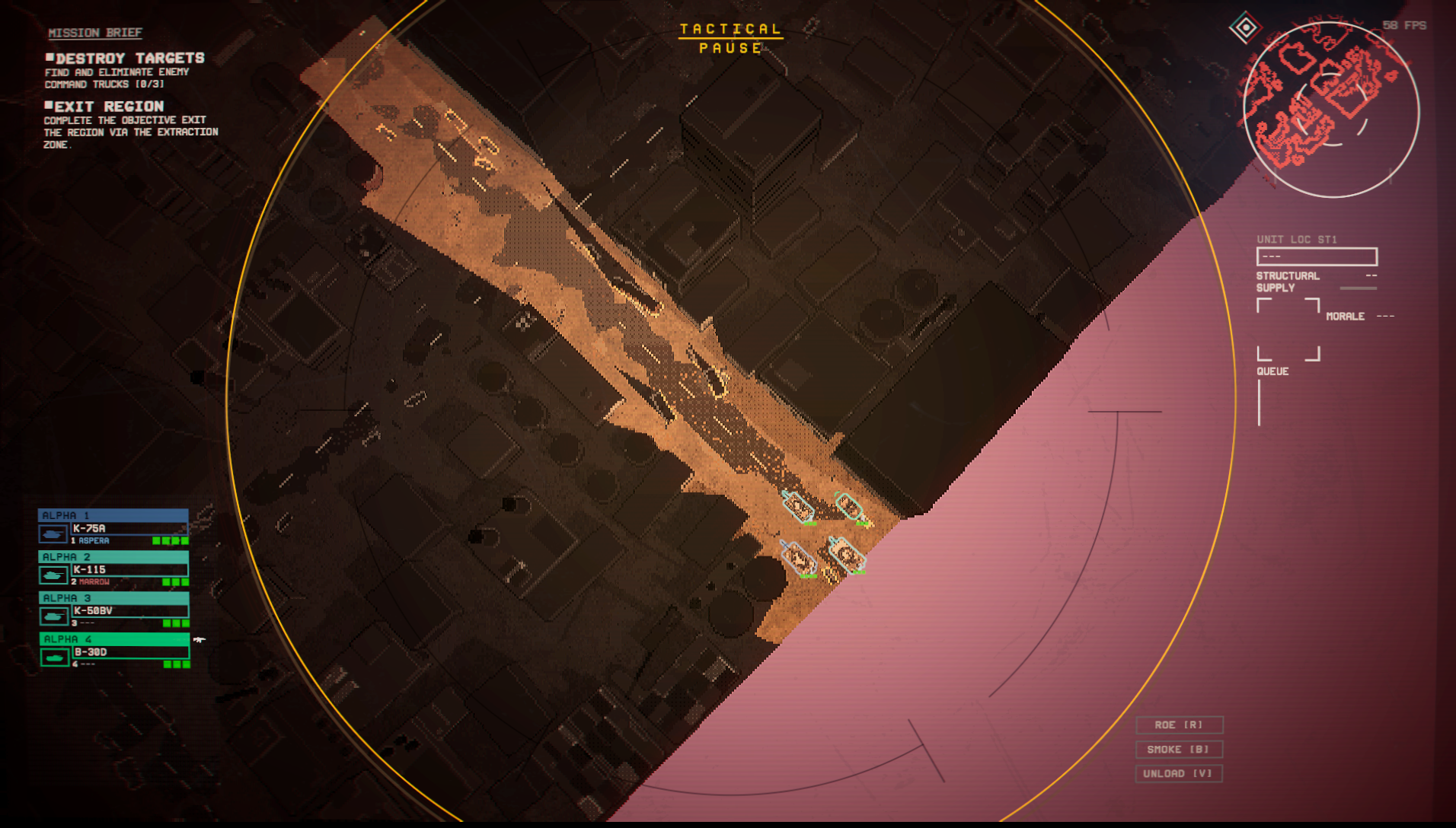
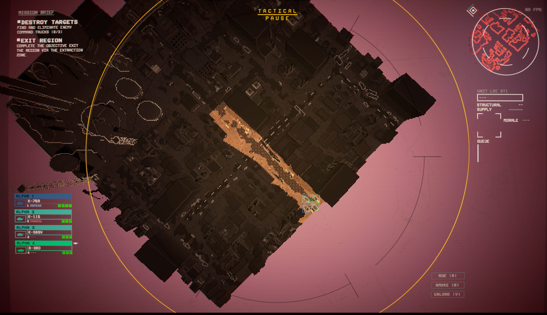
3. The minimap is a massive improvement! It doesn't give you enough detail to see everything perfectly but there's enough detail now that I can see what the map looks like, rather than a bunch of thick red bricks. Spotted enemies also showing up on the minimap actually gives you a real reason to look at it or pay attention, rather than going "uh which tank just beeped at me?" and frantically scrolling the camera to find the enemy which I also conveniently couldn't see because of the layers of filters. I might actually have a reason to look at it!
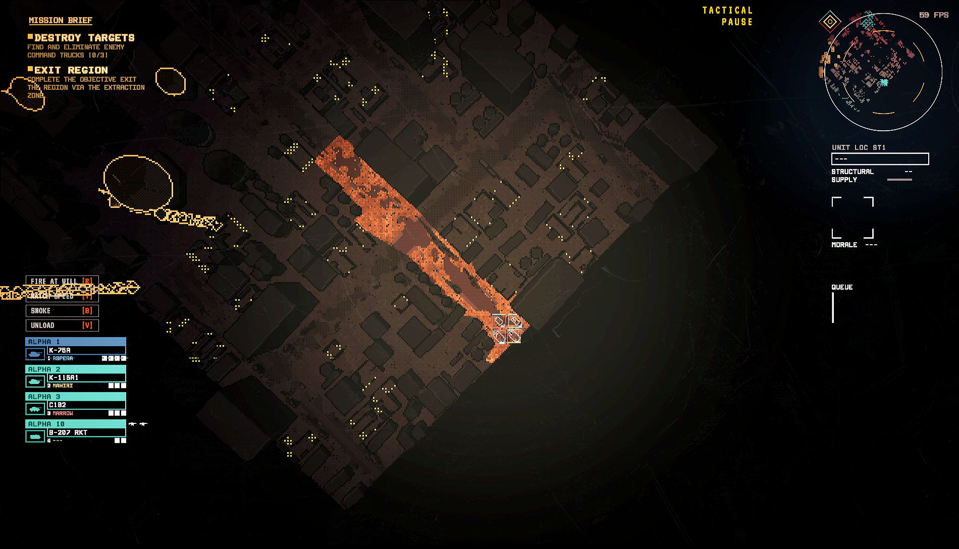
4. Infantry view is way easier on the eyes, and it's quite nice to not have to flashbang myself every time I want to see all of paths I can drive or walk. It's just way easier to look at and use, with most of the buildings being a lot clearer and the cutaways give a better view of the whole map. It's overall an improvement, but sometimes thinner walls and windows will blend into the map easier and sometimes become nearly invisible. This would happen with the old system to, but since all of the buildings were bright red, the contrast with the environment meant you could see the sliver of red pixels even when zoomed all the way out, and if you saw a break in the wall you'd know there was a window there, even if none of the yellow pixels rendered. Not a massive deal since it's fixed by just zooming in a little, but notable. I do really like that buildings highlight when you hover over them, lets you see the actual size so you can get a better grasp of whether your tank will or will not fit.
I'm also noticing that the name for drone fireteam (recon) still cuts off and starts a new line, even though there's enough room for the whole text in the box. I also don't know why the morale and health boxes were changed from green to white; I personally find them a lot harder to see now and have to rely on the bottom left icons more. As a final note, the new pause menu is absolutely awful and it hurts my eyes. The older one was sometimes not really clear if you paused in a bright area but man, I'd rather have that than staring into the sun.
Those are my first impressions of the new update. I am thinking about posting a gameplay post after I get to mess around a lot with the new weapons, tanks, and changes but I wanted to put my first impressions here before muddling it down. A lot of it is UI annoyance, so a lot of this is just fluff when what really matters is how the game plays. I was gonna put it here but this is too long already.
TL;DR Give a semi-transparent background to a lot of the text boxes to make it more readable and reduce the glow of some of the text so the CRT filter doesn't make my eyes bleed. Aesthetic was removed which is very sad but there are pros and cons. Gameplay clarity is better, but that's more because of how awful it was before. New tanks awesome, no new anime waifu sad. Cute hangar drone. Haven't extensively played; first impressions.
Small suggestion, let us change the colors of our squads, or base it off of their callsign. Having 1 dark blue and 3 cyan is really bad when I can't see the vehicles and have to guess which cyan is the one I want to order.