
Hi! and thank you! <3
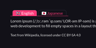
Yeah, I’ve been thinking about making ‘Tabs’ component, but I realized its just Toggle with different skin -‿-”
You can override/style the component’s CSS to achieve the tabbed-view appearance.
.custom-toggles {
  /*  Spacing  */
  padding: 0 .5em;
  margin-bottom: .5lh;

  /*  Gap between the toggle button/tab  */
  gap: .3em;

  /*  Reset default border styling  */
  border-radius: 0;
  border: none;

  border-bottom: 1px solid var(--l);
}

.custom-toggle {
  margin: 0;

  border: 1px solid var(--br);
  border-bottom: none;

  /*  Round top-right and left corner for the tab style  */
  border-radius: 9px 9px 0 0;
}
The CSS above will style Toggle to:
Just remember to put that CSS after the copied CSS from the Pitch app (ゝᴗ•)b