
Ooooh hey there, this incredible! ;A; <3
Is there a way to include a "tabbed view" option, similar to the toggle view but with tabs? ;-; /
277 days ago(+1)
Hi! and thank you! <3
Yeah, I’ve been thinking about making ‘Tabs’ component, but I realized its just Toggle with different skin -‿-”
You can override/style the component’s CSS to achieve the tabbed-view appearance.
.custom-toggles {
  /*  Spacing  */
  padding: 0 .5em;
  margin-bottom: .5lh;

  /*  Gap between the toggle button/tab  */
  gap: .3em;

  /*  Reset default border styling  */
  border-radius: 0;
  border: none;

  border-bottom: 1px solid var(--l);
}

.custom-toggle {
  margin: 0;

  border: 1px solid var(--br);
  border-bottom: none;

  /*  Round top-right and left corner for the tab style  */
  border-radius: 9px 9px 0 0;
}
The CSS above will style Toggle to:
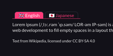
Just remember to put that CSS after the copied CSS from the Pitch app (ゝᴗ•)b
276 days ago(+1)
Oh that's already an incredible help, thank you! ; 0;
It works like a charm! <3
Another question if you don't mind (also I'm totally hitting up your ko-fi with a donation to thank you for your time and this tool), if I wanted to add additional custom content sections, how would I go about that? ;w;
276 days ago (+1)
omg thank u so much!!
For the content sections, Toggle component in this version can only have two contents TwT”
But! in the next update, you can have as many Toggle contents as you want (It is actually done, and I’m sitting on it rn. Hopefully I can push this update today.)
Here’s the new Toggle’s CSS, it can have up to 5 contents (content-a → content-e), which you can still add by tweaking the CSS a bit if you need more!
/* Styling for the toggles container */
.custom-toggles {
  display: inline-flex;
  background: var(--itchio_bg2_color);
  border: 1px solid var(--itchio_bg2_sub, currentColor);
  border-radius: 24px;
}


/* Styling for the individual toggle */
.custom-toggle {
  padding: .1em .8em;
  margin: 2px;
  border-radius: inherit;
  transition: .3s;
}
.custom-toggle:not(:hover) {
  text-decoration: none;
}


/* Initial state of the content (hidden) */
[class^="custom-content-"] {
  display: none;
}


:is(#wrapper, .primary_column):not(:has(a.custom-toggle:target))

/* Default visible content ( .custom-content-a ) */
.custom-content-a,
/* Make sure to match the rule below */

  :is(#wrapper, .primary_column):has(a.custom-toggle:target[name="toggle-a"]) .custom-content-a
, :is(#wrapper, .primary_column):has(a.custom-toggle:target[name="toggle-b"]) .custom-content-b
, :is(#wrapper, .primary_column):has(a.custom-toggle:target[name="toggle-c"]) .custom-content-c
, :is(#wrapper, .primary_column):has(a.custom-toggle:target[name="toggle-d"]) .custom-content-d
, :is(#wrapper, .primary_column):has(a.custom-toggle:target[name="toggle-e"]) .custom-content-e
  /* Add as much as you want. Just change the toggle-* and the .custom-content-* accordingly */
{
  display: block;
}


.custom-toggles:not(:has(a.custom-toggle:target))

/* Default clicked button ( toggle-a ) */
a.custom-toggle[name="toggle-a"],
/* Make sure to match the rule above */

/* Styling for the individual toggle when clicked/activated */
.custom-toggles > a.custom-toggle:target
{
  color: var(--itchio_button_fg_color) !important;
  background: var(--itchio_button_color);
}
Use this instead of the one copied from the app in the current version.
276 days ago(+1)
You are ABSOLUTELY SUBLIME, THANK YOU! ;A; <3
The code works like a charm, thank you so much! ;_; <3