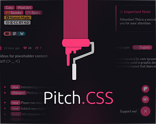
hi! thank you! am doing relatively okay! sadly I don’t have (nor plan to have) any UI assets here ><
nnda
Creator of
Recent community posts
Hi! thank you for the kind comment, and no problem! ^^
The links decorations requires custom-link-itch or custom-link-ext class to be added to the <a> HTML element manually.
Since the CSS doesn’t have the way to see which links point to profile page or external page yet. I should’ve word it better on the page T‿T”
omg thank u so much!!
For the content sections, Toggle component in this version can only have two contents TwT”
But! in the next update, you can have as many Toggle contents as you want (It is actually done, and I’m sitting on it rn. Hopefully I can push this update today.)
Here’s the new Toggle’s CSS, it can have up to 5 contents (content-a → content-e), which you can still add by tweaking the CSS a bit if you need more!
/* Styling for the toggles container */
.custom-toggles {
display: inline-flex;
background: var(--itchio_bg2_color);
border: 1px solid var(--itchio_bg2_sub, currentColor);
border-radius: 24px;
}
/* Styling for the individual toggle */
.custom-toggle {
padding: .1em .8em;
margin: 2px;
border-radius: inherit;
transition: .3s;
}
.custom-toggle:not(:hover) {
text-decoration: none;
}
/* Initial state of the content (hidden) */
[class^="custom-content-"] {
display: none;
}
:is(#wrapper, .primary_column):not(:has(a.custom-toggle:target))
/* Default visible content ( .custom-content-a ) */
.custom-content-a,
/* Make sure to match the rule below */
:is(#wrapper, .primary_column):has(a.custom-toggle:target[name="toggle-a"]) .custom-content-a
, :is(#wrapper, .primary_column):has(a.custom-toggle:target[name="toggle-b"]) .custom-content-b
, :is(#wrapper, .primary_column):has(a.custom-toggle:target[name="toggle-c"]) .custom-content-c
, :is(#wrapper, .primary_column):has(a.custom-toggle:target[name="toggle-d"]) .custom-content-d
, :is(#wrapper, .primary_column):has(a.custom-toggle:target[name="toggle-e"]) .custom-content-e
/* Add as much as you want. Just change the toggle-* and the .custom-content-* accordingly */
{
display: block;
}
.custom-toggles:not(:has(a.custom-toggle:target))
/* Default clicked button ( toggle-a ) */
a.custom-toggle[name="toggle-a"],
/* Make sure to match the rule above */
/* Styling for the individual toggle when clicked/activated */
.custom-toggles > a.custom-toggle:target
{
color: var(--itchio_button_fg_color) !important;
background: var(--itchio_button_color);
}
Use this instead of the one copied from the app in the current version.
Hi! and thank you! <3
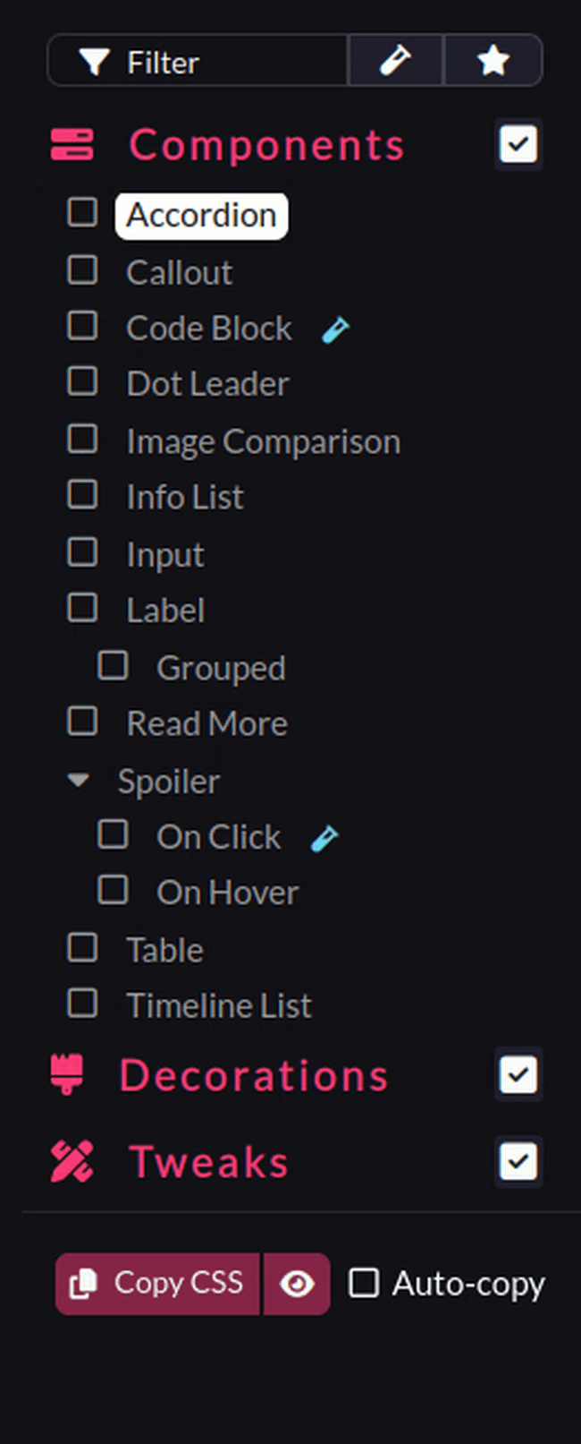
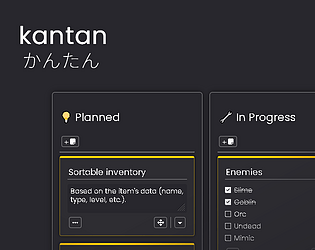
Yeah, I’ve been thinking about making ‘Tabs’ component, but I realized its just Toggle with different skin -‿-”
You can override/style the component’s CSS to achieve the tabbed-view appearance.
.custom-toggles {
/* Spacing */
padding: 0 .5em;
margin-bottom: .5lh;
/* Gap between the toggle button/tab */
gap: .3em;
/* Reset default border styling */
border-radius: 0;
border: none;
border-bottom: 1px solid var(--l);
}
.custom-toggle {
margin: 0;
border: 1px solid var(--br);
border-bottom: none;
/* Round top-right and left corner for the tab style */
border-radius: 9px 9px 0 0;
}
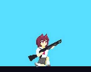
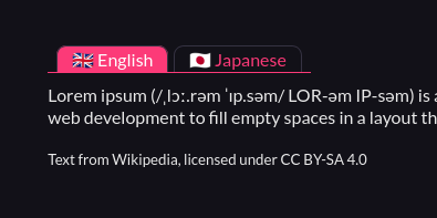
The CSS above will style Toggle to:

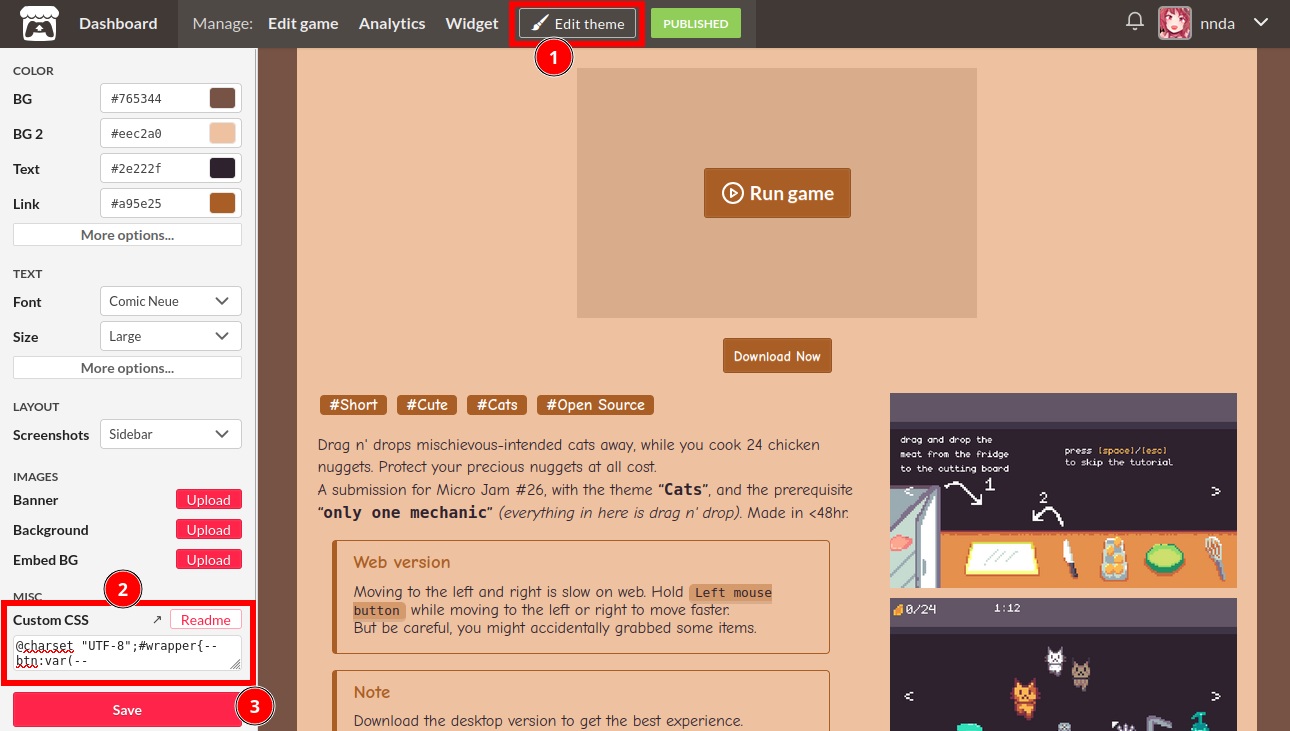
Just remember to put that CSS after the copied CSS from the Pitch app (ゝᴗ•)b
Yeah, I also feel the same way about using the ‘No AI’ tags. I’m afraid it’ll make my projects more likely to be scrapped, to avoid AI ‘inbreeding’.
For AI scrappers/crawlers specifically, itch.io doesn’t seems to implement any measures against them in the robots.txt, HTML head meta tags, and in the HTTP headers. At least as far as I know.
On your project page, click the Edit Theme button, and paste the copied CSS onto the Custom CSS field.

Hope this help :)
If its not there, that means you don’t have custom CSS enabled on your account. You’ll have to contact support to have it enabled. Refer to this itch documentation page for more info.
Edit: simplified the CSS, and made it less of a headache to work with and easier to tweak :)
/* Styling for the toggles container */
.custom-toggles {
display: inline-flex;
background: var(--itchio_bg_color);
border-radius: 24px;
}
/* Styling for the individual toggle */
.custom-toggle {
padding: .1em .8em;
margin: 2px;
color: var(--itchio_bg2_color);
border-radius: inherit;
text-decoration: none;
transition: .3s;
}
/* Initial state of the content (hidden) */
[class^="custom-content-"] {
display: none;
}
#wrapper:not(:has(a.custom-toggle:target))
/* Default visible content ( .custom-content-a ) */
.custom-content-a,
/* Make sure to match the rule below */
#wrapper:has(a.custom-toggle:target[name="toggle-a"]) .custom-content-a
, #wrapper:has(a.custom-toggle:target[name="toggle-b"]) .custom-content-b
, #wrapper:has(a.custom-toggle:target[name="toggle-c"]) .custom-content-c
/* Add as much as you want. Just change the toggle-* and the .custom-content-* accordingly */
{
display: block;
}
.custom-toggles:not(:has(a.custom-toggle:target))
/* Default clicked button ( toggle-a ) */
a.custom-toggle[name="toggle-a"],
/* Make sure to match the rule above */
/* Styling for the individual toggle when clicked/activated */
.custom-toggles > a.custom-toggle:target
{
color: var(--itchio_button_fg_color);
background: var(--itchio_button_color);
}
You can now add as many items as you want easily:
#wrapper:has(a.custom-toggle:target[name="toggle-a"]) .custom-content-a
, #wrapper:has(a.custom-toggle:target[name="toggle-b"]) .custom-content-b
, #wrapper:has(a.custom-toggle:target[name="toggle-c"]) .custom-content-c
, #wrapper:has(a.custom-toggle:target[name="toggle-d"]) .custom-content-d
, #wrapper:has(a.custom-toggle:target[name="toggle-e"]) .custom-content-e
{
...
}
You can also change which toggle are active by default.
For your purpose (three languages on one page), as an alternative approach, may I suggest this:
Languages
<div class="custom-toggles">
<a name="toggle-a" class="custom-toggle" href="#toggle-a">🇬🇧 English</a>
<a name="toggle-b" class="custom-toggle" href="#toggle-b">🇮🇩 Indonesia</a>
<a name="toggle-c" class="custom-toggle" href="#toggle-c">🇯🇵 Japanese</a>
</div>
<br> <hr>
<div class="custom-content-a">
Lorem ipsum (/ˌlɔː.rəm ˈɪp.səm/ LOR-əm IP-səm) is a dummy or placeholder text commonly used in graphic design, publishing, and web development to fill empty spaces in a layout that does not yet have content.
</div>
<div class="custom-content-b">
Lorem ipsum, atau ringkasnya lipsum, adalah teks standar yang ditempatkan untuk mendemostrasikan elemen grafis atau presentasi visual seperti font, tipografi, dan tata letak. Maksud penggunaan lipsum adalah agar pengamat tidak terlalu berkonsentrasi kepada arti harfiah per kalimat, melainkan lebih kepada elemen desain dari teks yang dipresentasi.
</div>
<div class="custom-content-c">
Lorem ipsum(ロレム・イプサム、略してリプサム lipsum ともいう)とは、出版、ウェブデザイン、グラフィックデザインなどの諸分野において使用されている典型的なダミーテキスト(英語版)。書籍やウェブページや広告などのデザインのプロトタイプを制作したり顧客にプレゼンテーションしたりする際に、まだ正式な文章の出来上がっていないテキスト部分の書体(フォント)、タイポグラフィ、レイアウトなどといった視覚的なデザインを調整したりわかりやすく見せるために用いられる。
</div>
/* Initial state (hidden) for the content containers */
.custom-content-b,
.custom-content-c,
#wrapper:has(a.custom-toggle:target[name="toggle-b"]) .custom-content-a,
#wrapper:has(a.custom-toggle:target[name="toggle-c"]) .custom-content-a {
display: none;
}
/* State when the content containers' button are clicked */
#wrapper:has(a.custom-toggle:target[name="toggle-b"]) .custom-content-b,
#wrapper:has(a.custom-toggle:target[name="toggle-c"]) .custom-content-c {
display: block;
}
/* Buttons container styling */
.custom-toggles {
display: inline-flex;
background: var(--itchio_bg_color);
border-radius: 24px;
}
/* Buttons styling */
.custom-toggle {
padding: .1em .8em;
margin: 2px;
color: var(--itchio_bg2_color);
border-radius: inherit;
text-decoration: none;
transition: .3s;
}
/* Buttons styling when active/clicked */
.custom-toggles:has(a.custom-toggle:target[name="toggle-a"]) a.custom-toggle[name="toggle-a"],
.custom-toggles:has(a.custom-toggle:target[name="toggle-b"]) a.custom-toggle[name="toggle-b"],
.custom-toggles:has(a.custom-toggle:target[name="toggle-c"]) a.custom-toggle[name="toggle-c"]
, .custom-toggles:not(.custom-toggles:has(a.custom-toggle:target[name="toggle-b"], a.custom-toggle:target[name="toggle-c"])) a.custom-toggle[name="toggle-a"]
{
color: var(--itchio_button_fg_color);
background: var(--itchio_button_color);
}
A little wacky, but it should work.
You have to change the 'href' attribute of each .custom-toggle elements, by appending your itch.io project page URL before the '#' mark for it to work.
Here’s the demonstration page
Is it even possible to stylize details so the first block is opened by default and when you click on another one, it replaces the shown one?
I’ve played around a bit to confirm this. But, apparently the attribute 'open', 'name', and even 'class' gets stripped on <details> elements, and also on its <summary> elements :/ So, sadly, I don’t think its possible.
Also, since classes are stripped off <details> and <summary>, you’d want to have them inside a container with custom class, and then target that container in the CSS:
<div class="custom-details">
<details>
<summary>...</summary>
...
</details>
<details>
<summary>...</summary>
...
</details>
...
</div>
.custom-details details { ... }
.custom-details summary { ... }
I've converted your codes above to ones that displays correctly on itch.io pages (though, still without the two functionalities you mentioned).
<div class="custom-details">
<details>
<summary>Question 1</summary>
<div class="custom-details__content">
<p>Pretty long text in language 1 lorem ipsum dolor sit amet consectetur adipisicing elit. Earum omnis beatae itaque! Maxime consequuntur architecto, voluptatibus iste aliquid quaerat dolores, culpa repellendus optio omnis rem saepe quisquam incidunt, numquam molestias?</p>
<p>Pretty long text in language 2 lorem ipsum dolor sit amet consectetur adipisicing elit. Earum omnis beatae itaque! Maxime consequuntur architecto, voluptatibus iste aliquid quaerat dolores, culpa repellendus optio omnis rem saepe quisquam incidunt, numquam molestias?</p>
</div>
</details>
<details>
<summary>Question 2</summary>
<div class="custom-details__content">
<p>Pretty long text in language 3 lorem ipsum dolor sit amet consectetur adipisicing elit. Earum omnis beatae itaque! Maxime consequuntur architecto, voluptatibus iste aliquid quaerat dolores, culpa repellendus optio omnis rem saepe quisquam incidunt, numquam molestias?</p>
</div>
</details>
<details>
<summary>Question 3</summary>
<div class="custom-details__content">
<p>Lorem ipsum dolor sit amet consectetur adipisicing elit. Earum omnis beatae itaque! Maxime consequuntur architecto, voluptatibus iste aliquid quaerat dolores, culpa repellendus optio omnis rem saepe quisquam incidunt, numquam molestias?</p>
</div>
</details>
</div>
.custom-details > details {
position: relative;
display: block;
max-width: 650px;
margin: 0 auto 10px;
background: rgba(255,255,255,0.5);
border-radius: 5px;
transition: 0.3s;
overflow: hidden;
}
.custom-details > details::after {
position: absolute;
right: 24px;
top: 15px;
content: "";
display: block;
width: 14px;
height: 14px;
border-right: 3px solid #425995;
border-bottom: 3px solid #425995;
transform: rotate(-45deg);
transform-origin: center;
transition: .3s;
}
.custom-details > details[open]::after {
transform: rotate(45deg);
}
.custom-details > details[open] {
padding-bottom: 100px;
}
.custom-details > details[open] > summary {
margin-bottom: 32px;
}
.custom-details > details > summary {
background: #fff;
border-radius: 5px;
padding: 12px 24px;
font-size: 20px;
cursor: pointer;
list-style: none;
font-weight: 700;
transition: .3s;
}
.custom-details > details > summary::-webkit-details-marker {
display: none;
}
.custom-details__content {
padding: 0 32px;
font-size: 18px;
margin-bottom: -60px;
}
.custom-details__content p:last-child {
margin-bottom: 0;
}
.custom-details__content p:first-child {
margin-top: 0;
}
Hi again! No problem! Don’t hesitate to ask anytime. First off, that’s a cute adaptation of the styles! I really appreciate the attribution and the shout-out!
Addressing your issues:
- For sizing the ‘Support Us’ icons, you can increase the
heightattribute of the<img>element. Or, you can set them in CSS to avoid having to set the height for each images manually:
.custom-cb > img {
height: 35px;
}
- And for the off collection box background, set the
heightof the.collection_row::beforeelement to 100%, minus the space that it takes by its heading/title:
.collection_row::before {
height: calc(100% - 3.5em);
}
The calculation is just speculation: 100% of the height minus 3.5em—around the height of the collection’s heading/title, you can readjust it to your liking.
Sorry I didn’t put many documentations/comments in the SCSS source code T^T
Also, if you wish to, I can help you guys set things up with the CSS directly :)
You can try:
https://itch.io/jams/hosted-by-USERNAME
For example: https://itch.io/jams/hosted-by-kenney
Ah, that little off spacing to the right of the video?
Try this:
.right_col > .video_embed {
/* Center video embed */
margin: auto;
/* Bottom spacing */
margin-bottom: .5em;
/* Video embed maximum width */
max-width: 700px;
}
Its just the margin: auto; that centers it, the rest is optional to tidy things up.
Hi, sorry for the late reply!
I assume you meant having the screenshot like in the mobile layout of the page?
You can force the mobile layout by setting it as flexbox and reverse the direction:
.columns {
/* Reverse the direction (screenshot column on top) */
flex-direction: column-reverse;
}
.columns > .column {
width: auto;
}
/* Set the screenshot list to display as if its on mobile layout */
.view_game_page .screenshot_list {
white-space: nowrap;
overflow: auto;
text-align: center;
font-size: 0;
}
.view_game_page .screenshot_list img {
display: inline-block;
margin: 0;
}
Glad it helped! :)
Yea, for my profile page’s CSS, you’d have to build the CSS from the repo first. I’ve put the installation section for that in the readme. Its quite a mess of a system, because I want to save characters count. itch.io limits profile page’s CSS to 5120 characters for some reason :/
And yep, you need your itch.io’s username, instead of the display name for the Author Badge.
Thank you for the comments!
For the main projects section, I used Grid layout, and for the collections, I used List layout in the page’s theme editor.
As for the two-column layout of the collections, that was done through this custom CSS:
@media (min-width: 780px) {
/* Split collections row into two-column layout on desktop */
.collections {
display: grid;
grid-template-columns: 50% 50%;
padding: 2em 0 !important;
}
.collections .inner_column {
height: 100%;
display: flex;
flex-direction: column;
}
/* Fade out gradient */
.collection_row {
position: relative;
overflow: hidden;
margin: 0 0.8em;
}
.collection_row::before {
content: "";
position: absolute;
bottom: 0;
box-shadow: inset -13em 0 9em -2em #0f1116; /* Match the background color */
pointer-events: none;
width: 100%;
height: 76%;
z-index: 2;
}
.collection_row:first-child {
padding-left: 1.2em;
}
.collection_row:last-child {
padding-right: 1.2em;
}
}
Thank you for the comments!
I’ve been a little hesitant on adding hover effects or animation-related stuff. Since I’m aiming more on CSS stuff for the page’s content.
But I do plan on adding more decorations, including animation-related tweaks.
And if or when there’s the components/tweaks like you’ve described, it’ll probably be under the ‘Decorations’ or ‘Tweaks’ section/category :)


