Indie game storeFree gamesFun gamesHorror games
Game developmentAssetsComics
SalesBundles
Jobs
TagsGame Engines
(1 edit) (+1)

A fun and addictive high-score game with a clever theme execution and well-thought-out mechanics! It’s a strong entry overall, though the visuals can feel a bit overloaded at times, and the audio could use more variety to keep things fresh. Here is what I thought in more detail:

Game play / Fun / Engagement ●●●●●
The game play is very engaging and executed really well. Merging planets is satisfying and addictive, making you want to push for a higher score. The only issue I found is that holding down the left mouse button drops too many planets too quickly, which can be frustrating... Needed to get used to the mechanic. Also: The "next Piece" does not work all the times? But maybe this is due to the quick dropping of planets... It forces players to carefully tap instead, which slightly interrupts the flow. Still, this is a minor issue in an otherwise excellent game play loop! A strong 5/5. This was my high score:
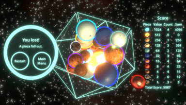
 

Theme ●●●●●
Perfect use of the theme "limited space"... and in space! The title itself is funny, and the design makes the limitation feel central to the game play... you literally have limited space for the spheres. Easy 5/5.

Art Style / Visuals ●●●●○
You used the given shapes well and the planets fit the concept nicely. However, the visuals feel somewhat overloaded. The combination of glows, outlines, and a busy background can make the screen overwhelming at times. I’d suggest either leaning into distinctive textures for the planets (cartoony styles could work well) or simplifying to clean colored spheres without as many effects. That polish would take the visuals to the next level. Thus, 4/5.

Audio / Sound Design ●●●○○
The music fits the space theme well, but the sound effects are quite basic and repetitive. Adding different merge sounds depending on planet size would add a lot of depth, and menu/UI sounds would help polish the experience further. 3/5 here.

Thanks!

The only issue I found is that holding down the left mouse button drops too many planets too quickly, which can be frustrating... Needed to get used to the mechanic. Also: The "next Piece" does not work all the times? But maybe this is due to the quick dropping of planets... It forces players to carefully tap instead, which slightly interrupts the flow.

At first I had drop only on click but I often wanted to just spam planets especially at the start of a run so I made them drop every 0.3 seconds while holding the mouse button. Maybe it should have been a longer cooldown or be adjustable. Someone else complained about that as well. It actually was only 0.25s before and I already increased it. 

The "next piece" is maybe badly worded and should be "current piece". Someone else mentioned that there is a bit of a confusion. Both the piece in the spawner bubble and the one in the "next piece" UI area are the piece that gets dropped when you press the mouse button.

There have been some complains about pieces being hard to distinguish and I noticed that as well during development and added those outlines and making them thicker and more distinct multiple times. They are all planets from our solar system minus Earth, plus Pluto, plus our moon and plus a white dwarf so making random artificial planets would have deviated from that idea but maybe I should have done that.

I removed Earth because the hard transition between blue water and the land masses created various random shapes so jam rule wise it would have been tricky. I replaced it with a green tinted Mars for a bit but for gameplay reasons decided to remove one piece and picked the questionable Earth / random planet.

I also thought about reducing the sun piece brightness and even did so a bit. Maybe it should have been more but I also would have had to separate materials which would have eaten some time and I just focused on other things first. I thought that not everything in a game has to be super clearly visible and having some overblown brightness might be fine. A bit like other games make it intentionally hard to see in dark or foggy areas.

I actually thought about UI sounds but wasn't sure how long that would take, how to implement that and such. I prioritized other things and this idea as well just didn't make it.