No worries, we have a limited understanding on english too so communication is always more complicated, but in the end we manage to understand each other and that's the most important !
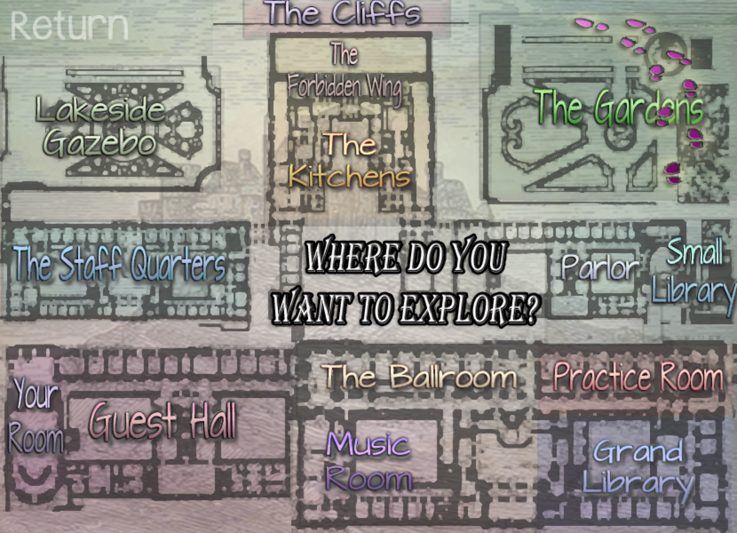
There is some plan to redesign part of the UI such as the notifications, maybe it will make some difference in the end ? I don't think we can redo all the UI, but if you have specific things you didn't liked in the UI it could help us to know what we should improve in priority ? (Like the main menu ? The textbox ? The quickmenu in game? The choice menu in game ? The notification ? The credit page ? The encyclopaedia ? The saves/load page ? The preference settings ?)
Thanks again for taking the time to give us your opinion anyway !


