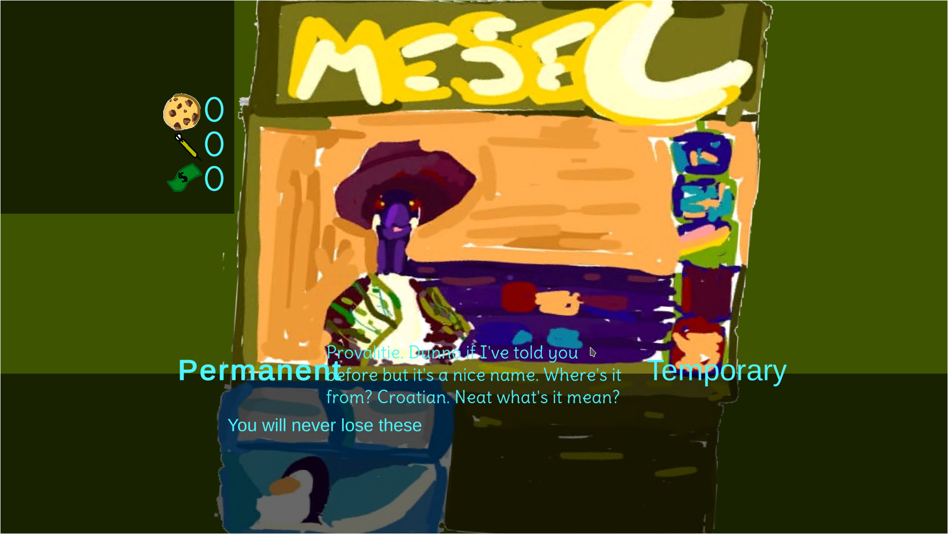
the text works differently on different screen sizes so it works on some monitors and not others as far as I know there's no easy way to make sure it's the right size and I did try other colours for the shop text but they seemed to be less readable so I ended up just going with the blue (if you have any suggestion for what colour the text could be that could work that would be useful but thanks for the feedback.
You could try using an overlay (although I am not sure it is called like that...). That means you draw a filled rectangle etc. on top of the background image with some transparency and put the text on top of that. This helps the text to stand out. See an example:

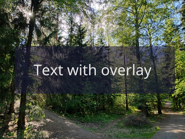
May not be the best example but I hope it gets the idea across...