
Indie game storeFree gamesFun gamesHorror games
Game developmentAssetsComics
SalesBundles
Jobs
TagsGame Engines
(1 edit)

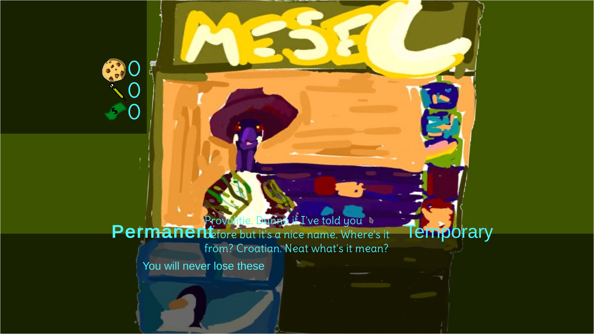
I tested the game and while the normal game play works, the shop screen has text that goes outside the screen; like this:

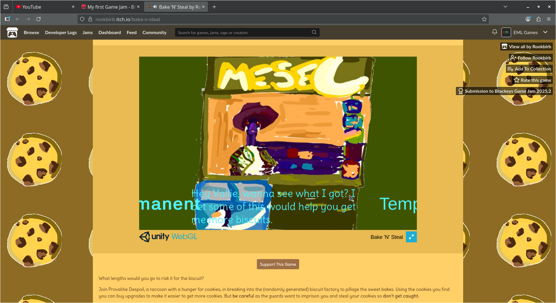
Also text  over that blue thing is very hard to read. But otherwise the game seems to work - controls are good and responsive, etc.

Although the procedural generation could perhaps be more balanced. By that I mean if you could reduce the luck factor like the cookie placement and how easy they are to get. Because now there is no cost at restarting and you could just as well restart over and over again until the cookie jars appear next to you. Just a thought...

(p.s As a side note, I also made a procedurally generated game and it's also my first game jam and published game. Nice to see I am not the only one and how people do procedural generation differently.)

the text works differently on different screen sizes so it works on some monitors and not others as far as I know there's no easy way to make sure it's the right size and I did try other colours for the shop text but they seemed to be less readable so I ended up just going with the blue (if you have any suggestion for what colour the text could be that could work that would be useful but thanks for the feedback.

(1 edit)

You could try using an overlay (although I am not sure it is called like that...). That means you draw a filled rectangle etc. on top of the background image with some transparency and put the text on top of that. This helps the text to stand out. See an example:

May not be the best example but I hope it gets the idea across...

thanks I'll try that soon

added it is it better now

Lot better. But I just noticed that I if go to fullscreen mode the text moves out of the overlayed area; but fullscreen fixes the other problem I mentioned about the text going out of screen...


at least it's only the dialogue that doesn't relate to what you're buying so it's not as bad