
yeah strongly agree with KevUndead up there that the inventory hotbar being some kind of sliding FIFO buffer of the last items you interacted with makes it pretty awful to use, and the fact that the default icons for a bunch of the most-used tools are just "3 pixel wide dark grey smudge on a black background" aint helping matters.
anyways, here's another little UI gripe: the positioning of the prop action menu way off to the prop's right on the screen creates problems with some of the bulkier props. Especially the workbench. Like here, take a look at this screenshot:
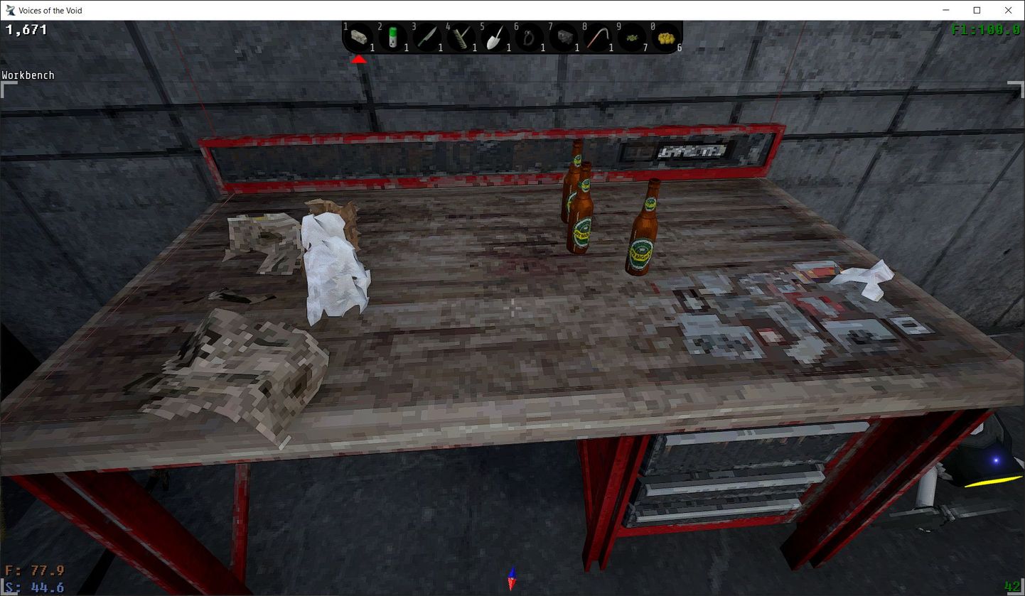
A workbench, a pile of crumpled paper bits, a couple gasoline bottles. My cursor is hovering over the workbench; when I hit the "E" key, what's going to get crafted? A Molotov or a chunk of paper scrap? It's impossible to tell right now because standing close to the bench has bumped the crafting menu completely off the right side of the screen. It would probably work better if the positioning of that menu could be restricted to, like, inside the actually renderable screen space.