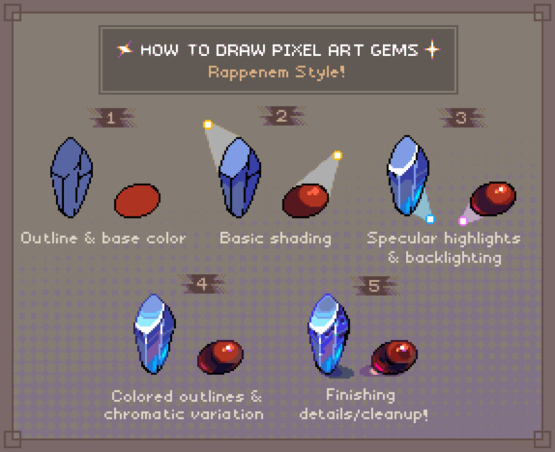
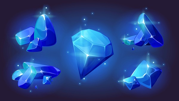
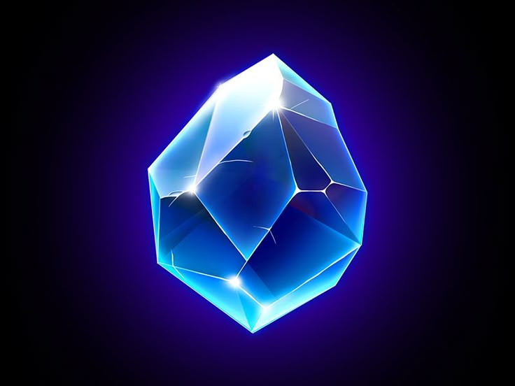
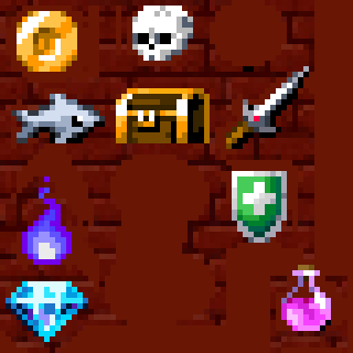
I think the blue gem would look better without the black edge lines all over it. Gems should shine bright but the black lines are doing the opposite. Try using brighter edge lines instead and some rim lights maybe. You may want to look up specular highlights as well. The chest, sword, and shield I think would look better with specular highlights on the metallic bits.
Right now, I’m planning to create a Skill Icons Pack featuring around 100 icons, including various skills, buffs, and debuffs. Since my current RPG icon pack didn’t perform as well as expected, I won’t be focusing on it much for now, though I’m considering a revamped version in the future.
As for animation — I’ve actually been thinking about that! Icons like fire, campfires, wands, potions, and buffs could definitely benefit from subtle animations to add more value and make the pack stand out. It’s still something I’m exploring, but your comment makes me more confident it’s worth pursuing!
Again, thanks for the kind words it means a lot and really helps keep the motivation going :)
I feel like it gets more and more difficult to market asset packs because market saturation increases over time, especially with artists doing free icons for Minecraft, Terraria, and other sandboxy games like those. People can just save them off Google images with no problem. Though it's not impossible to make an RPG icon pack do well financially I guess. I have no idea because personally I've never tried. And just about every gig in the world is competitive anyway so gotta still try. Sometimes I'd feel like quitting pixel art, but if I quit pixel art, I don't have any other career skills to fall back on lol... brutal but that's why I never give up on art, though I take breaks. You can see my portfolio on Cara by the way.
I didn't finish all the items, but I was tweaking some of the sprites, mainly anti aliasing and specularity on some of the sprites. The gem is probably the biggest take away to study though. You can get pretty wild with the lighting on gems and it will often look passable, as long as you don't use black lines for the polygon edge lines.
Yeah, they look pretty good! I still have a lot to learn about shading and lighting I'm still learning pixel art and improving bit by bit. My progress has slowed down lately since I’m traveling and don’t have access to my PC or laptop, so I’m doing small sketches or pixeling on my phone when I can, and jotting down ideas for the future.
I’ll be updating the pack with revamped gems and definitely working more on lighting and shading next.
I checked out your work too it’s honestly amazing! Keep it up, you’ve got a lot of potential. Don’t give up.
I personally started pixel art to eventually earn and cover some basic expenses. I haven’t made anything yet, but even when one pack doesn’t do well, I feel more motivated to make the next one even better. And honestly, the small support I’ve received — even just kind words — means a lot to me. I’m really enjoying pixel art now, and that’s what keeps me going. :)