
Hi, I'd like to add some comments re: the visuals that I hope will be helpful.
Firstly, the work you've done is brilliant. My comments are purely PERSONAL opinions. They do NOT mean that I am right!
1. Background rock faces. I prefer your design to that of the arcade version. Why? Well, take a look below.
The arcade version on the left certainly has more colours, but the rows of textures get a little repetitive and is a little too cluttered.
Your version is more elegant: you just place a few details here and there that convincingly SUGGEST a rock face rather than spelling out every single detail. This is beautifully done.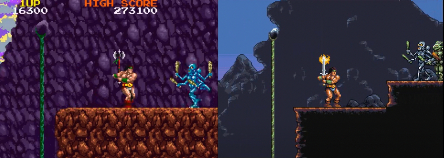
Good art is about judging what to put in - but also what to leave out. Your solution here is perfect - and leaves room for our imagination to fill in the gaps.
The other great advantage of your version is that it does not distract from the foreground characters and allows them to stand out clearly.
And note how well your version creates a separation between foreground (dark area), background (grey rock face) and far background (sky). Lovely work. There's a sense of space here that is missing in the arcade graphics.
For the same reasons, although I like your new rock texture in the caves (below, left), I still think your original version (below, right) worked better. 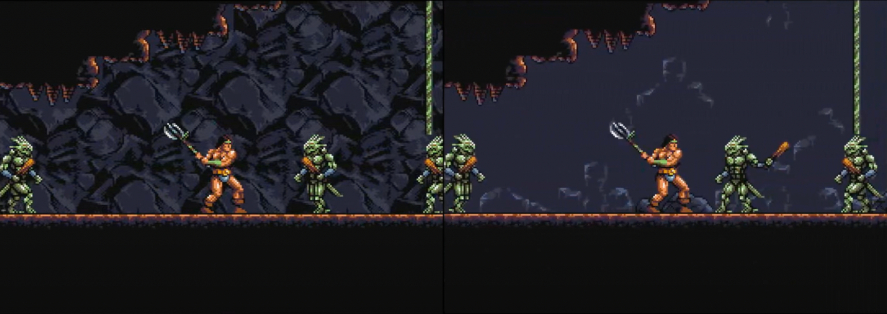
Your original rock face may not be as pretty, but it places the cave wall further into the background, giving the characters space to breathe and allowing the action to stand out clearly.
The new rock face is very dramatic and artfully drawn, but it brings the background almost into the foreground and starts to drown out the characters. I strongly feel that this is a case of Less is More.
2. The backgrounds in the second level. The castle interiors here are perfect - far better than the arcade version. There is nothing for me to add!
3: Scrolling. In my opinion, smooth scrolling is more important than attractive graphics.
In the Youtube videos of Amiga Rastan I've watched, the scrolling seems a little juddery. Is that just Youtube, or is it like that on Amiga hardware? Also: is it my imagination or does version 0.32 scroll smoother than version 0.33?
4. Lastly, I want to address the statues. They worked fine as part of the arcade design - and the parallax scrolling really helped with that.
However, the visual design of YOUR version of Rastan is quite different - and I feel your version works a lot better without the statues. Another case of Less is More and I think you got it right the first time.
Well, that's it. Again, these are just opinions and nit-picks, and you are the boss! The work you have done is outstanding and even if you go no further, the two levels you've done are more than enough for me. I never got past the second level of the arcade version anyway!