Super addictive and clever!!
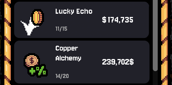
I have a small typography advice, if you want. On smaller screens the text on the right is hard to read cause it’s bold and tight together. If you add a tiny bit of tracking, it becomes much sharper. + also if you divide the dollar from the number and put it before, it will be more legible and habitual.
I changed the Lucky Echo to illustrate what I mean, if you zoom out so it’s small on the screen, you could see the difference: