Judge feedback is anonymous and shown in a random order.
You have done some really good documentation, its very thorough and in depth. I would like to see a little more research into lightning and shapes, colours and a few more examples. Perhaps looking at art styles and differences. I really like the branding throughout the presentation, this makes it look really good and has a professional element about it, its certainly been thought about.
You have learnt a lot in the process of creating this piece, you have taken on a lot of technical knowledge to create this. There are a number of things that are not well optimised, however to create a prototype this is really great! The issues with layering so many decals on the same spot and creating so many could create issues with performance, it might be an idea to tone this down a little to show you have some understanding of optimisation.
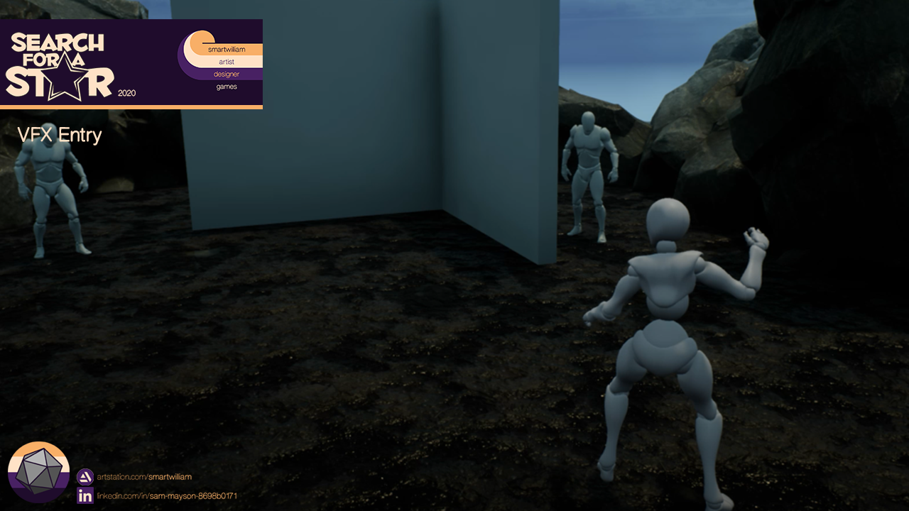
I think the decal and lightning strike of the player character is a little confusing, this could be confused as damaging to the player, especially with the glowing large decal. I would suggest removing the initial lightning strike and decal. I like the lightning coming from the ground however.
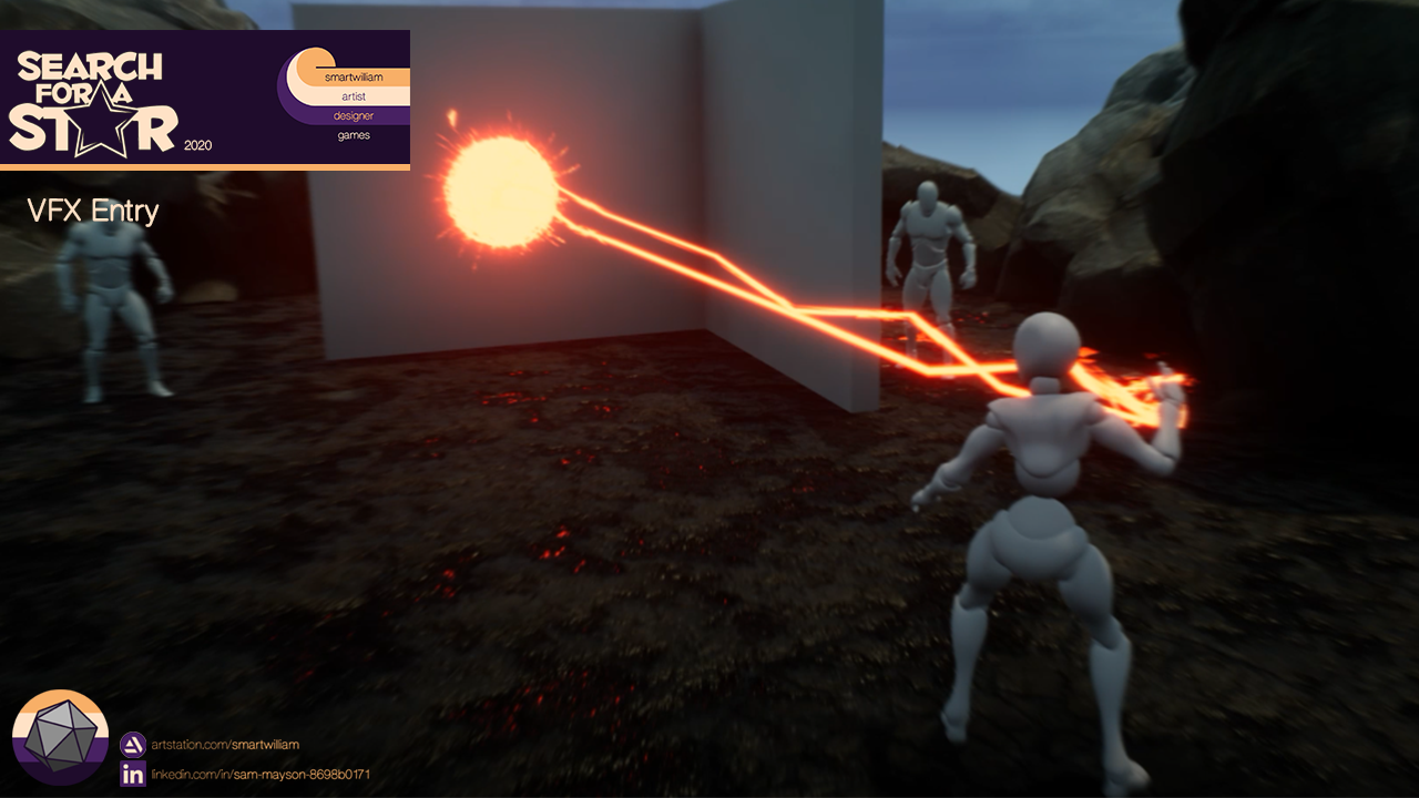
The energy ball could be a little more refined, the arching lightning beams work very well travelling over distance, however in the small area they become very noisy and spiky. I would suggest using perhaps an atlas animation texture or lightning and some kind of core effect, similar to the arc grenade in destiny 2 or the character screen when using warlock. This would give a cleaner more readable shape that you can scale or add more glow to show the power up. Perhaps some energy being drawn into this ball initially or a formation of the energy ball before the lightning comes from the ground would help give the effect some stages of build up?
I like your distortion ring, this gave great emphasis and power to the effect release. I would suggest a bit of a burst with an energy ring to add some colour at the same time as the distortion ring. Perhaps some sparks similar to the ones you have at the impact radially exploding with a short lifetime from the hand to add even more attention to this?
The lightning has some nice sparks along it and the impact has some nice shapes emitting from it also. As we spoke about before, be careful emitting so many decals. The only thing I would suggest is perhaps some colour over life or some more colour tones in the effect. Its very mono-tone with the red. Perhaps going from a more yellow to a red colour or adding some orange glow to the impact area. This will really make the effect pop and give it a nice balance visually. It can also help with showing the direction of the effect and where the damage is greatest.
A really great start and hopefully the things you have explored and learnt have inspired you to continue to explore VFX in game in the future
I really appreciate the thought and creativity that went into this piece! There's a lot going on, and a lot of pieces that need to work together to sell this, and that's essential to being a successful real-time VFX artist.
In your documentation you mentioned a lot of time spent in creating the lock-on system and how it didn't directly assist in the VFX itself, but in my opinion, it made a huge difference. A pretty effect doesn't help much in a game if it doesn't actually meet the needs of the game! What you did with the lock-on system is also play the part of a designer or programmer giving you a system and purpose for your effect so you could make it behave the way you wanted. And with tricky multi-stage effects using beams, that's pretty essential.
Here's some feedback for the content and presentation:
-The "Search for a Star" branding is great, but it takes up too much screen real estate and doesn't need to be displayed on the entire video.
-All of the stages make a lot of sense and work well together, but the entire thing feels like it could be sped up considerably without losing much. In your documentation you mentioned you wanted to slow it down a lot so you can see the stages happening more, but I think if you tweak the timing a bit and speed it up, your brain will fill in the blanks. Look at League of Legends powers...there's a lot of reference you could look at there for multi-stage effects that are also quick and snappy, and are extremely reliant on good timing to sell what's going on in a fixed amount of time.
-Everything in the effect is pretty much the same color and value. You can switch things up a lot by adjusting the hue or opacity on some elements to improve the overall read of what's happening. You could also give some opacity variance to those elements so everything doesn't look the same. Maybe you could even identify or create secondary elements and give them a different color.
-I like the fresnel/character glow...maybe try having that, the ground decal, and the electrical beams sync up closer together so it looks like they're all converging into the electricity powering up the hand.
-Speaking of secondary elements, you could add some electricity particles to various stages to help sell some lingering aftermath. That would help provide some of that slowness, visually, without messing up the timing of the overall effect. It would also help prevent the effect from being 100% reliant on the electricity beams. They're really cool, and the star of the show, but some other elements will help them from looking like they're overused. Another secondary element you could add is sparks. They're a bread-and-butter element you can add in to help sell that lingering feel on the charge up, impacts, etc.
-The charge-up decal is great, but it starts to break down when it's used as scorch marks on the ground. The circular shape hurts the read; you could try making something less complex and limit how many of those decals get spawned in a row to see if that helps improve the overall read of the impacts.
-Lastly, look into adding some lights to all of these stages. You don't have to go overboard, but they can definitely help reinforce the timing and will help keep your effects grounded and tied into the environment.
Keep up the great work!
-Ryan Hoss
Senior VFX Artist
Deep Silver Volition
Hello , i think you can add more stuff to the impact and the hands, it´s full of beams but you can add more particles and VFX to rise the quality. Also take in account that you are spawning so many particles at the same point on the impact and that´s expensive for a game. That said, keep going and improving ! dont give up!
This is a thoroughly thought-out effect, with a lot of elements forming a cohesive whole and serving the game experience.
From the reference phase of the iconic sci-fi battle, to planning how this would be a workable game mechanic, through investigating how each element builds the moment of attack - this all works well together.
It's great that you had ideas for how to give the effect more punch and inter-connection, but did not get carried away with overdoing it. You recognized some pitfalls early, and prioritized accordingly (using a simple stock animation vs. spending too much time getting a refined performance was wise).
It's a bonus that you have the technical chops to design this Blueprint, and the commitment to pursue answers you sought for what you wanted to learn.
My critiques would be more along the lines of polish, and pretty minor. The timing overall could be tightened up – the initial lightning drop has strong impact and nice fresnel on the character; the power-up phase feels about right (though I suspect in a twitch FPS, this phase should be trimmed to be more agile). But the 'strike' moment should be shorter, with tighter beats – the shockwave post effect conveys power, but the fade-in muddles it a bit; the 'release', with beams could vanish more swiftly. The arcing itself could use more high-frequency noise, especially if you are trying to match the feel of the 'Star Wars' force lightning.
Overall – excellent execution and strong integration, with tech & purpose.
I really like the idea, how you made it work and the technical details. However I would have wanted to see you spend more time on the textures and shaders you are using.
First of all, your electricity doesn't have any details in it, you could have used a more detailed texture and elevate it with the shader you are using to get more of a lightning feeling. You can use distortion and other shader tricks to get a more realistic looking lightning. You have Destiny as one of your references, they use really cool tricks to spice their effects up. I suggest you take a closer look at them.
The lightning ball at the characters hand becomes a little chaotic, it looks like a scribble when it is bigger. Instead of using the same assets as you are using with the lightning you can have a separate effect that is more detailed to get a better overall effect. Try to contain the chaos to make it look cool.
Second of all I really like your decal you are using on the ground. It looks really good on the initial powering up state when it is on the ground. However you are also using it as the damage decal. That decal does not look great when it is multiplied multiple times side by side. It has a very unique look to it and you can see that especially with the last part of your video when you are drawing a line with the lightning. A little grungier texture that can be rotated and would not look too similar when spawned side by side would help you a lot.
I used to get into the technicality and how the effect will play so much that I would forget about the main event, which is the effect itself. I really appreciate that you spent your time making everything worked but you have a little bit more to work on the actual effect and the assets you are using. It really shows you are reusing a lot of stuff. Which is not bad, everybody definitely does that. I have seen studios use the same textures for three different games but you need to change or shape it enough that it will not stick out too much.
Great work overall, great technical achievement. If you spend a little bit more time on what I talked about you will have an amazing effect on your hand.
Hi Smartwilliam,
Very nivce submision !
You have, build up, loop and ending for your effect. It's very good point !
Your decal on surface impact is very expensive, Be able to stack decal at the same place is not good idea.
Nice work, keep going !
LOWYS Clément Ubisoft vfx artist MONTREAL


Leave a comment
Log in with itch.io to leave a comment.