Indie game storeFree gamesFun gamesHorror games
Game developmentAssetsComics
SalesBundles
Jobs
TagsGame Engines
(1 edit)

I'm finding a few things really confusing about this:

1. The "problem checker"? So if a color is highlighted by this, is that bad? Because it highlights an awfully large number of colors, it's very difficult to make any kind of comprehensive palette that doesn't have 75%+ of colors highlighted?

2. How does one "fix" the problem colors? The "docs" under the tool just say "oh no"... so there's no way to fix them and you're just screwed? 

3. Why does it show one color, but then when it's exported it exports a different color? And the ball on the right's color doesn't really match the color in the palette either? Does this have something to do with the "muting to fit sRGB space? That kind of makes sense, but why can't I see the *actual palette that will be exported*? What's the point of looking at the colors *before* they are muted if that's not what they'll be exported as? It makes it super difficult to make any palette since most of the colors don't actually show what they'll be exported as?

I'm a beginner as far as picking colors (or even doing art in general) goes, so I'm probably just not understanding something.

(3 edits)


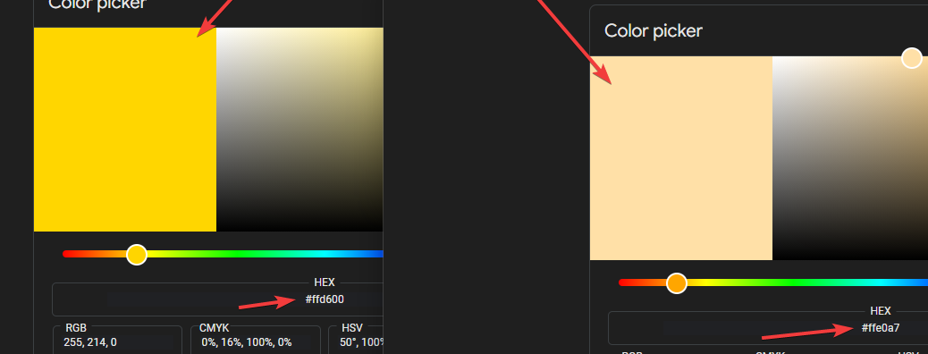
Here's a screenshot to explain the biggest confusion. The color in the palette shown on the left does not match the color that will be exported (the value on the right). 

 Also, maybe I'm just stupid, but isn't #FFD600 a valid sRGB color? Why is it a "problem" color that needs to be muted to "fit"?

Just to illustrate how different these 2 particular colors are, here's a comparison:


So the color on the left in this screenshot is the color that is displayed in the palette editor, and then when it's exported for use in Aseprite, the color on the right is what comes out... it's pretty different?

(1 edit) (+1)

You’re mixing up RGB space with sRGB gamut. Let me explain: a gamut is what a device (a screen, a printer) can display, and it varies a lot. And most screens that are just a couple years old cannot display all RGB colors — and compensate it with reduced saturation, lightness, or by shifting tint. You can open an image of an HSL circle/square and you will notice bands and strange luminous lines appearing on different screens at different places, if your eye is keen enough. (HSL is based on RGB color space, so the representation is valid.)

sRGB is a standardized gamut that is used as a baseline for most digital design. By using sRGB only, you make sure the colors will look the same on each device (relatively to each other, as average tint and lightness of each display will still vary). To make an image fit into an sRGB gamut, you will need to desaturate some colors and/or tweak their luminosity — and highlighted “problematic” colors are those that need such a tweak. My app decreases saturation to preserve luminosity and hue; other apps will change other properties to preserve another ones. Just one method of many.

Why Aseprite and PNG display colors not like the ones in the app? Because they can’t. And if the colors are not reduced to sRGB on export, they will look wrong in many other cases in a, let’s say, in an opposite direction.

Now, RGB space itself also cannot display all the possible colors that humans can see, is linear when human vision is not, and is just awful when interpolating colors — which is a staple in palette making and color gradients. Thus new color models were invented. The real goat nowadays is okaylch, which is the improvement of lch (luma-chroma-hue). My app uses lch, which is still perception-correct but a bit harder to use. Not the real problem for end users.

Most apps and formats still support RGB space only, though, which includes PNG image format (and many others!) and Aseprite. The real colors my app operates in are in lch format, not hex format with the leading #. lch works on the web, and in some image-editing apps. “Linear RGB” codes in the right column of the app were also invented to be used in 3D engines and rendering software, but it is still linear, though it can display brighter colors than RGB white, as well as brighter reds, pinks, blues, etc., which are a must have in emission/reflection display. These are supported in Unreal Engine for sure and probably in other 3D-related thingies, too. p3 is an Apple-invented older take on the problem and support for it can be found in Apple-made products and some other 3rd-party apps.

I really would like all this to be simpler, but color, behind the scenes, is not simple at all. There will also always be a gap between printing software and designs for digital displays, buuuuuut it’s another whole separate topic.

(+1)

What do all this mean to you, anyways? Try not to use oversaturated palettes — they don’t work as you think and are tiring to eyes anyways.

Wow, thanks for the super detailed reply. I never knew color  was such a complicated beast!

These concepts seem to be largely unknown to most pixel art artists... I had been researching palette design a bit, but hadn't run into anything even close to this level of detail. 

It still seems like it could be helpful if it were possible to toggle the display in this app to see all the colors as they will be exported, as sometimes the exported color isn't quite as I expected... But overall this palette generator is an absolute lifesaver for someone like me that was really struggling to figure out how to select colors for a good palette.

Thanks again for taking the time to explain things... And for this incredible generator 😃