Play story
Delve's itch.io pageResults
| Criteria | Rank | Score* | Raw Score |
| Gameplay | #3 | 3.818 | 3.818 |
| Overall | #4 | 3.894 | 3.894 |
| Presentation | #5 | 4.364 | 4.364 |
| Story | #5 | 4.091 | 4.091 |
| Creativity | #6 | 4.091 | 4.091 |
| Theme | #7 | 4.000 | 4.000 |
| Horror | #19 | 3.000 | 3.000 |
Ranked from 11 ratings. Score is adjusted from raw score by the median number of ratings per game in the jam.
Which Theme did you choose?
Realm of the Dead
How did you implement your chosen Theme into your game?
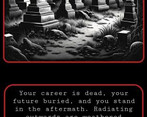
This game begins with the death of the player's career and uses Dante's Divine Comedy (where the author travels through the 9 circles of hell) as the framework for the level layout of a very weird job interview.
Did you implement any of the Bonus Challenges and if so, which ones?
Yes, the Gatekeeper.
Leave a comment
Log in with itch.io to leave a comment.


Comments
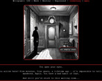
I loved it! The concept feels really well executed, the writing was great and the presentation ties everything together really well - I especially loved the elevator door animation. Great job!
Thank you for the feedback!
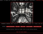
Overall, great work! I'm intrigued about the art – if it's AI-generated, that's an awesome touch. Tackling the music loop and menu intuitiveness could take this from good to fantastic. Looking forward to seeing how your game evolves!
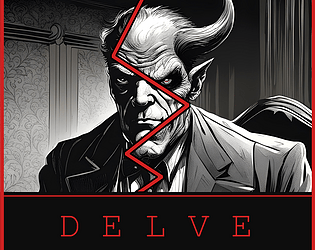
Yes, the art is AI, made with stabilityXL. I noted it in credits and itch page (just to reassure that I wasn't trying to hide it!). I got a kick out of appending demonic:10%, demonic: 50%, etc to Bob to see how he morphed.
Thanks for the note about the music loop. I definitely do want to fix that. Twine has fairly rudimentary music controls, so I'll need to bug the musician for some fading (or learn how to edit music, heh).
The menu is another thing I agree is meh. I struggled to figure out which CSS elements twine needs to target for things like sliders (there is code there for styling, but it's not applying properly, I'll need to deep dive to figure out how) and eventually decided it was lower priority than other parts of the game.
Thanks for playing and for the feedback!
Oh and regarding the form validation, there is a fun change to text if you replay through that section (say no for form input being correct). The whole game is designed around content changing when you revisit it again (eg delving back).
Interesting concept and very nice artwork. Its good to see people are still making point and click games!
Thank you!
That was really cool mixing Dante's Divine Comedy and a job interview together :) The writing was good and the artwork and music really complemented it!
My only complaint would be sometimes there would be pop up text covering other text!
Good work though :)
Thank you for the feedback!
It seems like it has a lot of potential, but unfortunately I can't play it because of how fast the text moves upwards.
You can adjust the text speed via the menu in the top right - select the settings button. Pulling the slider to the far left will have all the text appear at once while pulling it to the far right will have a long delay between sentences.
You can also adjust font size. Please let me know if there are any other ways we can improve accessibility through settings!