Play game
Lakewood's itch.io pageResults
| Criteria | Rank | Score* | Raw Score |
| Most Compelling Narrative | #8 | 2.309 | 4.000 |
| Most Innovative Use of Ludonarrative | #8 | 2.309 | 4.000 |
| Most "Complete" Project | #10 | 1.732 | 3.000 |
| Overall | #11 | 1.876 | 3.250 |
| Most Compelling Character | #12 | 1.155 | 2.000 |
Ranked from 1 rating. Score is adjusted from raw score by the median number of ratings per game in the jam.
Leave a comment
Log in with itch.io to leave a comment.


Comments
I just finished the game, but I arrived after the votes, sorry.
I'm curious what technique you used to get the images and animations.
I liked the parts that talk about women, the endings that force you to start over and the variations of the background. I did not understand the role of the neighbour.
A subtitle would have helped me understand, since English is not my first language and I feel like some characters had a regional accent.
The ending is shocking!
The technique for the images/animations took a while to start with, but then I could automate most of it once I'd figured out the process.
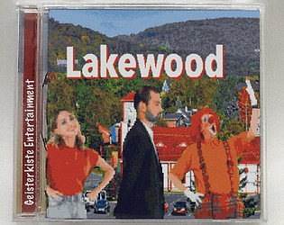
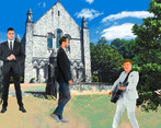
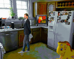
The character sprites are clips with greenscreen backgrounds from a stock footage website (stock footage acting is very strange and uncanny, perfect for this game), then brought into After Effects where I resized the image, reduced the framerate, and exported the frames as a sequence of images. Then in Photoshop I created an indexed colour palette with very few colours, and applied it to all the frames of the sequence to give it that crunched-down look and emphasize the pixellation.
The neighbour character is more like an omen or a prophet than a character who has a role to play in the events of the story, apart from being the one who made the coffins for the deceased characters.
Totally agree, subtitles would have been a good idea!
Very interesting, thanks for the explanation.
2D is very different from 3d!
That may explain why the cashier seemed to exaggerate her gestures!
It's my opinion that a big part of storytelling is presentation, and you hit that presentation right out of the park. The slow reveal of details that get more disconcerting as you play is paced wonderfully. The grain of the voice effects makes the more harsh sentences cut even deeper. The game's many "crashes" leading to stranger and stranger changes is a clever way to keep things from getting stale.
Everything about this game and the way it's executed is my jam.
You've outdone yourself, man.
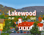
The visual aesthetic is really cool! I appreciate the effort involved in making all the assets look fairly cohesive while hitting that old school vibe. The meta elements were interesting, as well; definitely unexpected! I will say that the voiceover audio quality (maybe this was a stylistic choice?) was a little hard to get through, especially the main character's voiceover. I love the slow reveal of a story, though, and the gradual descent into horror with all the details was neat.
Thanks for the kind words. Regarding the compressed audio, I tried to replicate that horrible early 90s Darkseed-style adventure game aesthetic, but I may have gone a little overboard! It was also partly inspired by PilotRedSun's animations.
I definitely get that aesthetic, haha. That's a wild animation! Thanks for sharing. :D
The game looks very interesting. As a suggestion, perhaps you can describe some of the story or what to expect from this game, and maybe add a video with gameplay.
Thanks for the suggestion! Part of me would prefer that players don't know what to expect, but on the other hand I agree that my approach might persuade less people to give it a try. Tough balance to strike. 🤔