Play game
Happy mistakes: SoulClicker's itch.io pageResults
| Criteria | Rank | Score* | Raw Score |
| Best Gameplay | #17 | 2.087 | 2.556 |
| Overall | #17 | 2.359 | 2.889 |
| Most Innovative | #18 | 2.631 | 3.222 |
Ranked from 9 ratings. Score is adjusted from raw score by the median number of ratings per game in the jam.
Total Development Hours
50
Leave a comment
Log in with itch.io to leave a comment.


Comments
The overall design and theme of the game is very cool and interesting. Looking over the game, the main point would be to include numerical text to tell what each of the purchases for the clicker are such as the tombstone costing 100 souls from gameplay.
Really cool sound design and overall look of the game really sets the atmosphere. Managed to figure out how much each item cost after a while and once you get the upgrade for the demon the number start to get massive. I think to improve the game just give the players a little heads up such as what each item cost and what it will do for you. Other then that really cool game.
Absolutely love the game. From the concept to the art and animation to the sound design.
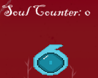
The sprites are disgustingly awesome and well animated. The floating blue spheres also reminded me of some older games like ray-man which was a welcome nostalgia trip.
The sound was almost inaudible on my normal sound settings so perhaps a volume controller would have been a nifty function. Nonetheless the sounds were fantastic and fitted very nicely with the ambience and overall feel of the game.
The game overall would have benefitted from some UI/ UX improvements. The upgrades were completely ambiguous in their function but once I got past that and had tested it enough I knew what each one was doing, more or less.
It also appears there's no way to quit the game without an alt-tab which is fine but an in-game UI is always appreciated and goes a long way in the overall UX department.
Well done to team Happy Mistakes
I like the sound design and the whole creepy vibe this has.
The sound of the upgrade(?) buttons seemed slightly delayed on some of them.
However my biggest issue is no info on the upgrades. I don't know what costs how many souls and what does it do.
But I really like the idea of soul harvester :)
Loved the sprites and the audio cues were nice but i think it would have been nice to have a visible value for the purchases so you know what you need to reach to get an upgrade. Otherwise you kind of dont know what you are working towards and it feels like you might need to spend alot of time to get the upgrade.
The art looks nice and I like the ambient sounds although I felt like a sound for the main button was missing. I wasn't too sure what to press other than the middle soul, as far as I could tell pressing the other sprites around it did something but I have no idea what exactly. Nice idea and what's there is well done but I feel it needs some more directions.
The ominous music and the design of both the background and the sprite are really nice visually, and the animation as well as the sound effects are a really nice feature that fit well with the theme. My biggest issue is the ambiguity of what some of the upgrades actually do, for example when purchasing the zombie I didn't notice any changes to the click power or points per second, so some info on each power up and ability would be a good addition including how much each item costs.
Other than that and some balancing in regards to certain upgrades this is a well made game and wass fun to play.
Spooky! Bit late for Halloween but I'll give it to you.
Definitely agreed that there needs to be more of an indication as to what does what and for how much, but otherwise great work!
needs other developers added as contributors and video
UP2037603: I like the high quality art pixel art of the icons in the game but found that it was a bit hard to maintain motivation to play as it wasn't entirely clear how many souls I'd need for the next level so I had to somewhat guess. The way it ramps up also feels a bit severe as you need to wait a very long time; perhaps the autoclickers should take into account the click upgrades?