Play game
Team Krull : Super Car Fighter - The Unbreakable Car's itch.io pageResults
| Criteria | Rank | Score* | Raw Score |
| Best Gameplay | #13 | 2.642 | 2.692 |
| Overall | #14 | 2.793 | 2.846 |
| Most Innovative | #15 | 2.944 | 3.000 |
Ranked from 13 ratings. Score is adjusted from raw score by the median number of ratings per game in the jam.
Total Development Hours
12+
Leave a comment
Log in with itch.io to leave a comment.


Comments
I think that the music and the models are good. It could help if you could find a way to add upgrades to the game.
Really like the concept here, it's really different to everything else in this jam!
The music and the sound effects give this game a really exciting and intense feel.
The combination of 3D and 2D was also fantastic and I really liked the juxtaposition of it.
I was hoping for a little more in the way of game play, though looking at the development hours it's understandable.
Well done team, Krull
I really like the ideas, art style and 3D world implementation for this game. Only wish there was a bit more of a challenge such as upgrades or the car starts to shatter and crack over time so you have a goal to reach. Really enjoyable premise and gameplay though as who can say no to smashing up a car.
I enjoyed the clicker, especially the movement of the 3d modelled car when attacked. But I did wish I could buy upgrades like a strong attack or the car becomes more expensive to gain more money. Overall a fun clicker
Was there a way to spend the money such as upgrades, they would provide a sort of goul for the palyer and a reason to be colleting the money. The models are amazing and gameplay was enjoyable.
yeah but we sadly ran out of time to code it. next time when we have more skill and longer development time
A nice little clicker.
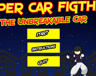
I felt that the style of the character and the rest of the game clashed a bit.
But I liked the animation of the car, and the models in general.
I do love the use of 3D models my only concern is there is nothing to spend your smash money on or if there is it isnt obvious. Also the Halo around the 2D character can be removed with a little bit of extra effort but apart from that thought it was really nice and a good nod to early street fighters.
try using a screen capture utility!
Oh hey, MASH is back! The 3D models are pretty nice, and the character from MASH (I don't know their name) pays a nice homage to that game.
It's a shame that there aren't any upgrades, but besides that, good game!
Glad you enjoyed it! It was fun to work with the 3D models and reanimating Saya (that's the characters name :) ) to really give the attacks the extra 'oomph' they were missing before.
beating up a 3d car in the same fashion as in MASH, making the sequel into a clicker game definitely was a good decision. If only there was a shop implemented so I can spend my money.
If only I had more time to program, then we would've got something like that working :(
Good work team!
We all did amazingly! And for the time that we had; We did it!
Team Krull forever!
We needed more MASH!, and now we've got it. Can't wait to see how incredibly broken people make this one.
The 3D is a nice touch, and the character and animations are as good as they were before, though obviously now a bit out of place (though I don't blame you for not wanting to try and model and animate the whole character)
Shame about the dropped features, might still be worth getting rid of the money counter until a shop is implemented though, tidy up the UI a bit.
Great job!