Play game
Hull Zero Hour's itch.io pageResults
| Criteria | Rank | Score* | Raw Score |
| Theme | #39 | 2.582 | 3.333 |
| Gameplay | #47 | 1.936 | 2.500 |
| Sound | #52 | 1.549 | 2.000 |
| Overall | #52 | 1.872 | 2.417 |
| Aesthetics | #54 | 1.420 | 1.833 |
Ranked from 6 ratings. Score is adjusted from raw score by the median number of ratings per game in the jam.
Leave a comment
Log in with itch.io to leave a comment.


Comments
Hello man! Cool character, just some controls would have been nice! Also the music is pretty cool
Sorry, but what do you mean by some controlls, controller options?
oh yes, sorry, options
Ok, I'll add that in the future
I like it! Everything was great except for the fact that I couldn't change gravity and press the movement key at the same time - which was pretty frustrating
That is a weird bug I found in Godot and it's one I'm currently trying to fix with my engine I'm building within Godot
Interesting mechanic, took a bit of getting used to but I got there in the end. Made it in 2:05. Great use of the theme!
Thank you, could you perhaps tell me if there is something I can inprove on, and well done, that's a pretty good time
Yeah sure! I think the main thing that could be improved is the level design. Everything being square makes getting around corners pretty difficult without air control. Including some slopes and curves might allow for some more variation and make the movement flow a bit better. It's definitely something you could add later if you add more levels.
Thank you that is a really good suggestion,I'll add that
The theme is implemented well! The music and the floor graphics fit together nicely, but the player looks a bit out of place. Also, adding some animation for moving up/down is something to consider in the future. Maybe also some sound effects when you bump into walls.
Overall it is a nice game, floating around felt almost meditating! Well done!
Thank you for your feedback, but can you please describe what of the player looks out of place to you? I am glad to hear that it feels like meditating, but I can assure you, in future updates floating will be a lot more stressful
Of course, I will try to describe, but keep in mind it is just my opinion, you don't have to change anything because of it :)
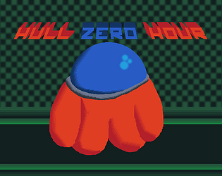
First, the shape. The surroundings are all sharp corner walls, but the player is all smooth and roundy, no corners, no sharpness. (I also saw your reply to Speed576 and an example of an enemy - also looking sharpey! I like that design!)
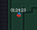
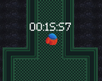
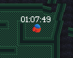
Then the colors. I am not an artist, so again take it with a grain of salt, but the surroundings are black and green and look cold, and the player is very bright and warm. It is understandable that the attention should be on the player character, so they should stand out, but maybe you could find some balance between capturing attention with character's looks and make it more in harmony with surrounding level.
My suggestions to improve this would be to change player's graphics. Maybe make a robot instead of astronaut (sharp lines and corners) and change color to something colder and more subdued (Maybe violet? Just a suggestion though).
Or change the level style to fit player character, but I like this option much less (also the music really fits the surrounding. If one of it changes, the other probably shall as well).
Hope this helps! (And again, this is my personal opinion, and I might be objectively wrong here)
Looking forward to seeing how you develop it further!
On a second thought, instead of changing the player to fit the level, you can actually do the opposite and make a story about it!
Something like "You have boarded the enemy ship and need to wipe them out/get to the reactor chamber and blow it up/etc." - This way the player is an invader, and it makes sense that they look foreign.
This allows for several differently themed levels each in different color and with unique enemies. Also, maybe different objectives (kill all enemies, get to the point, protect an npc ally while they are setting up some mechanism, etc.)
But if you go this route, the explanation should probably be in the game itself, not in the description on the game page (add cutscenes with mission debriefs before each level, explaining why the player is there and what they are required to do, or something similar)
It can make the game even more interesting, but it also requires a lot of work (I don't know how much you want to expand this project).
You have given alot of feedback, thank you, I'll try to go through your points one by one.
The player's shape and round hit box was largely inspired by some lore that will be added in later but mostly by a mechanic that will be added later of camera and player rotation to make the arm waving and wall jumping more natural
On the player colours, the lighting in future versions will be a lot weaker, in future the brighter colors will really help with visibility, and the game would lean a lot more heavily into horror, but horror would likely just be the seasoning of the meal
I really like the idea of making this a Rougelite, so adding a robot character is a nice idea and I like the colour purple, so you have me sold on that
I probably will rather expand the tileset than change the current one to be able to as you said : "boarded the enemy ship and need to wipe them out/get to the reactor chamber and blow it up/etc."
I have prototyped a combat system, where you currently only swing around a crowbar, so defeating aliens wil be the next priority
And again thank you for your large amount of feedback
I like how the gameplay works! The way I have to toggle zero gravity and having no control over me while in zero gravity made it quite balanced it fits really well with the theme. The aesthetics is quite nice but it feels a bit bland overall. (and the character looks like red impostor not that its not a good thing xD). Maybe a bit more variety to the rooms can make the game feel less bland! The music is very fitting but its lacking sound effects unfortunately. Overall, its a pretty fun game! Good job!!
Thank you for your feedback, after the jam I plan to make the game less bland for example

These,
But again thank you for your feedback
Ahh okay! It's still a pretty fun game regardless! Keep it up!
No online leaderboard, and no reset functionality?
Also, consider making the controls single-hand friendly so you don't need to use both hands.
Yeah I plan to add that after the jam as well as a couple other things listed on the game page, I think I'll add button remapping in the full game