

Excellent use of the limitation, great concept - really enjoyed this one.
Play game
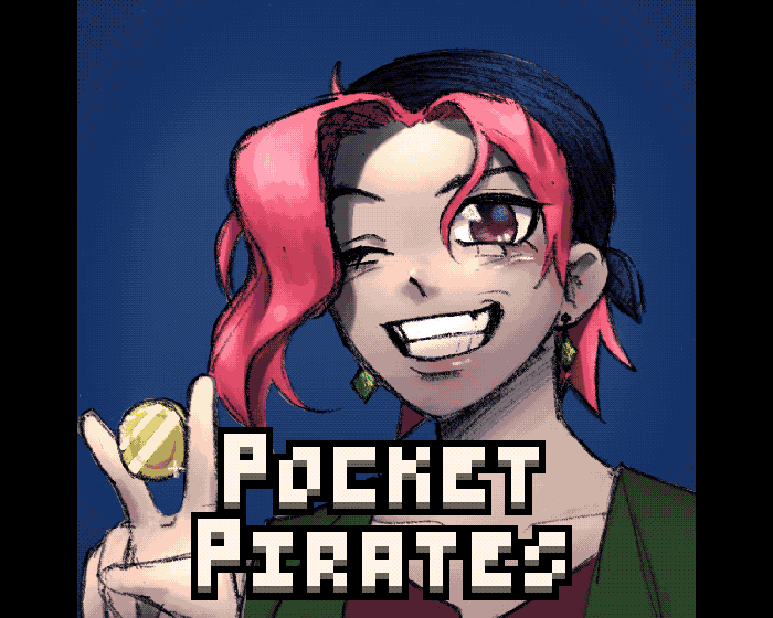
Pocket Pirate's itch.io pageResults
| Criteria | Rank | Score* | Raw Score |
| Overall | #1 | 4.554 | 4.554 |
| Use of the Limitation | #1 | 4.714 | 4.714 |
| Presentation | #1 | 4.571 | 4.571 |
| Concept | #1 | 4.500 | 4.500 |
| Enjoyment | #2 | 4.429 | 4.429 |
Ranked from 14 ratings. Score is adjusted from raw score by the median number of ratings per game in the jam.
Team members
Nothing#3367, pearl#1818, Rustedshell#6357
Software used
Godot
Use of the limitation
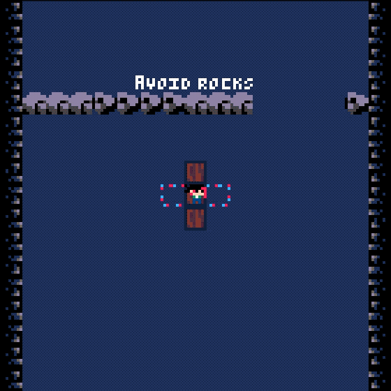
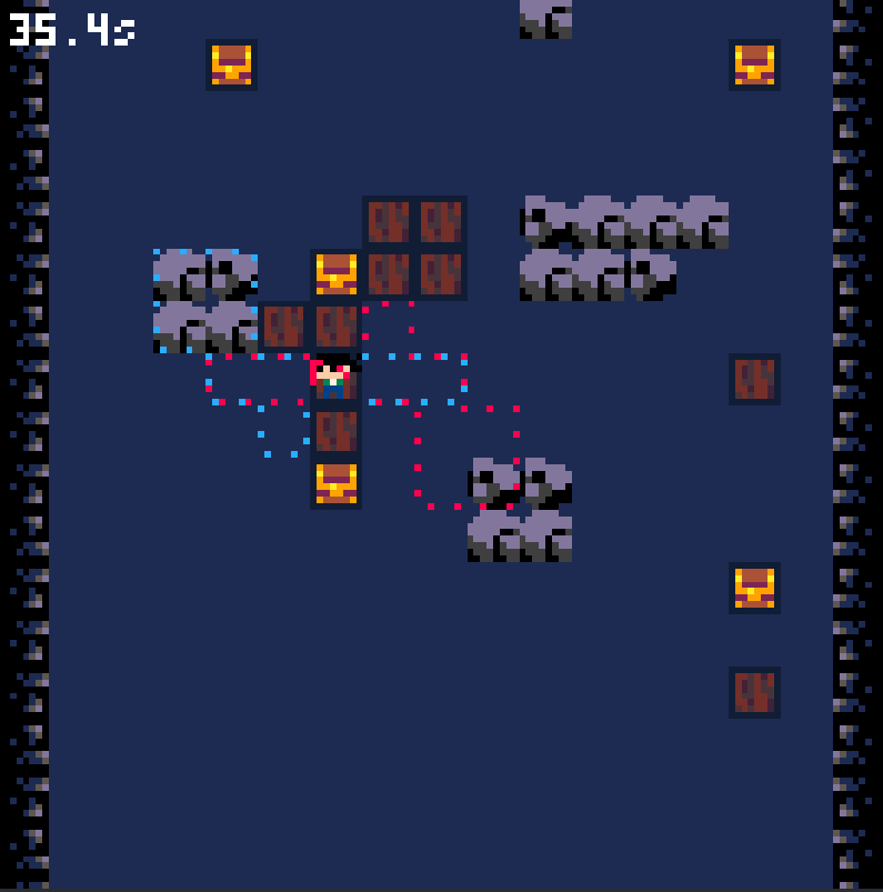
The pirate can only move their raft on a tile/grid.
Cookies eaten
0
Comments
I like the mechanic and the theme! It really gives you a feeling that makes you want to keep trying the level again and again! I personally struggled with trying to get passed the level where you need to make long bridges past the long walls, but this game overall is fun and interesting!
Submitted
Spare The ChangeSo, I love the mechanics. The presentation is very good, the GUI is also spot on. It’s a very good game, simple and addictive.
I have only one critical feedback to give, the rest is perfect: the font is very painful to read, strains the eyes. I suggest to look for a slightly bigger pixel font, that has more readable letters, some letters are just terrible and fatigue the eyes so much.
But regardless, amazing job, one of my favs of this Jam!
Submitted
Spare The ChangeThanks! You must not know about pico-8. This is the font for that game engine. It's the smallest font you can have that is still understandable and at this point it's kind of a tradition. This game is heavily based on pico-8 games. All the art and sounds were made using those constraints. But I understand the feedback.
If I remember correctly, Pico-8 only has uppercase letters, these look smaller, maybe that is a secret font?
Uppercase pico font is bad enough to make me write code in Notepad++ and only open pico to test. This “Lowercase” pico hurts my eyes even more.
Anyhow, it doesn’t feel like it’s made in Pico-8, so you can change the font, at least to the uppercase font.
Traditions might be important, I feel like UX should be more important :)
Great stuff guys, really cute art and the gameplay was interesting + unique! I came across a bug where every end screen after the 2nd level only had black boxes
Submitted
Bomb BuddyGreat concept, love the pixel art and the music! I agree with the other commenter that it felt like the direction was flipped sometimes. I assume the red and blue outlines are to help with that, but I didn't know whether the period was the red or the blue and sometimes I'd accidentally destroy my plank going the opposite direction than planned! I really enjoyed it though - great job!
Submitted
PocketsI like the Game, I just had the feel that the turning was flipped sometimes could be totaly wrong and just a knot in my brain xD
The music is awesome!
Submitted
[GameJam]Tatarun
Leave a comment
Log in with itch.io to leave a comment.