Play game
The World of Nala's itch.io pageResults
| Criteria | Rank | Score* | Raw Score |
| Concept | #5 | 3.800 | 3.800 |
| Graphics | #5 | 3.800 | 3.800 |
| Overall | #10 | 3.300 | 3.300 |
| Music / Sound Design | #14 | 2.950 | 2.950 |
| Fun | #15 | 2.650 | 2.650 |
Ranked from 20 ratings. Score is adjusted from raw score by the median number of ratings per game in the jam.
Leave a comment
Log in with itch.io to leave a comment.


Comments
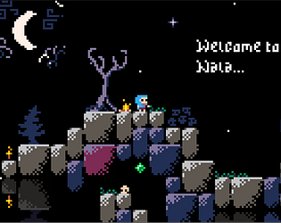
Very cute! Love the graphics :)
Everyone's pretty much said the difficulties I had with it, I think it might be helpful if it was a bit more intuitive in how the mechanics work.
Would love to see you work on this more past the game jam the style is super interesting and I love the concept of the reflective jump!
Your is pretty fun and the concept is interristing . I see a little thing that annoyed, sometimes is hard to see the edge of tiles because of shadows and that make jumps harder. But overall your game is pretty cool !!
I like the graphics, the concept, and the sfx. The biggest problem for me is that the movement is to slow for me. But I like everything else.
A very very good concept, and good art, this really feels like it could be a full game with a lot of length and different universe ! I don't know what to think with the slow movement and high jump, it "artificially" adds difficulty, but it also makes the game interesting because we're not really used to this... so not necessarily bad.

Also, first time I tried it, I was blocked at the beginning. Then saw a comment on the itch page and understood, and then I could finish the game ! so at the beginning, yeah it's not very clear I think. But once you get the base mechanic, It's very good.
Some line make the cgravity change, some not, it depend (like the one at the left of the beginning, works only to go from inverted gravity to normal gravity), and it's frustrating having to suicide yourself to find out. I think they need some visual indication, like color or something to get a sense of the "direction", because it's a very cool mechanic that it doesn't work in every direction !
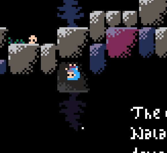
I also think some blocks could be a bit clearer visually : it's not natural for that big block that on the top side you can walk on it, but on the bottom side... it's behind you ? but other blocks don't behave that way, honestly it was a bit disturbing from time to time. Also, that dark corner with the shadow, looks good, but when you have to jump from the edge, and the background is black, you see nothing and it's frustrating, maybe could be a lighter shade of dark, more grey-ish ?
I'm making lots of criticism, but bear in mind that I really loved the game, very very great concept !
I like this 8-bit graphics that squezze al ot of juice out of this style. The concept is good, but not very clear, the lines just placed where you placed them and it's hard to get where every this line is placed, it's a problem for me. Also the character is slow and platforms are far so there's a lot of precision platformer aspects and I don't find that fun. The music is cool, gives the mood, but a bit repetitive
good, but i be mad because is hard, anyway i love the art and the music : )
The physics aren't very satisfying, but the gravity gimmick is fun - the concept of the game has potential. Good choice of assets, the athmosphere is very endearing
Horizontal movement needs to be at least twice as fast
very good game
The jump is very stiff but the experience is memorable ! Very well designed and very pretty !