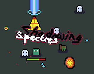
Play game
Shadowing Spectres 👻's itch.io pageResults
| Criteria | Rank | Score* | Raw Score |
| Fun | #6 | 3.923 | 3.923 |
| Accessibilty | #7 | 3.308 | 3.308 |
| Audio | #16 | 3.462 | 3.462 |
| Controls | #20 | 3.385 | 3.385 |
| Overall | #22 | 3.330 | 3.330 |
| Graphics | #28 | 3.615 | 3.615 |
| Theme | #49 | 3.308 | 3.308 |
| Originality | #98 | 2.308 | 2.308 |
Ranked from 13 ratings. Score is adjusted from raw score by the median number of ratings per game in the jam.
Godot Version
v4.3.stable.official [77dcf97d8]
Wildcards Used
It's broken! and Pursuer
Game Description
The hero's world is flooded with spectres and they must do everything they can to repair the pylon trifecta and repel the pursuing phantoms!
How does your game tie into the theme?
The world is haunted by ghosts!
Source(s)
https://github.com/ConnorRowe/GWJ-74
Discord Username(s)
connorrowe
Participation Level (GWJ Only)
7
Leave a comment
Log in with itch.io to leave a comment.


Comments
Good game. I liked the music.
I liked watching the ghosty moving around in the main menu and shooting at things. Also it's addicting to play around and get upgrades like that- I guess the same reason why Vampire survivors worked. The collect radius was a bit annoying especially considering that the enemy hitboxes were bigger than that.
Hi, i like your main menu. i like the crazy sounds. the music gets a little bit repetetive after some time.
I like the bomb SFX
I was ultra unliky with my first attempt, i got no upgrades for more or faster firepower, so i ended up with the first attack only until i died. second playthrough went way better.
I like the "Loot Goblin" feature and the "evil lough" when he enters his "portal" with my crystals
Love that you can pick your color on the main menu. I really like vampire survivors like games so that's an automatic plus. I didn't really know what the point was of fixing the pylons and as you've mentioned the difficulty spikes pretty fast. I would have loved to be able to manually aim as it often didn't fire at the enemies I wanted.
I loved the simple but consistent appearance. I was captivated by the main menu, it had all the information you need, but at the same time, you could fidget around with stuff, preview what the gameplay will look like. The color palette is easy on the eye and get the necessary info through.
My only issue was with the difficulty, by the time I got to the second pylon with the difficulty only "warming up", it felt like I little chance to repair it. Due to all enemies being kind of fast, it was really difficult for me to pick up the gems and get stronger. Of course, it might just be a me issue.
Thank you! The difficulty level could definitely be improved. Foolishly I balanced it for those experienced with this sort of game since I only had my brother test it… Would you believe it was harder before I let him test it? lol
A polished experience, with established gameplay. Cool effects when hovering over the buttons. Simple artstyle but everything fits together nicely! Played it to the end and have to say it was really fun!