Play game
Until The End's itch.io pageResults
| Criteria | Rank | Score* | Raw Score |
| Creativity | #2206 | 3.375 | 3.375 |
| Overall | #3802 | 2.792 | 2.792 |
| Enjoyment | #3968 | 2.563 | 2.563 |
| Style | #4819 | 2.438 | 2.438 |
Ranked from 16 ratings. Score is adjusted from raw score by the median number of ratings per game in the jam.
How does your game fit the theme?
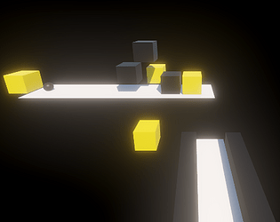
My game requires players to use blocks that can be changed based on rotation and size until the end.
Development Time
48 hours
Leave a comment
Log in with itch.io to leave a comment.


Comments
Loved the creativity in this game! Very fun to play and the level design is also balanced !! But the controls was a bit difficult to understand , also what to do if ball stops moving (at that point gameplay fun stops) !! Overall great idea, Cheers!
yeah i forgot to give a tutorial about the restart button in the top right corner and btw your game is really good
Interesting Idea. Since the collisions cause the ball to rotate in directions other than the direction you're scaling, I'd suggest either adding barriers to prevent the ball from rolling off the platform or limit the direction the ball can roll in depending on the platform. I also think making the game 2D like Daemon's comment mentions would work just as well if not better as it would simplify the perspective and maybe simplify the controls as well.
Yeah, I didn't think of it yesterday, but thank you for your input, it would definitely be good if it was changed to 2D later
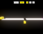
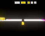
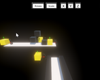
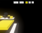
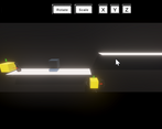
I could only complete the demo and one level, the controls are hard to use and unforgiving if you make mistakes, and the camera angle and bloom make it pretty hard to see what's going on. There's also a lot of what I assume to be bugs: the UI buttons don't work except on the demo level where only two of them do, the level for 2 and 3 bring you to the same level, the black cubes do not have any selection indicators, the cubes regularly clip through the floors or each other. I feel like things would be clearer in 2D, and the levels don't really utilise the third dimension very much, so that might have been a better choice.
I made a mistake with the UI because the only thing that can be used is the repeat button and return to the main page in the top right corner, the error doesn't differentiate between what can be clicked and what can't, while the others are just indicators and the black box is just an obstacle, You can just change the yellow box. I thought my bloom effect was just right, but it turns out it was still too much.
thank you for your input, it looks like it would be interesting and would be better if it were 2d.
Cool idea and pretty challenging! I would love to see more objects being scaled and rotated other than just cubes in the future :)
I struggled a bit with the controls but it is definitely an interesting concept! :)
A cool idea for sure. The controls were quite difficult to get used to and it was a bit hard to know which axis was which with rotating though. But I could definitely see this becoming a full game if you polished up the controls.
Thanks for your input, i will probably fix it after game jam 👌