
Play game
The Quest For Power's itch.io pageResults
| Criteria | Rank | Score* | Raw Score |
| Overall Fun | #3 | 3.175 | 3.667 |
| Controls / UI | #5 | 2.598 | 3.000 |
| Art / Graphics | #5 | 2.598 | 3.000 |
| Sound/Music | #5 | 2.887 | 3.333 |
Ranked from 3 ratings. Score is adjusted from raw score by the median number of ratings per game in the jam.
Leave a comment
Log in with itch.io to leave a comment.
Comments
Time for more feedback:
As I already said, my main problem with this game is its confusing UI and its game mechanics who aren't explained at all. I also feel the feedback given to the player of their actions and the enemy actions is currently pretty poor, it is hard to understand what's going on without looking at the battlelog. The game feels currently pretty simple (I mean, the gameplay doesn't have much depth), but I'm sure you are already working on more game mechanics.
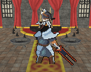
I'm a bit conflict with the art style; the cutscene illustration are stellar but the combinaison of 3d forest view from above and 2d sprites feels very weird to me. I don't have experience with 2.5d games, so I can not exactly say how it could be improved or if you should go all-in in one direction as suggested by hythrain.
SE are fine. The musics are nice, but I wish there was more of them; for example there is no music for the main menu (but for some reason, there is one in the options) and there was no music during some cutscenes.
In short, a game with a lot of potential, but that's currently still in early alpha stage.
Hello there! Welcome to Feedback Quest RPGs! My name's Hythrain, and I'm one of the streamer's for Feedback Quest and also a host for mini events like this. I'm writing this feedback after having played your game live. If you'd like a link to the VOD when it's posted, just let me know.
I want to start by saying I liked the pixel artwork for the cutscenes. They felt pretty detailed, especially considering the two colour nature of them. At one point, I had a little difficulty discerning what was going on, though, due to the lack of sounds and other elements to give a better sense of what was happening. I also liked the general idea of how combat went, though I can for sure see improvements that could be made.
Right now in combat, when you are selecting your attacks and such you're using the menu on the right side. However, you then change to needing to click on the target directly before continuing to use the menu. If the plan is that you'll have no more than three targets at a time, I would recommend just keeping it all in the menu and instead labeling enemies to choose who you attack. So for example, a soldier with the wind element would be labelled Wind Soldier (with A/B/etc or 1/2/etc for when there's more). These would also be in the menu and on the health bars. Speaking of health bars, it would be better to attach them directly to the enemy rather than on the side.
Next, there's how attacking works. When you're attacking, you select light, medium and heavy attacks. However, there's nothing else given about what any of this means. By this, what I mean is there's no indication of damage or accuracy. Such information would be useful to the player (especially with health bars giving more info) for making their decisions. I would also say the player should be able to see how many attacks the enemy can do too. Finally, in terms of attacking you shouldn't just lose your entire turn if you miss on the first attack. If you're unlucky and miss on the first strike multiple turns in a row, it can make the combat feel unfair. Let each attack continue on. You can even do this on enemies, which would let you better balance how many attacks they can even do.
I spoke on the stream about what I felt regarding combat challenge and the use of the elemental system, so I won't repeat it here. Instead, I will note that it's important to give the player as much information as possible. By this, what I mean is knowing how to use Absorb and how often it can be used. I got to a point where I was trying to avoid using items (for testing purposes) and rely on absorb for healing, only to realize I can only absorb an enemy so many times.
There are other things I could comment on, but right now I feel it's better to focus on the gameplay so I'm going to keep my comments in that area for now. The concept being put forward so far is good, it just needs adjustments to make it more player friendly. That said, since it was brought up to me I should leave comments so everyone on your team can have something to work on I'll be sure to leave a few things.
Visually, I don't think the combination of 2D and 3D works well given how the sprites look. I would recommend going all in one direction to keep a cleaner aesthetic. If you really want to keep both directions, you'll need to make sure the two styles work together.
Sound wise, adding more sounds and music in general will be nice. There are some silent parts that just feel off without sound. Also, it'd be an idea to make variations of sounds for certain things. You don't want to hear the same attack sound every single time you do a light attack. You might even be able to do this in programming by adding a random pitch to the sounds every time they're played.
Lastly, one thing I want to note is the progression of gameplay. I noted this in the stream, but there should be a general progression of difficulty. Starting off, fights should be relatively easy and not really require a lot of mental thinking. However, as time goes on the player will want to incorporate the elemental attacks. What I recommended was using the first two fights as an overpowered introduction where Arkanos just wipes the floor with the traitors. Then the first area sees his weakened and you begin the game proper, with fights starting off easy and not needing to use elements... but the player can still explore it and play around with it without it affecting their progress. However, by the time you get to the boss of the first area (which should generally be bigger), you would want the player to be using it more smartly. A great way for me to explain this is to use Super Mario RPG. You start the game in Bowser's castle. Enemies you fight don't require timed hits to kill nor timed blocks to reduce damage. You then fight Bowser, which is fairly simple. Then after the game's intro plays through and you're on Mushroom Way, you start getting enemies that are a bit tougher. This also coincides with when the game teaches you about timed hits anyway. Finally, when you reach the boss of the first area you're in a position where you need to be trying to use timed hits if you're going to defeat the Hammer Bros before they beat you down.
I want to see this again in future events. :)
Thanks for playing! So what did you think?
I still have the last game of the jam to test before giving everyone a more in-depth feedback, but something I can already say is that this game's interface is extremely confusing for someone like me who never played a game like this one. It took me quite some time to understand that the sword is my life bar, for example. A simple picture explaining what is what (like the ones in the barbaric game to explain the shop and the death) would be more than welcome as a quick tutorial. Same for the elements, I still don't know what was the point of using the element commands.
Yeah, we gotta do a tutorial soon, and that UI is brand new, and also needs improvement.