Play game
Siden's itch.io pageResults
| Criteria | Rank | Score* | Raw Score |
| Innovation | #4 | 3.846 | 3.846 |
| Graphics | #4 | 4.000 | 4.000 |
| Overall | #9 | 3.108 | 3.108 |
| Theme interpretation | #10 | 3.154 | 3.154 |
| Audio | #11 | 2.154 | 2.154 |
| Gameplay | #13 | 2.385 | 2.385 |
Ranked from 13 ratings. Score is adjusted from raw score by the median number of ratings per game in the jam.
Source code repository URL
https://github.com/Zyko0/Reverse
Leave a comment
Log in with itch.io to leave a comment.


Comments
A few things I’ve noticed:
Just as hinst mentioned, the mouse pointer is weird; I ran the game with “go run”, a native build on Linux, but the problem still persists.
The reversed camera movement is probably a little bit too much for the game. It’s already “reverse enough” for the jam theme in my opinion. :D It could be a nice difficulty option, honestly, if the player wants to suffer so badly.
It looks like the AI is quite capable. I haven’t seen it stuck. Well, it does “hide” and it’s hard to tell whether it stuck or not, but when you get close to it, it runs for the win.
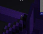
The camera angle could be improved. It was hard to see when zoomed out, it was even harder to see while zoomed in. :D
A random thought: it could be cool to have a theme song switch from a calm one to something exciting when the player runs for the flag.
Interesting. Weird 🙃 Mouse pointer position in OS does not match mouse pointer position inside the game view, so it is hard to steer 🐞
Yes, it's bugged in browser unfortunately...
I have a potential fix but, I'm waiting for the voting period to end in order to submit a new version
Desktop build / go run should mitigate this issue though, thanks for playing!
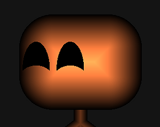
Maybe the main problem here is that you get so close to regular 3D that we just have to complain about the typical things we care about in 3D, like the camera, while we ignore the player animation, the star field, the editor (yeah I "played that" because I was curious), the lighting and semispherical effects for the taser and win, etc. In a way, it does feel like that, like you got too close to general 3D, and for the average player that doesn't understand what's going on under the hood... it may not translate so much into a visually unique result as other of the games you made? Some of the fancy details got drowned by the scale of the chase, in a sense.
I wonder if you have any plans to develop this style further, e.g., a "paper mario"-like framework to work with more generally (paper3D vs tetra3D war incoming?), or if it hasn't inspired anything in particular that you would want to bother working on. As a proof of concept is very interesting, but unlike your knowledge on animating characters with shaders, it doesn't seem so easy to reuse situationally?
Thanks for playing, also for your interest!
I agree with everything you said, the game in its state only looks like I want to be "showing" while actually I had various tweaks and polish in mind but I couldn't do it in time unfortunately.. :(
And indeed, I wanted to experiment a voxel world in order to make something more generic later on, it took me a while to setup without major bugs.
About a Paper3D thing, honestly I could feel like developing such a thing haha
As for the editor, the map in general, I had ideas to overcome it in mind, but it has this constraint of being rendered via a heightmap, so it doesn't have support for holes in the middle of a shape. It is for the same reason that it is hard to map different material ids / textures on a single column with this technique. But constraints are always a nice way boost creativity imo!
So, it's not a final version, it has its set of constraints, but I might develop a generic/public framework if people (at least you) finds the idea interesting haha
To the paper mario / animation sprites, this has been the way I decided to make it (through shaders) but it's not limited to this.
Regular spritesheet management and 2D animations could be made before the world rendering, drawn on an intermediate texture section and be read from the shader when having to display an entity (originally how I wanted to make it, I just couldn't do art).
Thanks for your honest curiosity and depth in review as always!
Really cool rendering! I'll admit my lack of patience made it so I never actually got to the first enemy -- was close, but the game ended as I approached. Platforming was pretty tough due to both the camera and how fast the character falls. I think with a slower falling rate, it'd be a bit easier to get used to. Character rendering looks interesting and as if done by a shader or something as well.
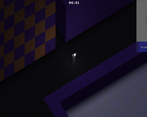
Isometric felt a little claustrophobic, but that might also be because of the darkness.
Very neat graphics rendering! I am envious of your ability to do such interesting things with shaders. :)
Thanks for your feedback!
I definitely understand the lack of patience (I'm having it myself with this), the game is not really fair atm
About the whole thing I also got lost and instead of taking a specific direction I started to add everything I "could" just because I "could"
So graphics are there a bit, but everything else lacks unfortunately haha, but thanks for this and for playing!
Wow, nice 3D! The light from the player is really smooth. The map is very intricate too, I got a bit dizzy rotating around the inverted pyramid sections, lol. The verticality kicked my butt, those enemies are way more nimble than I am. I managed to beat the first guy after a few tries and it made me feel a bit evil waiting in the shadows for him to pass by, which I really liked.
The second guy however loved to sit on the pyramids so my strategy was to rush the sides to cut him off before he nimbled his way out of reach. However I always ran in to a crash when he would get vision of me :(
I like the reversed cat and mouse gameplay but I kinda wish I didn't get filtered by the jumping. I could see the gameplay benefitting from a much flatter z-axis play area.
Thanks for playing!
I'm glad to read that you actually won those haha!
Because, as you stated, they are a bit too good at pathfinding and are quite agile, the balancing is not really fair in general and the AI not completely adequate.
The level design isn't great either for the verticality for example as you said haha
I just got lost mixing a lot of new things I've never done before and had to be rushy for all parts kinda, I guess it translates well in the game lol
Indeed, I think the idea is decent and could be fun, but it relies a lot on an actual AI that looks like a player, and also decent level design ofc
I might try to tweak the whole thing later on (has planned different levels, different AIs, a set of abilities for agents, etc..)
Thank you again for your feedback!