Play game
Lost in the Maze's itch.io pageResults
| Criteria | Rank | Score* | Raw Score |
| Audio | #553 | 2.167 | 2.167 |
| Theme | #582 | 2.417 | 2.417 |
| Graphics | #596 | 2.333 | 2.333 |
| Overall | #681 | 2.097 | 2.097 |
| Innovation | #684 | 2.000 | 2.000 |
| Game Design | #722 | 2.000 | 2.000 |
| Fun | #806 | 1.667 | 1.667 |
Ranked from 12 ratings. Score is adjusted from raw score by the median number of ratings per game in the jam.
Leave a comment
Log in with itch.io to leave a comment.


Comments
Fun little game. Like others, I found the mouse look to be a bit off putting. How you can improve it next time is, instead of setting the camera's rotation to the mouse position on screen, (which I'm assuming you are doing) add the input from the mouse to the current rotation. Something like:
targetXRotation = camera.transform.eulerAngles.x + Input.GetAxis("Mouse Y");
targetYRotation = camera.transform.eulerAngles.y + Input.GetAxis("Mouse X");
camera.transform.eulerAngles = new Vector3(targetXRotation, targetYRotation, 0);
This is off the top of my head and haven't tested it yet but it should point you to the right direction. Also one of the inputs will have to be subtracted instead of added due to it being inverted.
Good Luck on future updates!
thanks for the feedback Goest ! I appreicate it
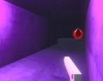
Very simple game, but it feels very weird. The aim is too sensitive; the lighting is weird; the enemies spawn behind you, without warning; there are some signs on the walls that I don't know if are graphical bugs or should mean something; the "lies" aren't all lies (some of them do not have consequences).
Your game needs polishing (mainly in the gameplay) and more "replayability" (like random levels, or something like that). I'll keep checking it out, as it says on the game's page that you will keep updating it. If well done, this could evolve into a pretty cool game!
A simple and okay little game. The controls is not the best, but for me it was not a big issue. Like the visual style, and the background sounds was pretty good. Overall a okay jam game.
The backwards controls took me a while to get use to. The yellow bar thing that was pushing me along was a bit confusing. But I really like the look. Well done with your use of lighting. Has a nice look.
I'd love to hear your thoughts on my game if you would be so kind. Thanks! :)
Yeah umm i dont escpecially like the sensitivity and that you can turn around 360 degrees. alright graphics but not good coding... sorry for being harsh