


Play game
Gravity Gone Wrong's itch.io pageResults
| Criteria | Rank | Score* | Raw Score |
| Innovation | #1808 | 1.612 | 2.600 |
| Visuals | #2085 | 1.240 | 2.000 |
| Audio | #2116 | 0.744 | 1.200 |
| Gameplay | #2119 | 0.992 | 1.600 |
| Overall | #2126 | 1.034 | 1.667 |
| Theme | #2126 | 0.868 | 1.400 |
| Enjoyment | #2130 | 0.744 | 1.200 |
Ranked from 5 ratings. Score is adjusted from raw score by the median number of ratings per game in the jam.
How does the game fit the theme?
It uses the gravity and time controlling mechanics to find objects and also the movement system is somewhat tricky. Wrong movement can make you feel lost in the game, which kind of makes sense with the theme.
What code and assets did you not make from scratch during the jam (if any)?
For this game, I used 12 textures from Poly Haven. All other assets, including models, code, and gameplay mechanics, were created from scratch during the jam. The textures used in the game are free assets from Poly Haven, which are licensed under CC0, allowing unrestricted use.
How many people worked on the game?1
Leave a comment
Log in with itch.io to leave a comment.
Comments
I don't see a download, did you take it down to fix bugs and not bring it back?
I'm sorry, I mistakenly deleted the downloadable file to fix bugs. But after fixing bugs, it was too late and I couldn't reupload the game file. But no worries, after the jam is finished, I will reupload the game with some major updates to graphics and control system.
Actually I submitted the game in a very short time because I was sick 😷. So, I couldn't properly fix the bugs at the first time because it was getting too late.
Man, that’s rough! I hope you are better now ❤️ I’ll look for updates after the jam!
Thank you.
I'll be honest, the game wasn't very good. But I'll give some constructive feedback, which will hopefully be helpful. And, it's not to say there aren't some good ideas here.
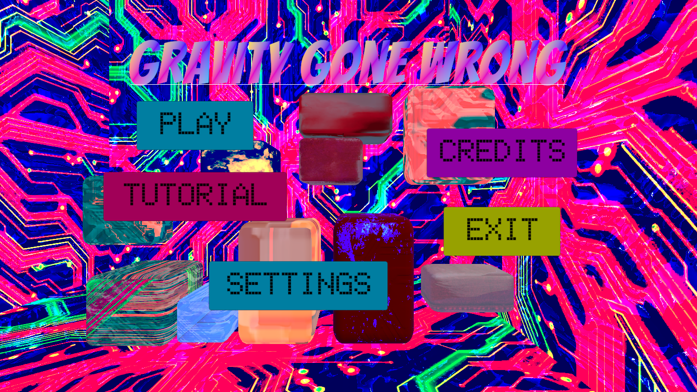
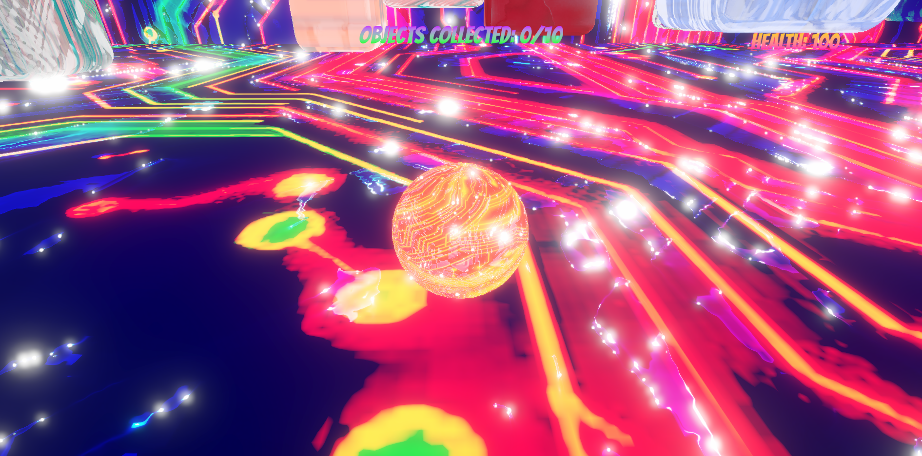
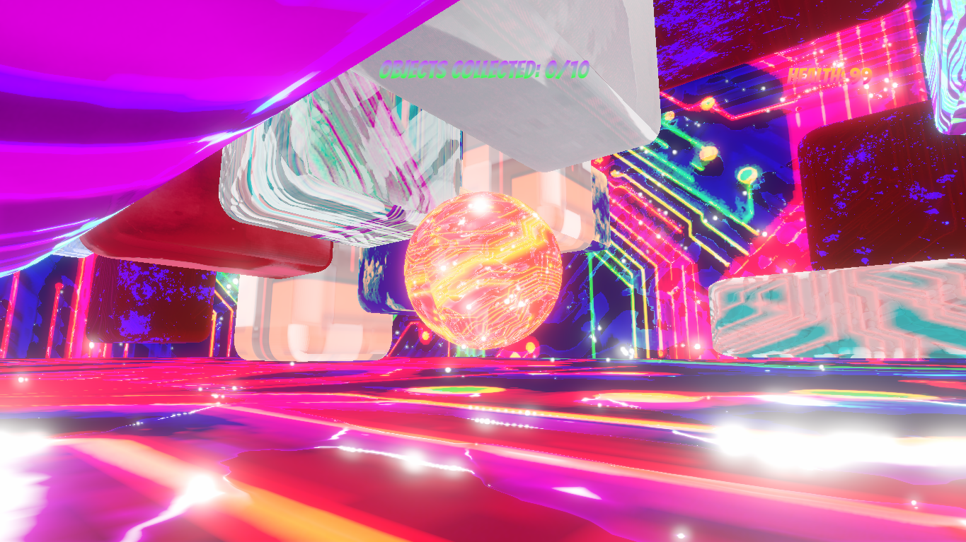
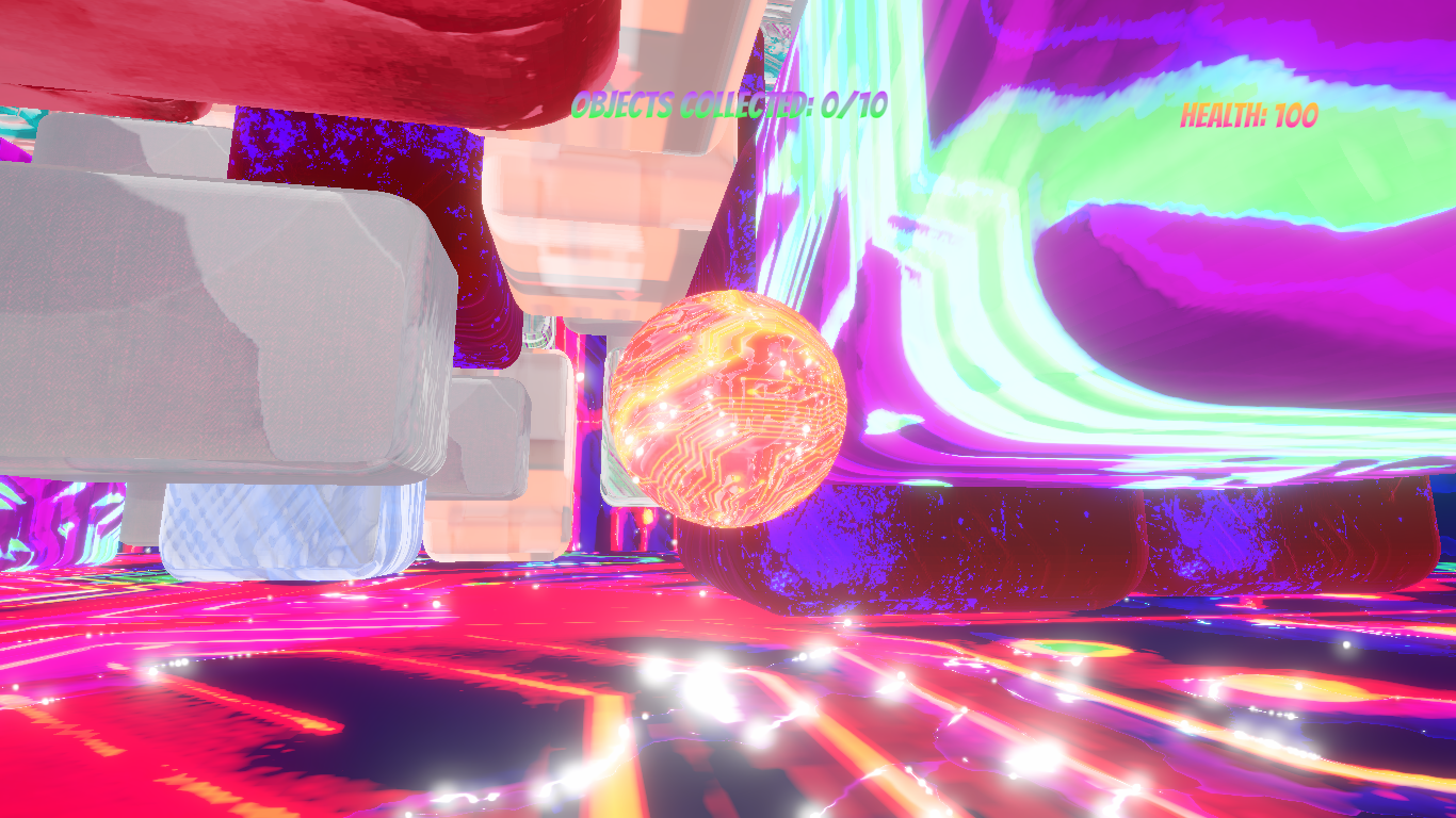
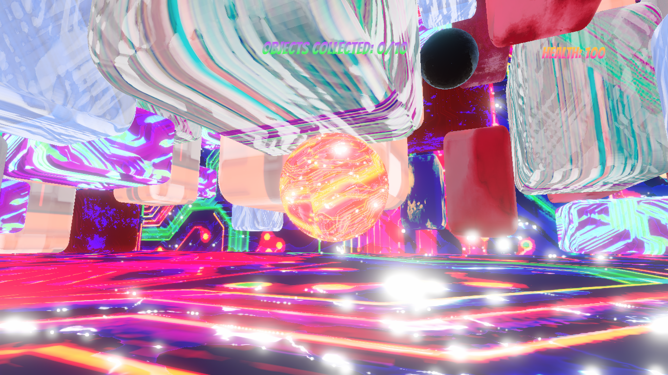
The UI: First issue was with the UI, which was difficult to read at all. The tutorial message overlapped with various other parts of the UI on screen. Also, the in-game UI, the /10 objects found, was very loud and often the brightest thing on screen.
The movement: In future, I would opt for a more intuitive movement system, one that's relative to where you're looking at the very least. This one took a lot of getting used to, and I couldn't see any reason why it would be like this. I could see a place for this movement as some kind of temporary status-effect, but not as the core movement mechanic. It was disorienting and keeping track of which key to press to get where you wanted was confusing. Some kind of directional indicator would have been a significant improvement as well. I got about one object in before I'd had enough of wrestling with the movement system.
The time/gravity manipulation mechanics were cool, probably the most interesting part. I feel this would have been interesting enough on its own with a standard movement system. You could also have the player take damage if they get hit by a floating obstacle, so they have to be careful about when they use their powers.
For future games, I would:
- Focus on making the controls feel nice to use, and not get in the way of the experience
- It's ok to confuse and disorient the player, but underlying that needs to be a sense of fun, and it needs to be done with intention. The way the player interfaces with the game should be intuitive, even if the obstacles they're overcoming aren't.
- Focus on making the UI clear and readable, but not too loud. For example, the tutorial message should be on a blank background. The "OBJECTS COLLECTED 0/10" could be a simple image of what you need to collect next to 0/10.
All the best with future development.
Thanks for your honest response, with that being said, I'm gonna update this game troubleshooting all the flaws you mentioned. And I'll also be honest to say that, in this jam, my only target was to submit a game by hook or crook, since this is the very first jam that I participated 😅
I'll be honest, the game wasn't very good. But I'll give some constructive feedback, which will hopefully be helpful. And, it's not to say there aren't some good ideas here.
The UI: First issue was with the UI, which was difficult to read at all. The tutorial message overlapped with various other parts of the UI on screen. Also, the in-game UI, the /10 objects found, was very loud and often the brightest thing on screen.
The movement: In future, I would opt for a more intuitive movement system, one that's relative to where you're looking at the very least. This one took a lot of getting used to, and I couldn't see any reason why it would be like this. I could see a place for this movement as some kind of temporary status-effect, but not as the core movement mechanic. It was disorienting and keeping track of which key to press to get where you wanted was confusing. Some kind of directional indicator would have been a significant improvement as well. I got about one object in before I'd had enough of wrestling with the movement system.
The time/gravity manipulation mechanics were cool, probably the most interesting part. I feel this would have been interesting enough on its own with a standard movement system. You could also have the player take damage if they get hit by a floating obstacle, so they have to be careful about when they use their powers.
For future games, I would:
- Focus on making the controls feel nice to use, and not get in the way of the experience
- It's ok to confuse and disorient the player, but underlying that needs to be a sense of fun, and it needs to be done with intention. The way the player interfaces with the game should be intuitive, even if the obstacles they're overcoming aren't.
- Focus on making the UI clear and readable, but not too loud. For example, the tutorial message should be on a blank background. The "OBJECTS COLLECTED 0/10" could be a simple image of what you need to collect next to 0/10.
All the best with future development.
Remind me to play this when I get home, this looks really cool...
You are most welcome to play the game 🎮! Don't forget to tell me your experience about the gameplay. It is the very second game that I made in my game dev journey.
My Brain hurts. It seems like the game basis is unique and interesting but I wasn't sure what to do our fully how the controls work.
Well, I know, coincidentally I made that game pretty complex 😅. I mentioned all the controls of the game in the 'Tutorial' part, in the main menu. Thanks for playing my game.
This game is made within the last 3 days before the deadline of the game jam. It is the first 3D game that I made. Any suggestions about updating the game is highly appreciated.