Play game
Wheelie Man's itch.io pageResults
| Criteria | Rank | Score* | Raw Score |
| Creativity/game design | #74 | 2.465 | 3.375 |
| Gameplay | #82 | 1.734 | 2.375 |
| Overall experience | #86 | 1.643 | 2.250 |
| Presentation | #87 | 1.552 | 2.125 |
Ranked from 8 ratings. Score is adjusted from raw score by the median number of ratings per game in the jam.
Does your submission follow the required limitation?
yes Yes YEsS definetly
Leave a comment
Log in with itch.io to leave a comment.


Comments
Remind me or Elasto Mania back in the 2000ish :p ! thx for the time travel. Nice entry!
An original idea and a fun game. Great job. Only issue I really had was needing to use the mouse to start the game, but use the keyboard to play it. Great game, though!
Fun idea but a little rough around the edges. Still impressive what you did in 3 days, Good Game!
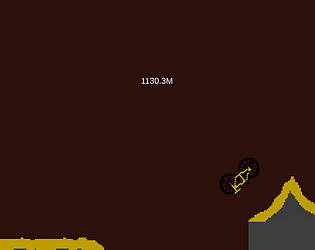
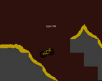
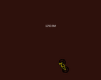
The game is pretty fun or it's better to say it could be if you fixed few small problems: the camera lags behind so much that you can't see at all whats in front of you, it's weird how it seems randomly to be harder to rotate in to another direction, it's pretty fun when you need to do 360 to change like 10 degrees of your rotation, but it should be more readable that when can you move fast to a direction and when slow, and the last thing, THE GRAPHICS: the art is very inconsistent, the bike has black outline, ground doesn't, in the death screen there is no pixel art and the background everywhere is just a solid color. The problem isn't really that the art is bad, it's more that it's very inconsistent, if the bike has a black outline everything should have that and vice versa, and the ground shouldn't just randomly be floating and you should also add a background with pixel art (if thats the style your going with), it's not hard to make a background thats blue and has some clouds (they don't need to have 100% outlines if everything else has, but it might look better if they have that). And also DIFFERENTLY SIZED PIXELS, that's the thing that frustrates me in about 70% of games in game jams that have pixel art, so please make it so that the pixel size is same in all pixels. And also don't use some default font, if you use pixel art, use a pixel art font aaaaand also check that it also has same sized pixels as everything else as I just said. But you really can't have "bad art", you more only can have very inconsistent art. Most games that people could call bad, are games that have inconsistent art, because the truth is to make a game that people can call "good" must have good graphics, because if you have the best gameplay ever, but if have terrible inconsistent art no one is going to call good. And also a bonus tip, post processing can make your game look like 80% better, but only if the game looks already decent.