You submitted to DDs before I joined /agdg/, so I was not there to give you feedback when the game was in early stages of development, but I hope you are still going to get something out of the video.
Pretty environments, but sometimes the obstacles get lost until I've hit my boomerang against them. Maybe another colour would be better, but that could compromise the nice visuals as well. Also cool dynamic lighting. Like the presentation in general, and while the boomerang is a bit difficult to control, it displays every info you need to do so. So it is mostly a matter of practice.
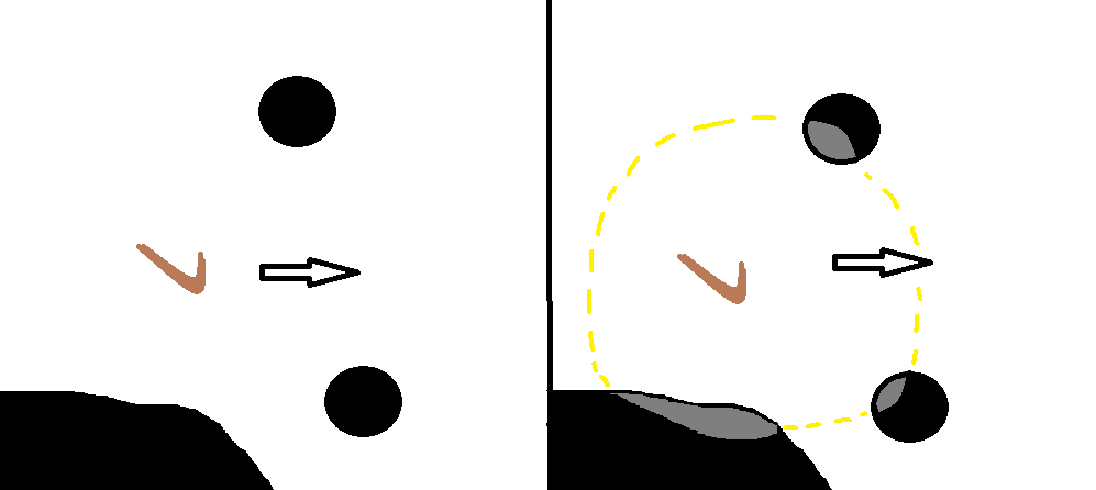
I am purely ideaguying here, without the full knowledge of the implementation difficulties it involves. But maybe an invisible "highlight field" surrounding the boomerang that will light up the inside of the obstacles depending on how close the boomerang is at the moment. The yellow part is invisible.
It's fun! Good work on the UI and consistent art style. Some comments:
- controls are intuitive and feel like it would be good also with touch controls
- in the first tutorial it was not obvious I had to go to the first check point orb, maybe direct the camera towards the objective for a few seconds will help
- some UI icons could use text labels/tool tips (end of level buttons)
- I like the various puzzle mechanics, some are definitely challenging and require precision
An update has been made to fix the end of demo screen showing up in an incorrect level as well as an enemy not working in it. If you played earlier and thought that was the end, there's more!
Dig the aesthetics and navigating the UI / tutorial was fairly easy - I didn't get lost. For now I've only played a few levels but I can see a lot of potential for mechanics.
I'd recommend adding some stronger highlights or outlines to clickable objects. I was a little confused at the level select screen. Having the buttons "indent" is great visually but hovering over levels and some buttons could use extra oomph - Especially since your keeping the UI sort of flat (which is good aesthetically so keep at it!)
Comments
I recorded myself playing your game with some commentary.
https://mega.nz/file/iM1VBAQQ#_weCkAdHoxNBa9jJNnM-zfxSkM6zkjPvxttyJBN_SeY
You submitted to DDs before I joined /agdg/, so I was not there to give you feedback when the game was in early stages of development, but I hope you are still going to get something out of the video.
Pretty environments, but sometimes the obstacles get lost until I've hit my boomerang against them. Maybe another colour would be better, but that could compromise the nice visuals as well. Also cool dynamic lighting. Like the presentation in general, and while the boomerang is a bit difficult to control, it displays every info you need to do so. So it is mostly a matter of practice.
Thanks for playing!
What would you suggest? Typically most if not all obstacles cast full shadows + are a dark color.
I am purely ideaguying here, without the full knowledge of the implementation difficulties it involves. But maybe an invisible "highlight field" surrounding the boomerang that will light up the inside of the obstacles depending on how close the boomerang is at the moment. The yellow part is invisible.
It's fun! Good work on the UI and consistent art style. Some comments:
- controls are intuitive and feel like it would be good also with touch controls
- in the first tutorial it was not obvious I had to go to the first check point orb, maybe direct the camera towards the objective for a few seconds will help
- some UI icons could use text labels/tool tips (end of level buttons)
- I like the various puzzle mechanics, some are definitely challenging and require precision
Thanks for playing!
We'll do a polish pass soon and level end button tooltips are on the list, amongst others.
An update has been made to fix the end of demo screen showing up in an incorrect level as well as an enemy not working in it. If you played earlier and thought that was the end, there's more!
Dig the aesthetics and navigating the UI / tutorial was fairly easy - I didn't get lost.
For now I've only played a few levels but I can see a lot of potential for mechanics.
I'd recommend adding some stronger highlights or outlines to clickable objects. I was a little confused at the level select screen. Having the buttons "indent" is great visually but hovering over levels and some buttons could use extra oomph - Especially since your keeping the UI sort of flat (which is good aesthetically so keep at it!)
Thanks for playing!
The game's almost finished but we've definitely got to do a round of polish around that stuff before it's out.