A browser game made in HTML5.
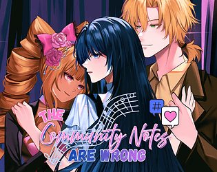
Wow this went even deeper than I expected it to! The writing itself impressed me the most. It captured my attention right from the get go and pulled me into the plot. The pacing felt very consistent and appropriate. The seriousness of the topic was very tastefully handled, while still feeling raw and realistic. Definitely a lesson to be found here in how cruel and ruthless social media can be, especially to those who are famous, forgetting that even idols are humans. People should learn to be more forgiving when others make mistakes, so long as they are willing to take accountability. Afterall, no one is perfect.
All the characters felt unique with their own distinct voices. I think Levi is my favorite character so far. I liked that despite his teasing, you can tell his relationship with Ayla runs a lot deeper than just being her manager, and perhaps—after reading her story—that special bond between them is what spawned Romy's toxic jealously. It was very interesting to see her point-of-view (even though she's still a total jerk :P) It'll be interesting to see how that drama plays out in Levi's route. I'm expecting an "I knew it!" from Romy somewhere down the road. It just seems like something she'd say. She's so petty. The kind of ex you love to hate.
I also really enjoy Ayla as a sympathetic main character. Even in the demo, I can tell she's starting to shift into being true to herself and not what her fans and agency want her to be. The Social Media posts were a nice touch in this regard.
The GUI is nice in terms of aesthetics. The font was a little challenging for me to read on a translucent background, so I'm very appreciative for the setting option to up the opacity! However I did notice one of the names (Communications Director) didn't fit in the namebox. A minor detail that is easily fixed by making the name smaller or changing the name itself. But I like all the little icons for the 'quick menu' and I especially like the choice of color scheme being the bi-flag colors. Seems very appropriate given the theme.
I like the art style of the sprites and especially the more dynamic poses for the characters, as I feel it really reflected their individual personalities. While the backgrounds also had some nice attention to details and lighting, the perspective felt a bit off when comparing them to the sprites. For example, a lot of the furniture looked too small for the characters or the floor/ceiling too low. Most of the time, it made the characters look like giants. It's a minor thing really and not one worth fixing (as I'm sure it'd be a pain for the artist to fix and resized them all), but still something a background artist should bear in mind when making art for future VNs.
Overall though, it was a real treat to read and I am very much looking forward to seeing the final product! Keep up the good work ~