Indie game storeFree gamesFun gamesHorror games
Game developmentAssetsComics
SalesBundles
Jobs
TagsGame Engines

[Feedback] Need feedback for my mobile puzzle game

A topic by Wysteria created Jul 31, 2020 Views: 257 Replies: 2
Viewing posts 1 to 2
(3 edits)

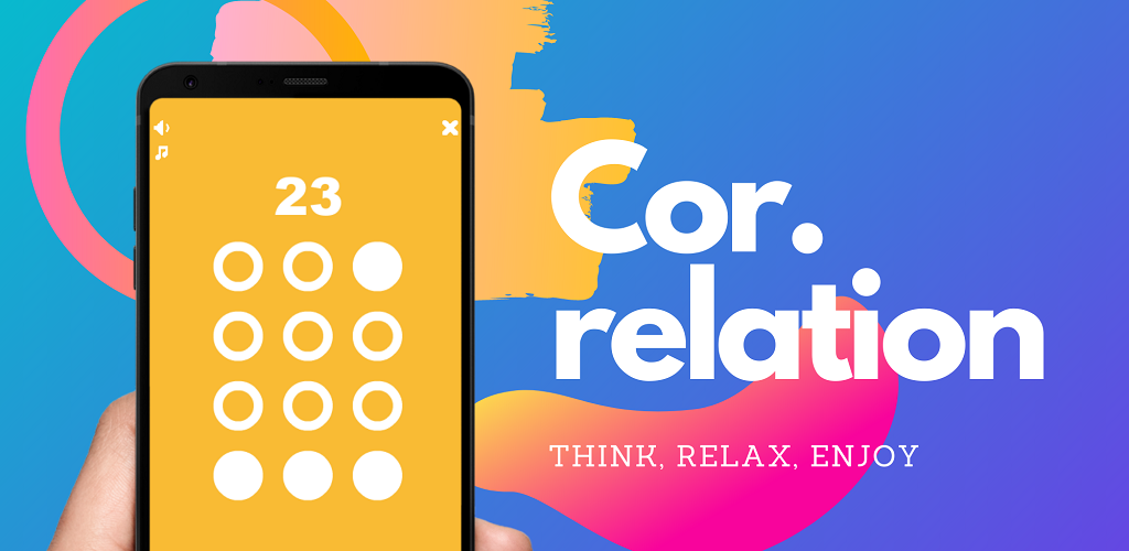
just released my 1st mobile puzzle game, and I could really use some critiques and suggestions. Also would be much appreciated if you could drop a review on my google play page:

https://aguylikematt.itch.io/correlation

need feedback on: current difficulty, game modes, design, music/sound, etc

-currently would like to have  someone reach past level 23 in the casual mode and give his/her feedback on any bugs or difficulty.

Moderator(+1)

Hi AGuyLikeMatt,

I took a look at your game, here’s the feedback that I have:

  • It would be nice to link your Itch page in posts like these, to ensure you are actually using the site. For those wondering, the game’s page is at: https://aguylikematt.itch.io/correlation

  • The “Get it on Google Play” button on your game’s page is broken.

  • The main menu is fun and simple, but it seems a little misaligned. The main buttons (start game and time mode) are in the center of the screen vertically, with the game’s logo above them, and the audio buttons on the top left. The bottom half of the screen looks way too empty. One quick way to improve this is to center both the buttons and the logo, in such a way that the buttons are just below the center, and the logo is slightly above.

  • As much as I like the name “Cor.relation”, when looking at the main menu, I feel like I’m missing something. The “Cor.” part is in its own line, followed by “relation” on the next line, which makes it look like two different words.

  • On the information screen, if you are sharing URLs, it would be better to prefix them with “https://”, as some of them might not look like websites at first glance. Extra points if they are made actual links that open in the browser when clicked.

  • When it comes to touch screens, buttons that show an icon without a surrounding shape, like the audio buttons, can be difficult to interact with. Yes I know, I just have to touch as close to the center as possible, but it will look easier if they are surrounded by a shape like the play buttons. Maybe it would help if they also became bigger?

  • The game looks fun, similar to the game “Lights out”. But one issue I noticed is that each dot is connected internally to a different dot, and they seem to be connected randomly, not following any pattern. At least I didn’t notice any. I get what you were going for, and possibly more casual players might enjoy the randomness, but as an addict of complicated puzzle games, I couldn’t really get into it. It felt like I was pressing buttons randomly until I get it right. It was too much trying to keep track of what each dot is affecting. This isn’t exactly a “negative”, it’s more like what audience are you targeting.

  • A little bit adding to the information above, because I was pressing the dots almost randomly, when the game is solved, it jumps straight to the next level, in one frame. I’d much rather see the finished puzzle with a button to guide me to the next level, as sometimes I didn’t realize I finished the level already.

  • I like the idea of assigning a random color on each screen. I’m not sure if it would look better for the levels to follow a pattern though. Maybe something like “Early levels are red-ish, and they slowly transition to green, then blue” (for example). This could help players tell levels apart more easily, so instead of saying “I’m stuck at around level 25” someone could say “I’m stuck at one of the blue levels”.

  • This is quite a simple looking game, with simple interface, I would love it if it supported landscape mode as well, although I’m aware of the hassle involved to achieve that.

  • The “X” button to close the game could use a confirmation window.

  • Would be nice if the back button worked on the app.

That’s all I could think, it’s a nice small-scale game so far, curious to see what direction it will grow into.

All of these are my opinions, so feel free to only pick the ones you like :)

Wow this is very detailed and really helpful thanks a lot. I'm already looking into fixing the UI based on your suggestion, also the the music, sound, and info buttons have bigger masks than they appear so it should be relatively easy to press, but ill still look into improving it. Also on the randomized aspect of the game, I really enjoy memory games and needing to remember which dots affect which was intended, but I can understand where you are coming from and I am looking into either improving/changing how the dots work or adding a separate game mode for that. Again I appreciate your feedback, thank you.