Indie game storeFree gamesFun gamesHorror games
Game developmentAssetsComics
SalesBundles
Jobs
TagsGame Engines

Primary structural version in the development of a high quality HTML5 block breaking game

A topic by Welder created Jun 30, 2020 Views: 272 Replies: 2
Viewing posts 1 to 2

I would like to count on your kindness to take a look at the structure of the first version of a block breaking game that is intended to unfold in successive improvements until it reaches an excellent graphic, sound and gameplay quality. 
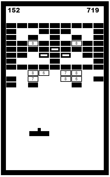
But for that I need your help in simply taking a quick look ... if you like to leave your comment please!

A hug, I hope to see you in a next post with a new improved version!

https://welder.itch.io/break-black-blocks

Moderator(+1)

Hi Welder,

I played your game, and it looks pretty good! I don’t have much to say, as the gameplay seems to be finished for the most part (excluding graphics and audio, as you mentioned)

  • The space button is used as an “Action” button across the game. For some reason when I pressed space, the webpage would also scroll down. I’m not sure if the game needs some configuration to “take the focus” away from the page (my web dev experience is limited). Otherwise you can just change the action to a different button.

  • Although I didn’t notice while playing, I assume that each number on the numbered blocked is tied to a specific power-up. Not sure what are the plans for the graphics, but I would strongly suggest to make it obvious which power-up is good and which one is bad.

  • The paddle-ball collisions were a little buggy. If you manage to make a ball hit the side of a paddle, it will teleport to its front and count as a normal hit.

  • Kinda related to the above point, it feels like using the paddle I couldn’t control the angle of where to send the ball next. Not sure if that’s by design.

  • There is a lot of empty space below the paddle. I understand that it’s not as simple as moving the paddle down, as that will change the balance of the levels, but maybe there’s a different way to take advantage of the space?

  • Navigating through the level select was tricky. Was a little unclear what buttons I needed to press and what’s the current selection.

Hope this helps. Obviously everything mentioned is just my opinion, so feel free to pick only the points that you like :)

Good morning friend, thank you very much for the considerations! All your notes are pertinent, some were already in my "to do". Regarding the space under the racket, it is because my initial intention was to publish to android and I would need that space to slide my finger without covering the racket. Much obliged! Thanks!