
Ok we're back. So yes we'll be adding Doom Slayer into our scene today. The plan is to have him facing down with his iconic double barrel shotgun. Why did I choose the shotgun? Because he's going to be tightly cornered by pinky demons and the double barrel shotgun is a great choice of survival in this situation! I guess a chainsaw could work too, but it's a little riskier because they have a higher chance to bite you since they're melee based creatures... so we're going with the shotgun!
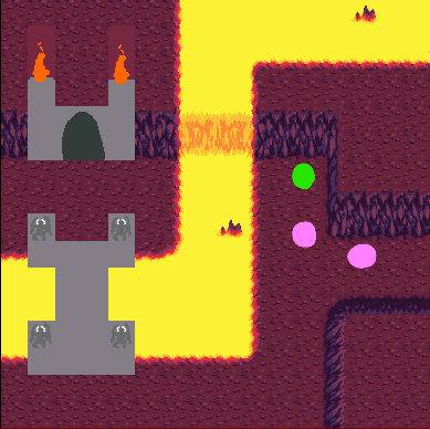
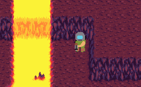
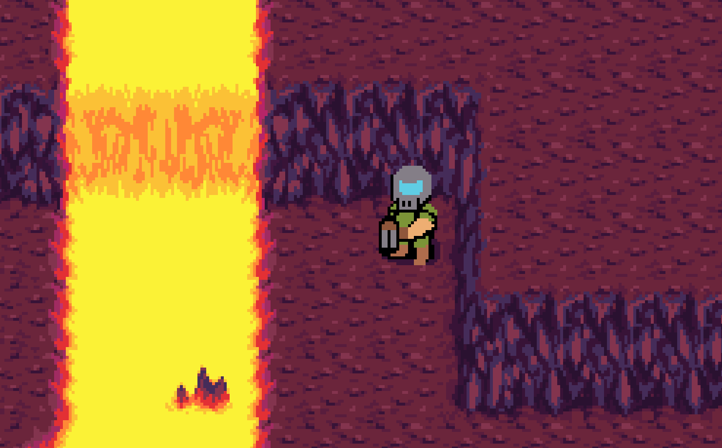
Ok so the plan is to have him cornered where the green dot is and the pink dots represent the pinkies.
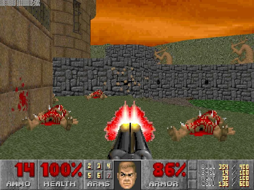
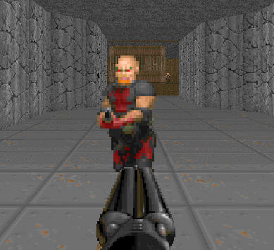
For pose reference we could just use a shotgunner, which are zombie men that shoot the player with their shotgun.
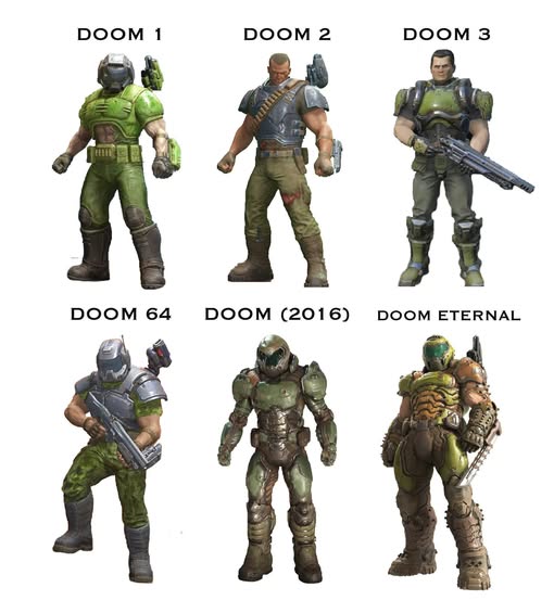
Then for Doom Slayer himself, obviously we have the cover art!
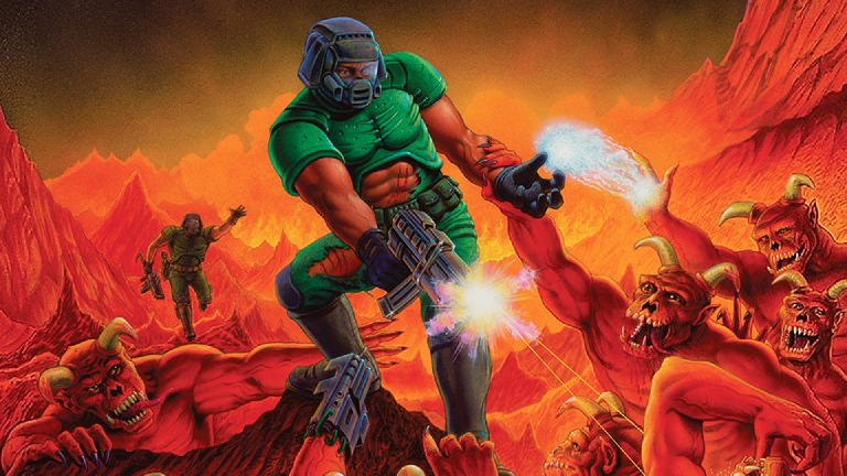
But feel free to always look up more reference as you want. As far as I'm concerned, he's a muscular green guy with a vented space soldier helmet as you can generally see here. His modern designs are usually more armored but I'm trying to keep things classic since I love the classics.
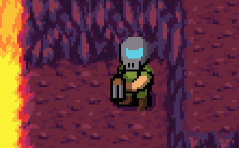
So the easiest thing to start with is a green blob and then just start iteratively drawing smaller and smaller details over him and then tweak the colors afterwards until he looks done. Here's our blob. We know he has a visored helmet with a vent positioned just by his mouth. I'm going to give him a gray helmet because why not? He obviously needs the shotgun so that he doesn't immediately get swallowed alive by pinky demons, and he has some fancy boots. I'm going to have his arm unarmored, classic-style. I'm just sketching in obvious Doom guy stuff for now.
Now let's just polish the shapes a bit more, possibly adding in a few extra details. We can add in a shadow underneath him.
Ok great but we still need to shade him so here's the blob with some shading. His legs and boots will be darker since his arms and shotgun will be blocking the sun (or whatever). Just shade it darker and it will look better, trust me.
Now we're going to shade parts of his sprite that are supposed to be round, like around the helmet, under his arms, around certain parts of his armor, etc. Let's see how it will look after that.
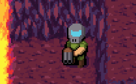
He's getting there! But this is a common beginner pixel artist mistake, at least in my opinion. Black lines can work well for outlines, but sometimes they're pretty unnecessary. For example, whenever there isn't such a big gap behind the black outlines, you probably don't need them at all and can replace those areas with soft shadows instead. Things like little crevices between armor plates, thin cracks on rocks, or the little slit between the two barrels of the shotgun, don't need a full back outline. Just a little shadow is all you need for these sorts of things. Maybe if I show you an edit, you'll understand what I mean more clearly.
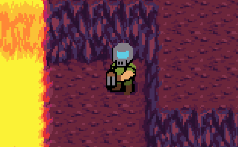
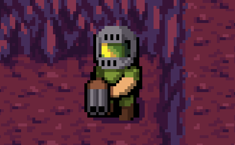
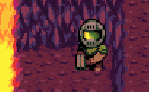
Let's tweak his helmet design some more. I'm not liking it. I also want his head to be bigger, more like a "chibi". Also I want his visor to reflect his surroundings more. We can show the lava being mirrored in the left side of his visor, but we should also tweak the color of the visor in general because it doesn't make sense for it to be blue in this reddish-purple hellscape.
And then after tweaking the visor, doesn't it make the rest of the helmet's colors look weird? The gray isn't working. Why? Because we have to factor in the ambient lighting of the environment. So that's how I get this next helmet design with a slightly more purple tone.
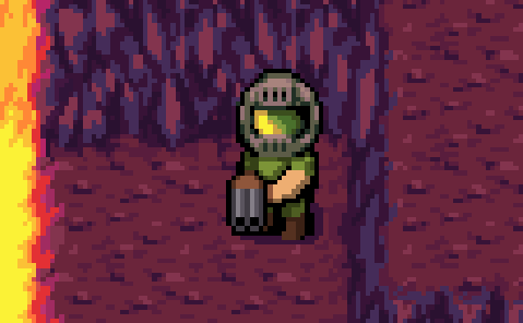
And then here's Doom Slayer a little more beefed up with better colors, generally a purple tint.
That's it for Doom Guy! Next up, pinkies! Be patient and I'll be back with another post soon enough.