

Hi, sorry while I sent you 2 emails today for other issues I found another one but I require gifs to explain them.
Is this a "me-problem", as in, a problem of my font, or is this a problem of the asset?
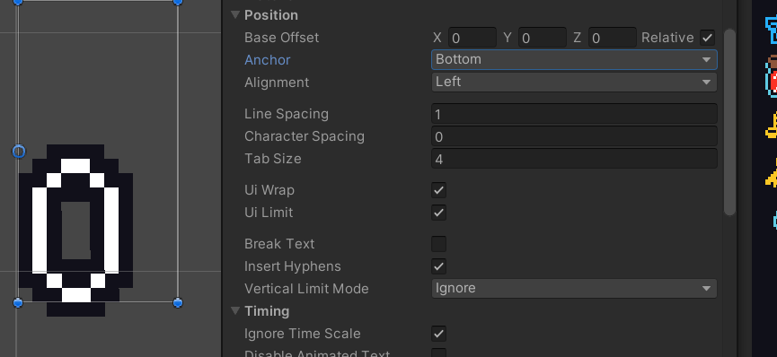
As you can see, the height of the element is bigger than the text needs it, but the font seems to have so much upper-space that center isn't actually centered. Neither is Top or Bottom.
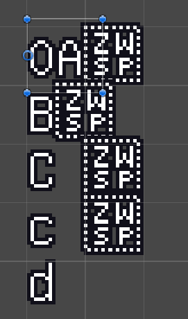
Also here is a weird image of the "zero width spaces" appearing out of nowhere:
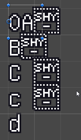
If I hyphen them, it also looks weird:
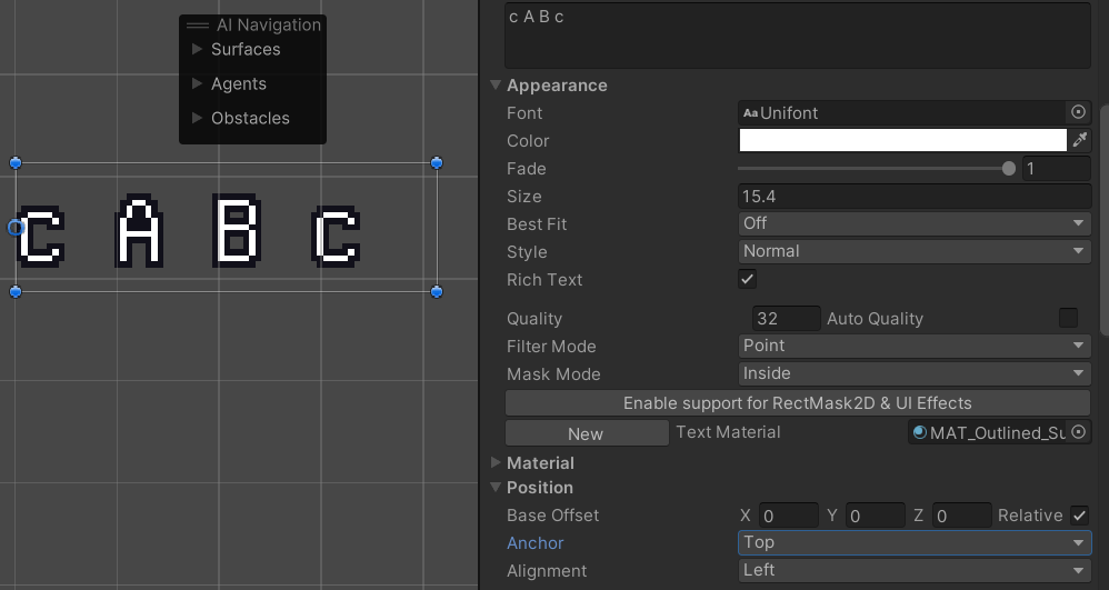
And here I also show "top" anchored with different character sizes, still doesn't really make sense.
EDIT:
I read up a tiny bit on how fonts actually "work" and I guess this font just has a high 'ascender'.
I put a ' character after the 0 and saw that the line size is taller than the zero, so it probably accounts for that. So I guess this isn't really something you or me can fix for this font.