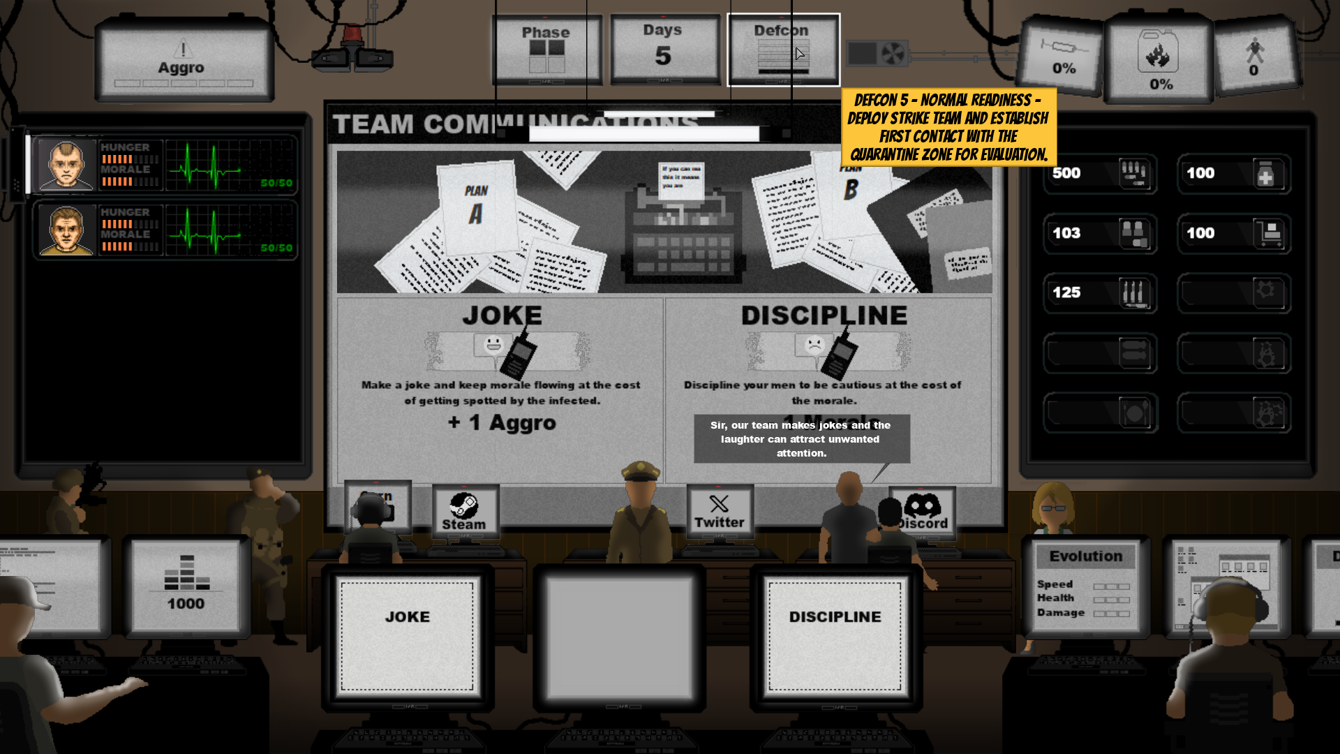
I try to make a Diegetic UI design somewhere between Xcom and Papers please for my upcoming game "Welcome Back, Commander"
Tips and suggestions are appreciated
It looks good, it does give off an old flash game vibe at its current state!
I would say that in my opinion it feels very cluttered, I assume it's supposed to be the Main Menu and a Character Selection? By the Discord, Twitter and Steam icons?
Separating those into a separate screen could lower the clutter.
If you look into XCOM 2 and Papers Please, you would see that the UI elements often feel immersive (Although the only immersive thing about XCOM 2 UI I remember is the loading screen).
I would also say that when I look at it my eyes are immediately dawn towards two elements, The Big Screen (Team Comm) and The Three computers on the bottom.
Apart from that, I wish you luck 😁