Indie game storeFree gamesFun gamesHorror games
Game developmentAssetsComics
SalesBundles
Jobs
TagsGame Engines

scritch editor

A simple, customizable audio player designed for artists · By torcado

More Track Info Customization?

A topic by Veto created Oct 31, 2023 Views: 207 Replies: 3
Viewing posts 1 to 4
(1 edit)

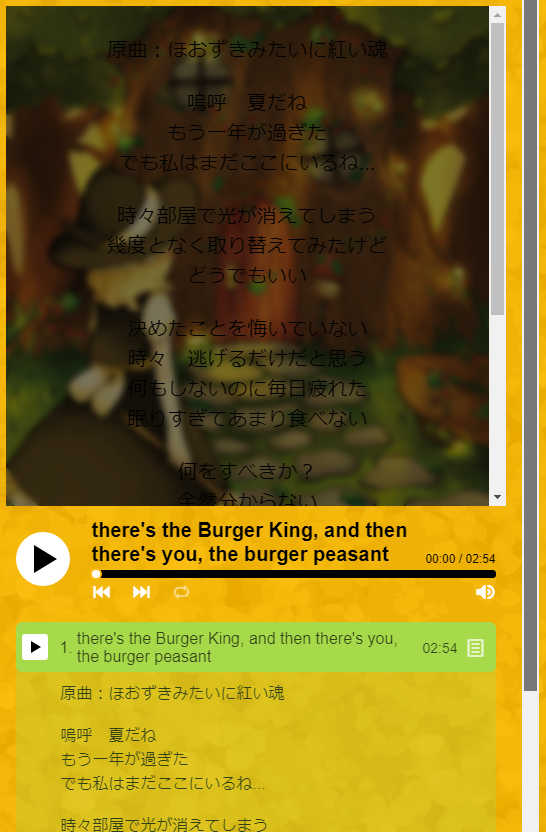
I was wondering if it was possible to add another "track info style," where you can toggle the info to only appear overlaid on top of the album art?

Basically, I think it's a shame that there are no options to not expand the info below the song within the tracklist, because even the "overlaid-toggle" option still expands the vertical dimensions of the contents of the frame, creating a scrollbar if someone (as recommended) set the viewport dimensions of the itch page manually. Info within the album art getting a scrollbar for extended info is at least a compromise, as this doesn't break the manually set dimensions on an itch page. I think that's fine as it is.

This probably wouldn't be a problem on a custom website, but I think the option would be appreciated if people are to be using this more on itch itself. At the very least, I'd appreciate it!

While I'm asking about info style features, would it be possible to further customize at least the font color of the overlaid info on top of the album art? Currently, track names and track info share the same color selection, which is fine, but that same color is also laid overtop the album art when using either overlaid style. This seems to darken the album art, and with black text it can make it hard to read. Alternatively, instead of darkening the album art when overlaying info on top of it, could there be an option to brighten it instead instead of defaulting to darkening? Either fix would work, though arguably making the info font color selectable might be easier since it has its own div id within the album art...

If these features already exist and I've overlooked them, I apologize. Thanks for your time making the scritch editor and also reading this; I think this is a really handy tool so I'd like to see a few more customizations available is all. Though now that I think about it, I could probably just edit those features in myself instead of bothering you about it...

Showcased are both problems I'm having.

Developer

Hi there, sorry for the delay!

These are very good suggestions! I can absolutely add those options :)

For now, you can use custom css to make these changes:

.infoContainer {
    display: none;
}
.toggleInfo {
    display: none;
}
#mediaInfo {
    color: blue;
}

The first block hides the info box below tracks, the second block hides the info button, the third block changes the text color on top of the cover

Developer

Ok, Scritch has been updated with the following options:

  • overlayTextColor
  • overlayBackgroundColor
  • hideInfoDropdown

Let me know if these work for you, or if you have any other suggestions!

(2 edits)

Incredible! Thanks so much!

I don't think there's anything else that can't be adjusted simply with the custom CSS entry for people that would want to do those things. My concern would be that adding every single option I would want personally would make the UI too big/unwieldy, if that makes sense. I think the best features of the scritch editor currently are that despite being simple to use for people who aren't necessarily comfortable with markup/CSS editing, you still have the custom CSS field for people that are.  I'd prefer if the scritch editor kept most of that simplicity at its core so that hopefully more musicians will be open to trying to use it without being overwhelmed with customization options.  But perhaps that's just my own conceit.

Thanks again for creating this cool application!

And for anyone else who ends up reading this, here are some more useful custom CSS options:

/* color of player icons */ 
#controls #nextTrack, #controls #prevTrack, #controls #loopSwitch, #controls #volumeContainer #volumeIcon {
    color: var(--primaryAltColor);
}  
/* color of highlighted info icon on current track */ 
.track.active .toggleInfo { 
    color: var(--primaryAltColor);
}  
/* justify-right song durations */ 
.track .spacer {     
    order: 3; } 
.track .duration {
    order: 4; } 
.track .toggleInfo {
    order: 5;
}