Indie game storeFree gamesFun gamesHorror games
Game developmentAssetsComics
SalesBundles
Jobs
Tags

STATS!

A topic by The Bworg created Aug 11, 2018 Views: 1,062 Replies: 5
Viewing posts 1 to 4

The challenge:
Can I create a game within a 64x64 pixel space that allows players to make choices, take risks and earn rewards, without presenting any text to the player at any time (with one exception being the title of the game appearing on the title screen)?
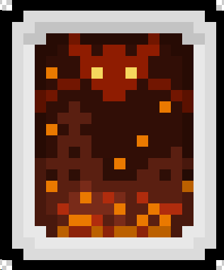
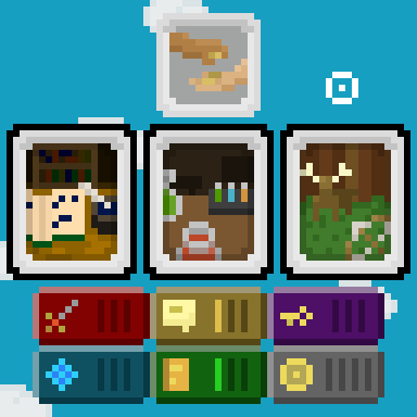
Say hello to 'STATS!', a game about making choices, taking risks and earning rewards that contains no text (other than the name of the game appearing on the title screen).


I'll update this as I go, but first, a quick Q&A:
Q: What is STATS! about?
A: Fishing.

Q: Really?
A: No.

Q: What is it about then?
A: Stats.

Q: Will the game be fun to play?
A: I simulated the game via an extended conversation with a family member. He enjoyed the conversation, so I can only assume that means the game will be great.

Q: Any more information?
A: I'm not an artist and I only started learning to code anything a few weeks ago in my spare time. I'm working on this alone, but if I can get the game done I genuinely think people might have some fun playing it. I'm literally learning as I go so it might not turn out exactly how I'd like it to, but if everything goes to plan, there will be choices, there will be risks, there will be rewards, and there will absolutely not be any text.

(2 edits)

A few days to go, and the player can definitely make choices.

I've learned a lot in the last 24 hours, and my brain aches a little. I can confirm the following three facts:

  1. The player can choose things, and those things make other things happen. Sometimes this is good, and sometimes it really isn't.
  2. I learned how to generate random numbers and now the player can expect the unexpected. - exciting!
  3. It's up to the player to learn the meaning behind the options they have, and work out how to succeed through their failures.

I'm also mixing things up a bit with ghost romance. It's beautiful.

Oh - and so far, there still isn't any text.

Now we're getting somewhere.

Okay, so I've got to admit something - I've made a huge mistake, and I hope you can forgive me...
*deep breath*...

So text does appear in my game in some form. That form is numbers. I mean, the game is called 'STATS!' and I'm not sure why I didn't at any point realise that meant there's gonna be numbers. It would have been better to use a bar or nodes or something like that, but 64 pixels is really tight and I just couldn't find  a nice way to make it work. Well except for in the image below, but that's a special case. Ignore that.

Anyway, progress is being made and I'm slightly panicking as we get closer to the deadline. However, I'm now making all sorts of fancy images (by my poor, poor standards) and starting to populate each of the game's stages with... you guessed it - more choices!


I need to add in the inventory functionality and some game-of-chance style dice rolls for what is arguably the most important aspect of the game, but for now I'm just trying to get all those cards in there.

Question: Those black outlines on the cards feel really bold, maybe I should remove them. What do you think?

First of all, good job on the progress! Even though you have -as you mentioned earlier- just started programming, the game looks really good! As for the big issue you have got, I may have a solution:

I'm guessing you would use the numbers for percentages, which is a 1-100 scale. If you can spare a 5*5 pixel space, than visualizing the percentage by how much that space is filled in, it could be a possible solution (Like for 80%, you would fill 20/25 pixels.) For more precision, you could play around with the colour of those pixels or the size of the area. 

Then again, I didn't test this, and I don't know the exact problem so it's just an idea ;)

PS.: For the borders, I think a dark-gray colour would fit better.

Ah, thanks so much for the advice, that's great! I hadn't considered doing a simple grid like that as I couldn't think of a way to make it look right, but you've helped me come up with a solution. Previously I had a maximum base stat of 10, but if I change that (and do a little bit of rebalancing) I can present the stats out of nine in a grid, similar to what you described:

It's perfect and exactly the kind of thing I was hoping for. I don't know why it hadn't crossed my mind but thank you!

I'm also experimenting with the borders, I may try making them slightly transparent and seeing how that works too :)

(+1)

So where did I get to?

This last week I've learned a hell of a lot. I really jumped in at the deep end, and while my game is very unpolished, buggy and missing content, I'm actually quite proud with what I managed to do in the time I had available.

STATS! was going to be a game with three stages, where you make decisions based on your interpretations of the images you're presented in. Challenges are resolved by comparing your ststs to the stats of your obstacle, and to add some chance into the mix you can also equip items and roll dice to increase your score.

What I planned (and actually had partially created before having to strip it out for the deadline):

  • random loot chests
  • strange minigames of chance
  • More variations in card types
  • Three stages, each with an end-stage boss that does something unique, such as steal one of your dice to roll for itself
  • A different ending scene based on the third card you choose in the character setup stage!

I wish I had managed to start the project sooner, as I only started with 10 days to go and with more time I genuinely think I could have had most of the above done, if not all. If you play the game and enjoy what's there (well, what works of it) then please let me know. If people enjoy it and think it has potential I may well finish working on it!

So if you've got some time, why not check it out?