Hey guys, I'm back with yet another tutorial. So in this one we're drawing a coin bag. The things we're illustrating are:
- The sack
- The coins
- The tying string
This tutorial should be real easy. We're going with 24x24px so create the canvas.
Then create a sketch. Ideally you'd want to use most of the empty space, if not all. I'm creating this for an icon set, so I like to leave a little space in between icons. You may want to create a light-blue background if it makes things easier for you.

From here, we add our main light areas (we'll shade the coins last, for now we're just focusing on the bag).

Now that we have our light, we know our shadows go on the other side. Roughly around these areas.

If you want the bag to be fuller you can leave it like that, but I think creases or folds might help give the sprite some texture. This can be done very subtly. The creases are vertical. You can start rendering some subtle lines like this. Mostly just between the clusters.

Now that the bag is mostly done, we should start our coins. I want the coins to be stacked. You can draw the coins on another layer and lock the bag layer if it makes things easier for you.

The coins can use some shading. It's probably easiest to start with the shadows first since they're already pretty bright. For gold material, you can use colors ranging from yellow to orange, or even red in some cases where there are really deep shadows. You might want to color pick the coins then use the HSV or HSL sliders for this.

Now we can try some highlights for now (might be a little too bright, we'll see later).

I want the shade the coins a bit further. I also want the coins in the stack to look separated from each other, but at this scale of pixel art, adding shadow lines in between the coins would look a little too thick.
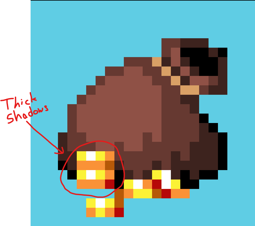
The problem is that the separation lines reduces the shine of the coins because they're so thick and replace it. The workaround is keeping the shiny clusters, but just adding a little bit more detail in the shadows.

Now I just take the polishing further. Here can decide if you want to add more shades, tweak colors, adjust the silhouette, increase saturation, etc. but make sure everything has good readability. The coins were too bright against the bag so I reduced the contrast by decreasing the shine and adding another highlight tone to the bag. The second thing I did was add an outline to the coins to make them pop out better.

So that's the final result. Thanks for checking the tutorial/process. Looking forward to seeing you in the next one!

