
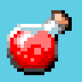
Hey guys! I'm back with another tutorial. This time we're drawing a health potion in 24x24px. I won't be talking about how to set up a canvas or use Aseprite in this tutorial but finding documentation on how to do that should be easy enough on their website. I'll just be going over my thought process for designing the sprite itself.
So first off, reference always helps before starting so look up some on the internet. We're drawing one of those round "light-bulb" looking potions with the red liquid inside. There's just a few key things we need to focus on when illustrating it:
- The Red Liquid
- The Glass Container
- The Plug
- The Reflection
If you can keep those in mind, you should at least end up with something decent. Of course we will need to shade it and add shadow but I feel like that's an after-thought, the idea comes first.
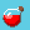
So I will set up my 24x24px canvas and I will use a blue background just because it has good contrast for this type of sprite. The first sketch I do here is just to get the light-bulb silhouette going and have somthing that resembles red liquid.
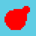
Then we add the brown plug/cap that's used to seal the container.
We need the container. The container is see-through and the easiest way to show this from the beginning is just show the border only without the semi-opaque glass within the sprite.
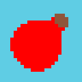
Now we need to show that the glass is reflective. To do this, we need some very small highlights, preferably around these areas: the bulb and the bottle-neck. Also if you look at a lot of potions or shiny spheres, the highlight on the bulb part should be slightly curved.


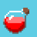
From here, we need to start shading it so that it actually looks like a round potion. Since we know where our highlights are (top-left), we know ideally that our shadows would go in the bottom-right.

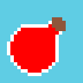
Next thing is the glass is a little too clear. This is where the partially-opaque pixels come in. The reason why I'm using pink here is because pink is the blend color of the glass + the liquid. I use pink in the brighter areas only.
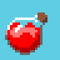
Now just for fun, I want to try making the bottle look half empty and wavy. First I remove some of the liquid so it has some room to slosh around.
and I want to show the liquid at slight tilt so to do this, I make the top part brighter than the side (light is coming mostly from the top). I also try to keep this top part of the liquid circular because the potion is a sphere. So now there's a noticeable circular top surface to the liquid.
Now we need to add the waves, so if you look at something like a sine wave, that's basically what I'm trying to apply around the top edges of the liquid.
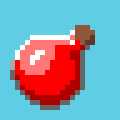
Now it's all about polish and getting the sprite to be fun to look at. This means "pop"! First thing that helps with the pop is stronger contrast. You can see here that I add stronger shadows towards the very dark areas so the potion has a very strong outline. It looks almost as if it were a collectible floating around in a game.
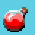
Next I play around with proportions! With pixel art depending on what I'm drawing, sometimes I like to "chibify" sprites, whatever that means. It's hard to explain how I got the idea, but I just look at a lot of existing pixel art items people created and I get a feel for the cartoony style over time.

And finally I add bubbles just as a final detail.
So that's it for this tutorial! I hope you enjoyed it. Thanks for reading and I'll see you in the next one.