Indie game storeFree gamesFun gamesHorror games
Game developmentAssetsComics
SalesBundles
Jobs
TagsGame Engines

1920s Historical Detective Narrative Game

A topic by TheWanderingBen created Jun 08, 2016 Views: 1,980 Replies: 3
Viewing posts 1 to 4
(1 edit)

The Ben Wander Murder Collection (working title) is a narrative-driven adventure game, set in historical 1920s San Francisco. You play a female private investigator (rare for the time!) solving multiple intertwined mysteries.

Explore both the glitz and grunge of the Roaring Twenties. The height of prohibition, the rise of organized crime, and the jazz revolution.

Travel to different parts of San Francisco -- from speakeasies to mansions -- and meet characters from many walks of life. Can a crook be honest? Even if he steals from you? Even if he kills? There is no black-and-white in the Jazz Age.

A vertical slice demo, without the travel mechanic and with a placeholder story, is available on itch.io.


DETAILS

The game requires careful attention to clue details and character statements. Interaction is with objects and text on each screen -- think something between Phoenix Wright and 80 Days.

The art borrows heavily from the ideas of Saul Bass, Dieter Rams, Olly Moss, and other visual designers. I wanted to go with something that didn't distract from the world, but stayed within the style I wanted.

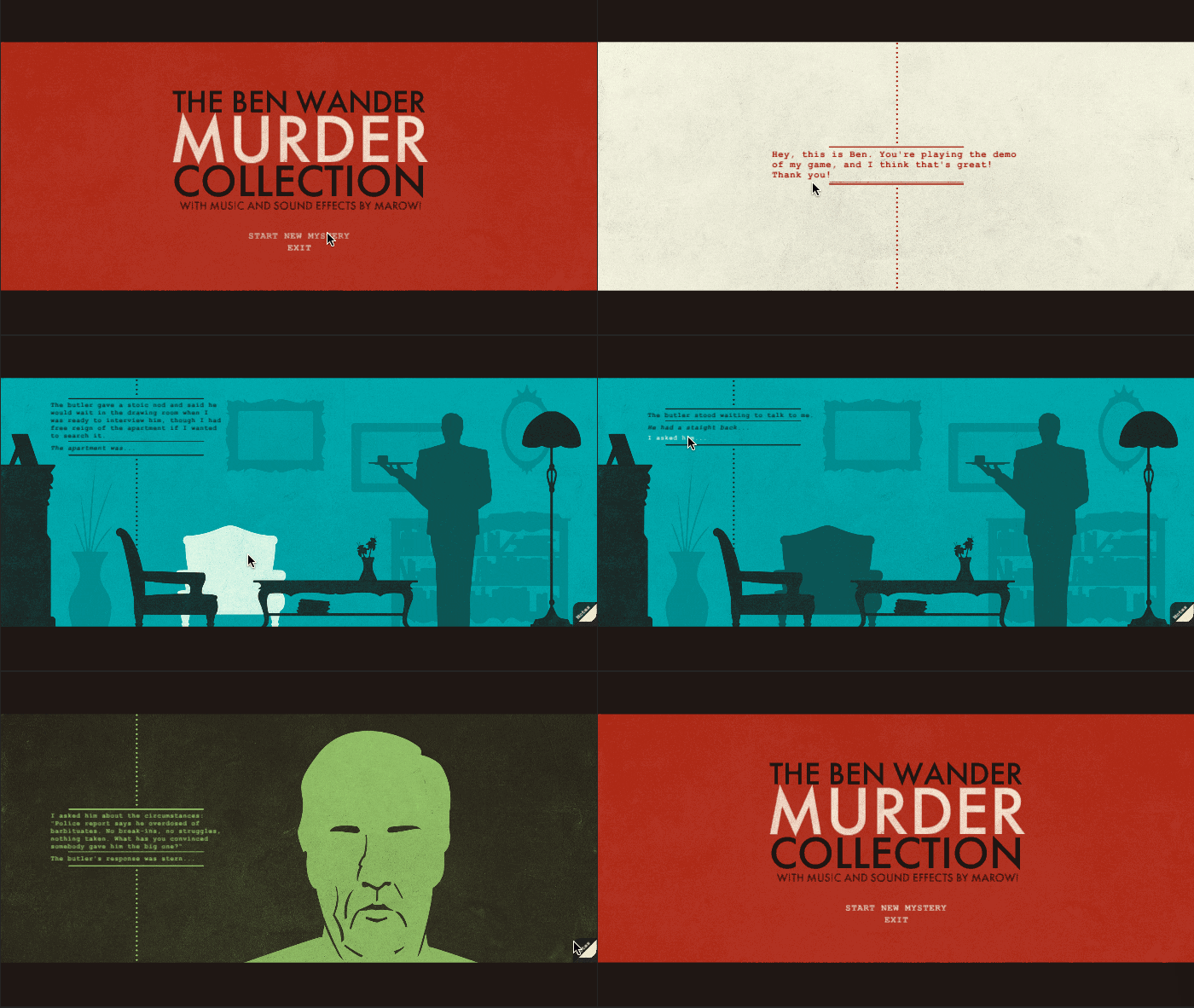
Everything is still very early, but there is a vertical slice gameplay demo on itch.io. The demo doesn't have every feature (most notably: no travel!) and it doesn't feature the actual plot. But does give a feel for the user interaction and game style. Think of it as a basic starting point. I hope to explore more together!


GAME CREATORS

Ben Wander - Design, Code, Visuals, Writing | @TheWanderingBen | Website

Up until October, somebody else had paid me to make video games (EA for the last few years, at both BioWare and Visceral Games). Then I left because I hate money because I can't get enough of this indie scene! I realized indie games, specifically ones rarely found in a AAA environment, were all I was playing and all I could think about. I'd had this 1920s setting in mind for a long while, and I had always loved narrative games. So, with some savings in pocket, I made the jump.

Oh, also, I'm traveling southeast Asia while making this! It's a fun experiment -- can I travel while making a game? So far, the fusion has been magnificent. We'll see how it goes moving forward! If you'd like to follow along, click on that website link -- I blog every Wednesday about my travels.

Mark "Marowi" Wilson - Music/SFX | @MarowiTweets | Website

Mark is making all the audio for this game. For him, this isn't his day-job, so he's generously contributing his time. Everything you hear in the demo is his work, and it sounds awesome.

I met Mark while working on Dragon Age: Inquisition. He also worked on LA Noire at Team Bondi and is currently working at Riot Games.


MEDIA
(2 edits)

The real writing begins. What exactly am I going for? A very quick breakdown of the overarching plot, the individual mysteries, the world's style, and the historical elements:


Overarching Plot

The game will feature many mysteries that tie into one another. I've yet to decide if the stories will be linear (you solve one, then you solve the next, etc) or parallel (you can solve all the mysteries whenever) but there will be a tie throughout all of them -- probably something about the main character's past that she's trying to discover. It's something I still need to think about, but I have some ideas already.

Individual Story Structure

The Golden Age Mystery structure is perfect for a game, with the suspects known at an early stage -- important for gameplay, so the mystery itself doesn't seem unfair. With this structure, all the clues, red-herrings, and lies are vital -- everybody has something to hide, but what is it? Murder? The player must break down each suspect to find the truth! Agatha Christie is my main inspiration here.

Style

While I like the Golden Age's structure, its classic settings -- a country town, a secluded mansion, an enclosed train -- feel contrived by modern standards, and far too innocent to explore some themes I want. I need grit in my sandpaper. Jazz singers, mobsters, shady cops, and drug addicts. In that sense, the style will lean hard-boiled -- Raymond Chandler and Dashiell Hammett. But I don't want it as bleak as a classic noir film. Instead, think more neo-noir -- films like Chinatown and The Long Goodbye. A cutting humor in a corrupt backdrop.

History

The 1920s were both the pinnacle of glamour and the nadir of crime, contrasting the parties of Jay Gatsby with the shotguns of Al Capone. It was the first automobile age, featured the rise of women (though they'd hit many hard ceilings!), and kick-started consumerism. Jazz took hold (though black artists were still maligned), flappers became the first youthful rebells, and radio and film revolutionized media. Of course, the Volstead Act -- the American prohibition of alcohol -- played maybe the most well-known role of the decade. This was, quite literally, the first electrifying age. While main characters will be my own creations, their backdrops will be absolutely real. It gives me many themes to pull from; themes that I can tie to contemporary discussions -- about race, about drugs, about corruption, about industry, about almost everything. I'm eager to explore it!


I'll break down each element further as I get to it, but that's the basics of everything. Writing is maybe the hardest part of this entire undertaking. But I want to share as much of it as I can (without spoilers!). Wish me luck!

(2 edits)

CRAFTING THE MAP SCREEN (PART 1)

Sometimes, an idea is so vivid, I just go ahead and create whatever's in my head -- right in the game, the first time, with no preamble. The map screen was not one of those times. I had no clue what to do with it. In these cases, what happens next? Seems like a topic for a devlog! I'll go through the entire process as I make the map, but for today, let's start with getting a clue: making the concept art. I'll keep the text short, and images a-plenty!

My Concept Process

Step 1: Outline Requirements

Sounds like a no-brainer, but without actually listing the gameplay needs, I'll surely miss a subtle detail, leading to fugly clutter later in production. So what is the map screen, then? It allows players to answer two important questions: where can I go? and where have I been?. Pretty simple! Which leads to the following small list of requirements

  • A scrollable directory with many names that players can look up
  • Items in the directory should be clickable
  • A visual map of San Francisco
  • Buildings on the map -- at the very least, previously visited ones -- should be clickable as a shortcut to looking them up again
  • It all fits with the style of the rest of the game

Step 2: Inspiration

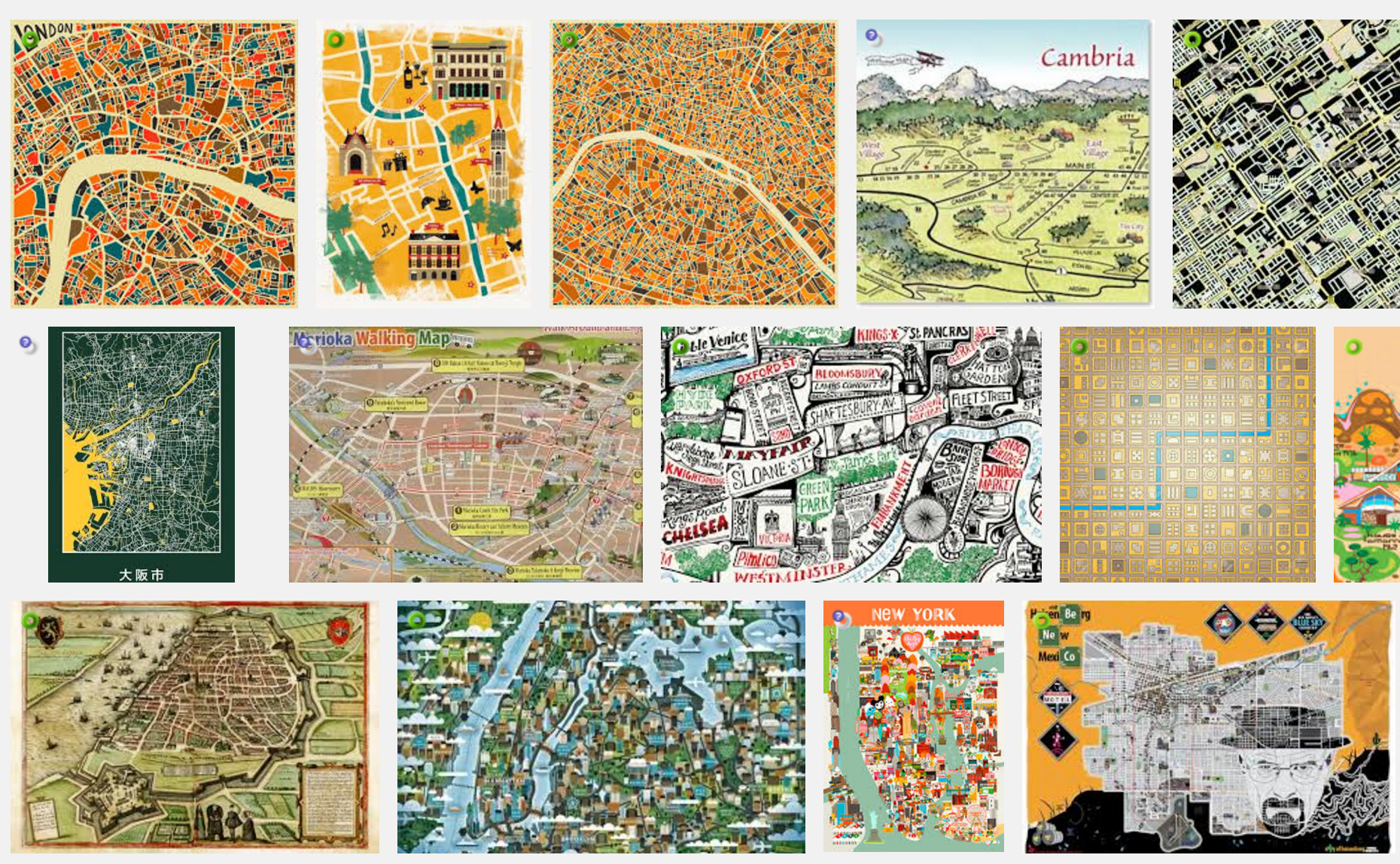
Gathering resources for concept art can be a blast. Quick Google Image searches lead to some great map ideas, including some seriously awesome stylized ones:

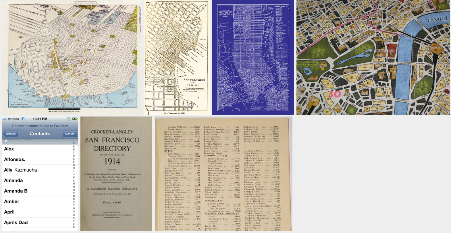
But remember, my map needs to show previous locations, and those locations gotta be clickable. Hard to incorporate all that with my minimalist silhouette style! A lot of searching later, the following thumbnails were the most inspiring. Note there are a few era-appropriate maps in the mix -- especially useful since they're both historical and public domain! Also note the directory inspirations -- a mix of era-appropriate for with contemporary usability. Finally, there are some images from the board game Sherlock Holmes Consulting Detective, my original inspiration for this whole travel mechanic:


Step 3: Concepts and Iterations

At first I toyed with the idea of a 3D map, where I rendered previously-visited buildings as silhouetted 3D objects. This was heavily inspired by the first thumbnail above. So, just for the mock-up, I decided to paint right over it:

Notice that I added a simple directory here too -- showing the names as a scrollable list on a side panel.

There's a good here, but I don't think it's quite grunge-y enough to match the rest of my art. Let's take away some color and add a few masks for roughness:

This looks better! But there's still something not quite right. The map looks... empty! I mean, there are dozens of buildings rendered, but it still looks like there could be so many more. In fact, I bet I could render a hundred buildings and it would still look barren. And if I took the time to render an entire city (not a small task!) the map would be cluttered and confusing from almost any angle except the top. And would it really add that much to the game for the heaps of dev time required? I don't think so. I'm not liking this 3D idea anymore.

This is where the blueprint inspiration comes in. Let's go back to 2D like the rest of the game!

Much better! I think this really compliments my other artwork. And I don't need thousands of buildings! Maybe not every one of those city blocks is a location the player can get to, but perhaps they're all clickable, and I can at least write some text for each. Now that's a more efficient way to make the world feel large!

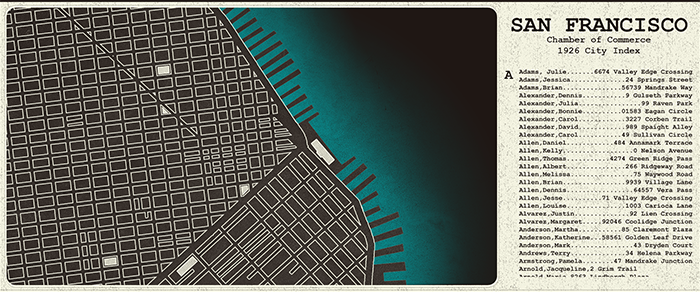
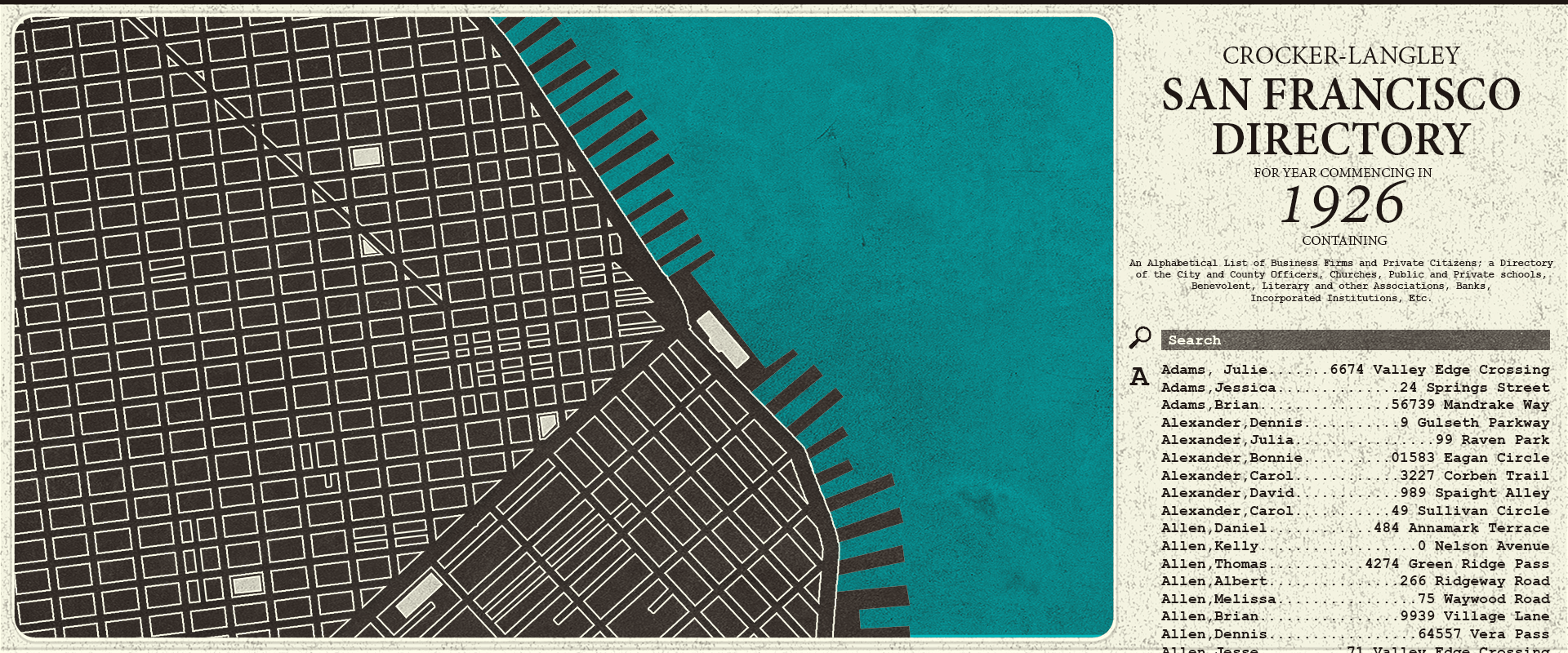
Still, it got a bit too dark. And that side panel needs some love. Okay, one final mock-up!


Now this I like! A bit lighter on the blacks, a full blue ocean, and a directory that has some (and an important Search function, that will make the long list manageable). This is a concept I can work with!


Future of the Map

Next up is actually creating this map in the game. I'll probably make the directory panel first, since that's most important for early gameplay, then I'll move onto the map itself. I'll keep you up to speed, and we can see it evolve together!

CRAFTING THE MAP SCREEN (PART 2)

The map screen will continue to evolve throughout its development. I took three days to implement the map's directory in Unity, so here are some gifs, where you can already see that transformation beginning:

Day 1 - Basic Screen and The List

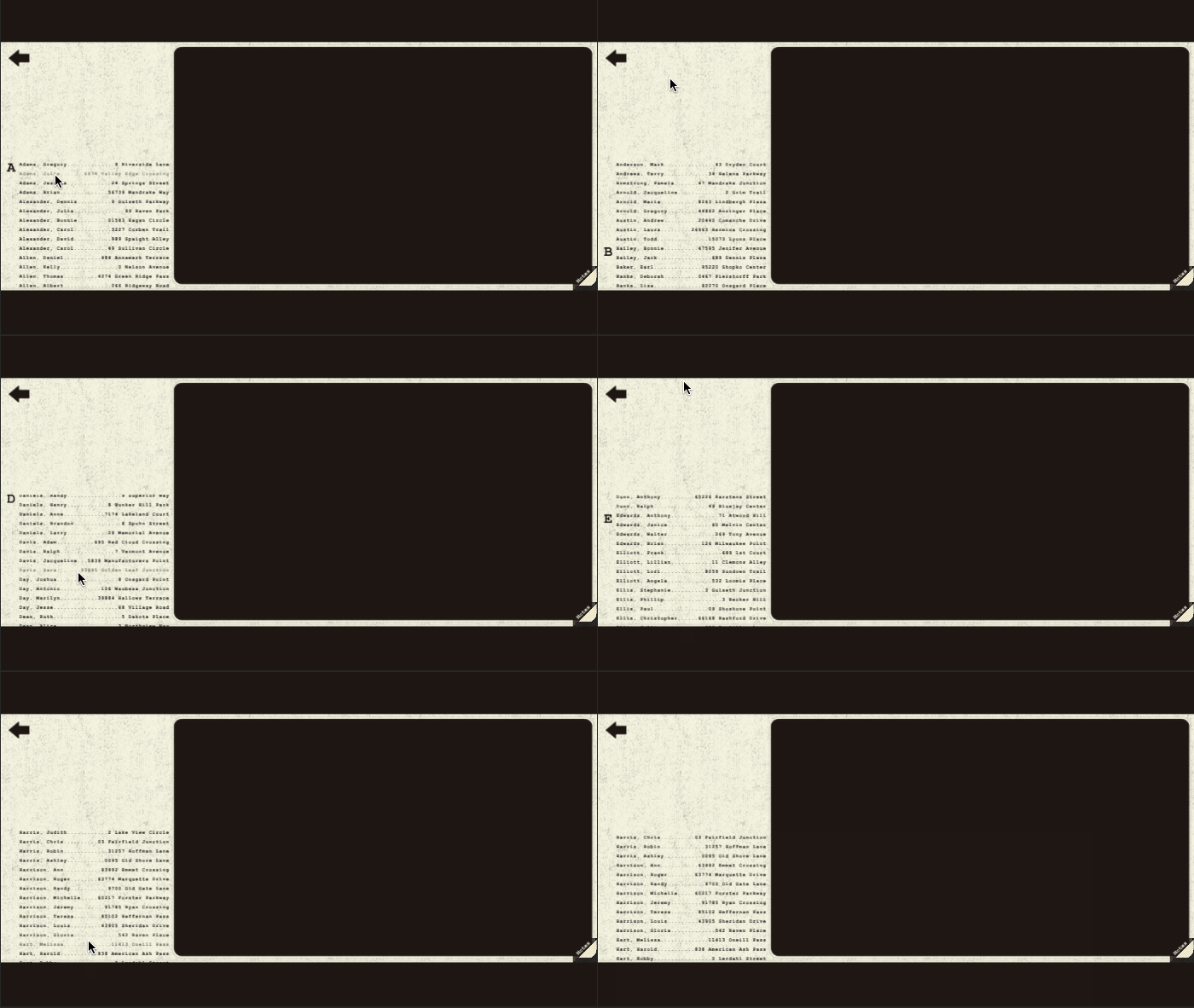
At the end of the first day, I had the "map" implemented as a static screen. I populated the map screen's directory with names from a mock address book generator, and I made the list scroll:

You can see the implemented directory is on the opposite side of the screen from the mock-up. I made this switch because of the Notes button in the bottom right corner -- I thought it might be confusing if you wanted to click on a name but accidentally clicked on the Notes, or vice versa.

Day 2 - In-Game Functionality

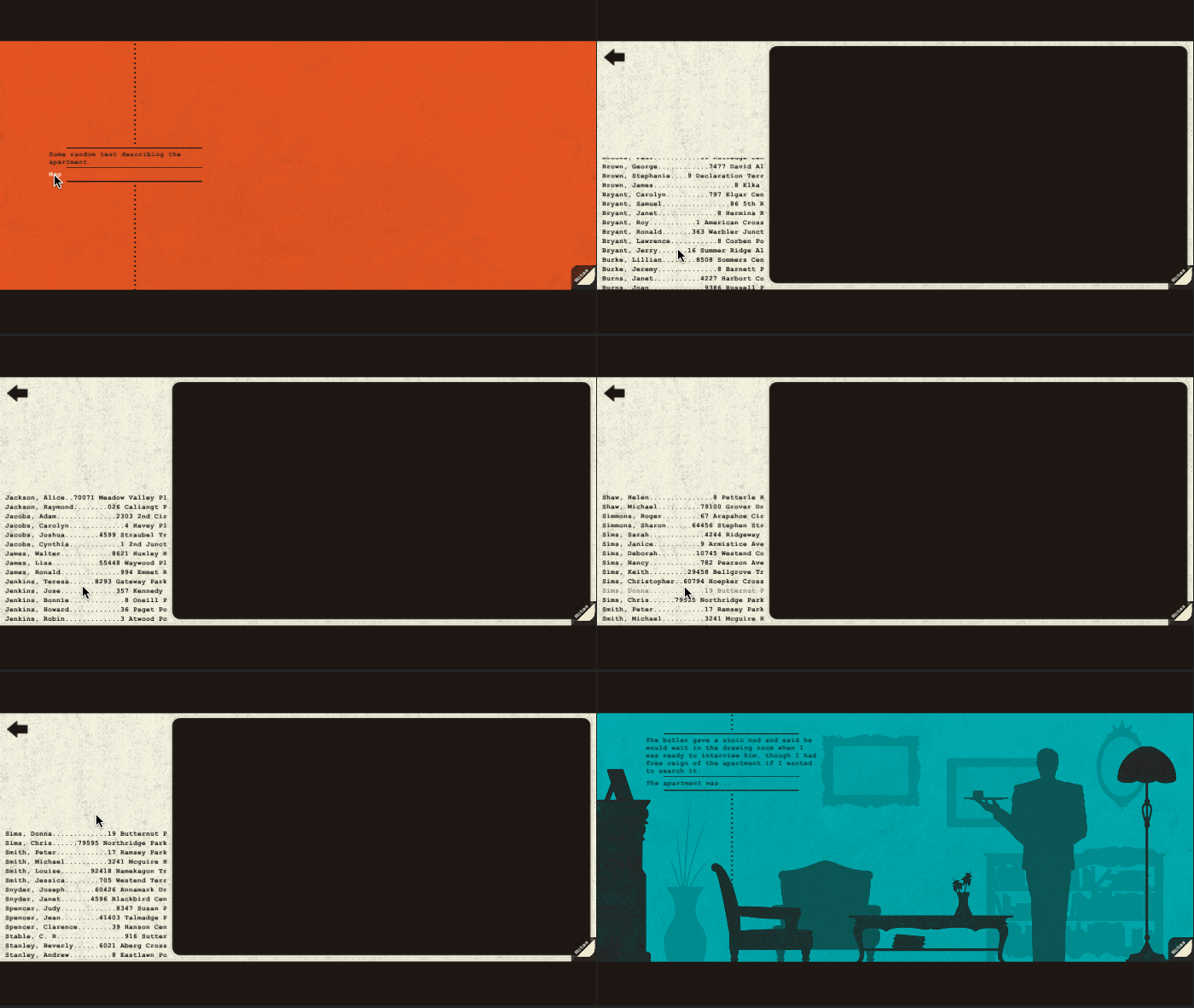
The second day was all about getting it to work. I had already created a "travel" concept in my Twine story, so I just had to represent it with the Map screen. I created a temporary starting location, then used a basic link to open the map. From there, clicking the name "C.S. Stable" takes you to Stable's apartment:

I again strayed from the mock-up by making the directory's headings in-line with the names. This allowed the names to be larger (easier to read at a proper resolution -- don't worry that you can't read them in these compressed GIFs).

Day 3 - Search Implementation

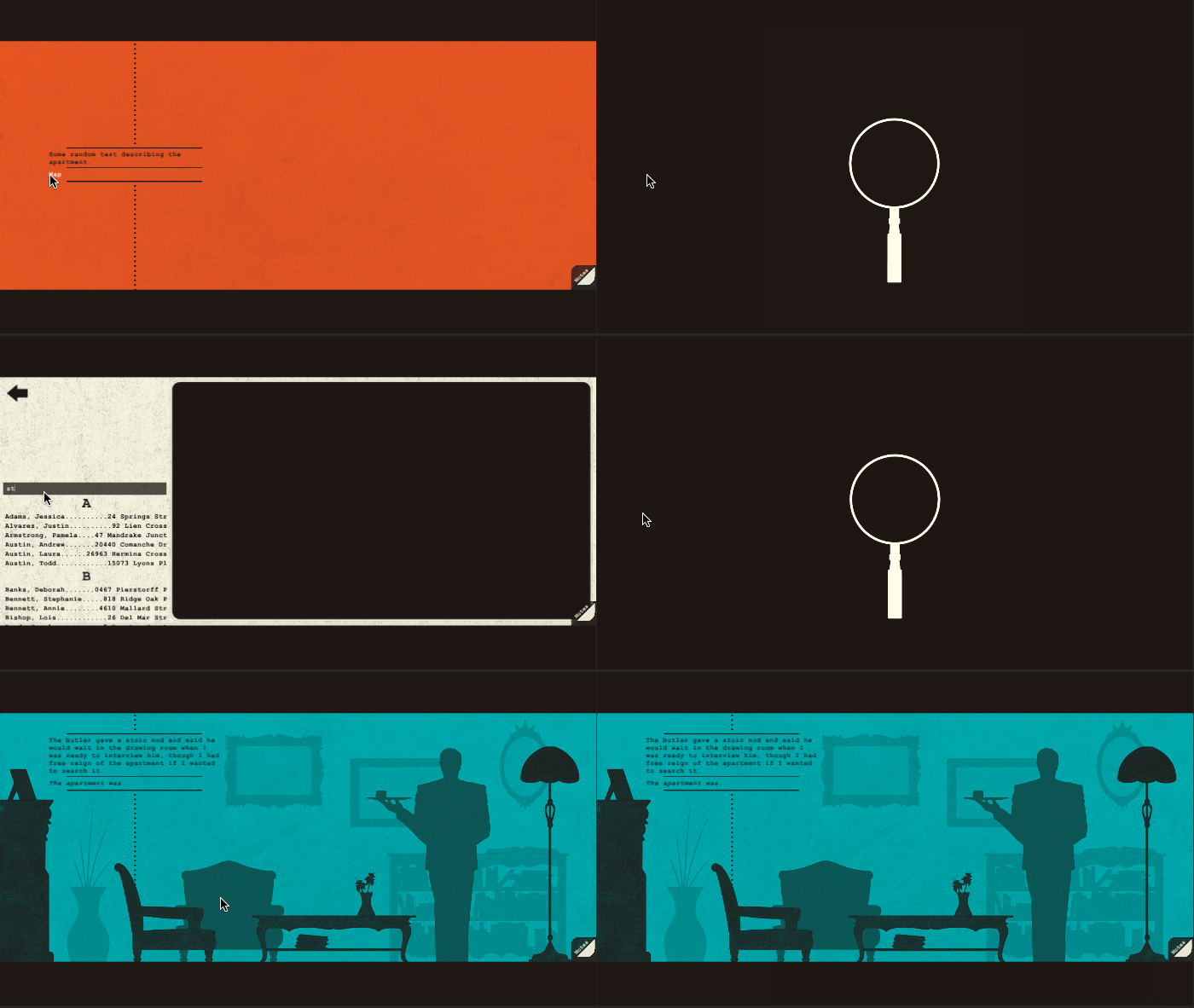
Scrolling through that list sucked! So on the final day of implementing the directory, I created a search feature for easier navigation. This required almost an entire rework of how I had set up the heading/list generation, and exposed a bug with Unity's button hierarchy, but I still managed it all in a single day, and I was pretty proud of that!


Future of the Map

The Directory is now fully functional! But the whole thing looks ugly as sin! Next week the directory will get its proper assets imported, and I'll even make the map of San Francisco in the to stick in the background!