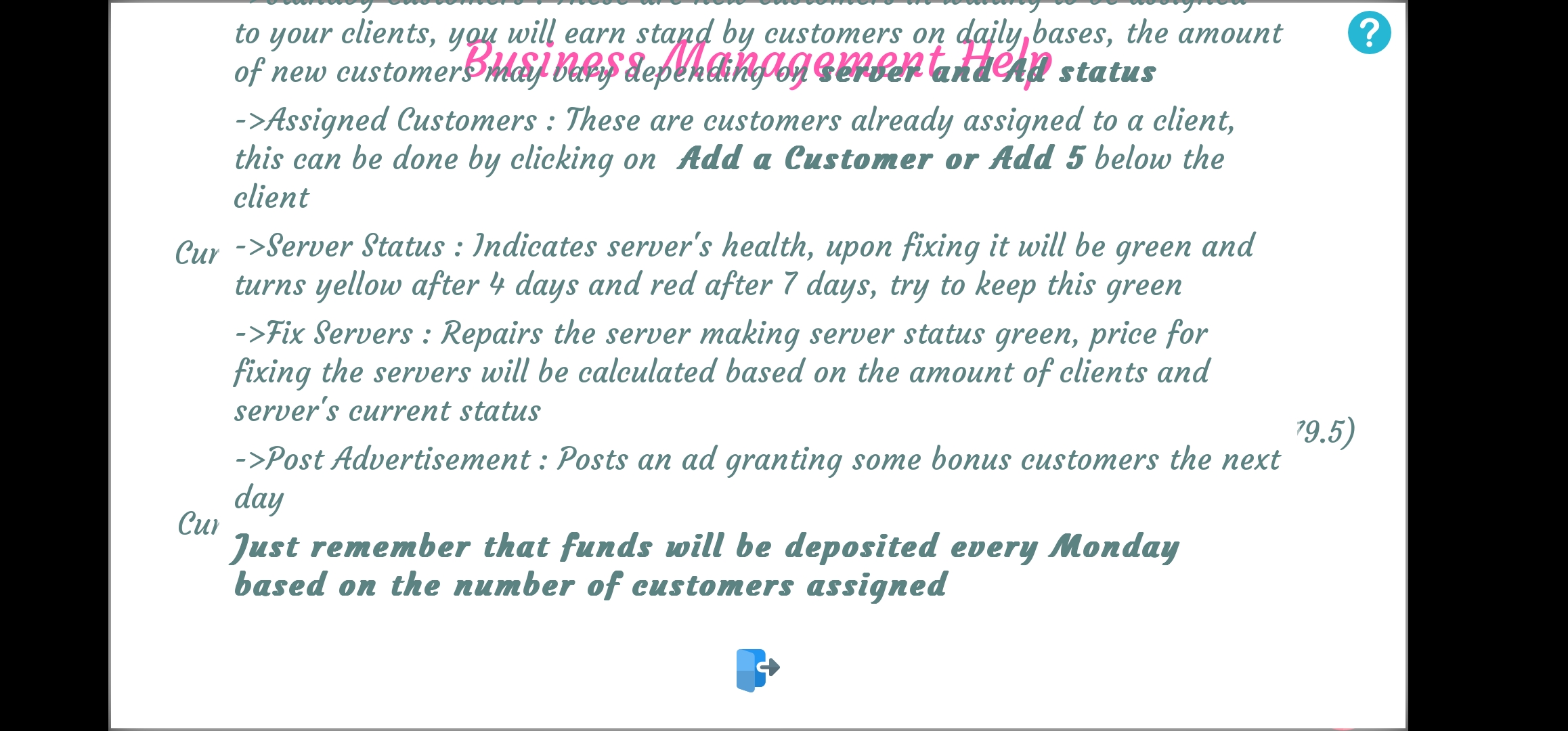
I am playing on an Android Galaxy S22 Ultra, which has a relatively big screen for a phone, and am constantly surprised that the text doesn't always fit the dialog boxes. It has this gap at the top where the text can easily be moved up to fit properly though. It often cuts into the bottom of the screen and becomes difficult to read when overplayed with the back/q.save/patreon/menu buttons or just goes off the screen entirely. There's a similar issue when looking at the info options for some things, where the tutorial/description is to far up and is above the screen. This one is easily seen when looking at the info for the Business Management Dash. You can see what it says from the assigned customers and below, but only the 1 line above that for whatever else is stated. There's a few other examples, but it just boils down to a lot of the text things not properly sizing for the mobile device, I can appreciate the text size because it let's me read it but it doesn't seem to account for making sure it fits on screen properly.