Today I have another tutorial! This one is covers some grass. The hard thing about drawing grass in pixel art is trying to get the texture down without over cluttering it. How do we portray blades of grass without making it look scribbly? Well that's what this tutorial is about. First of all, you need to consider the style of your grass. Some games like "Zelda: Link to The Past" for example keep it very simple, but here you can see four individual blades of grass by the stairs.
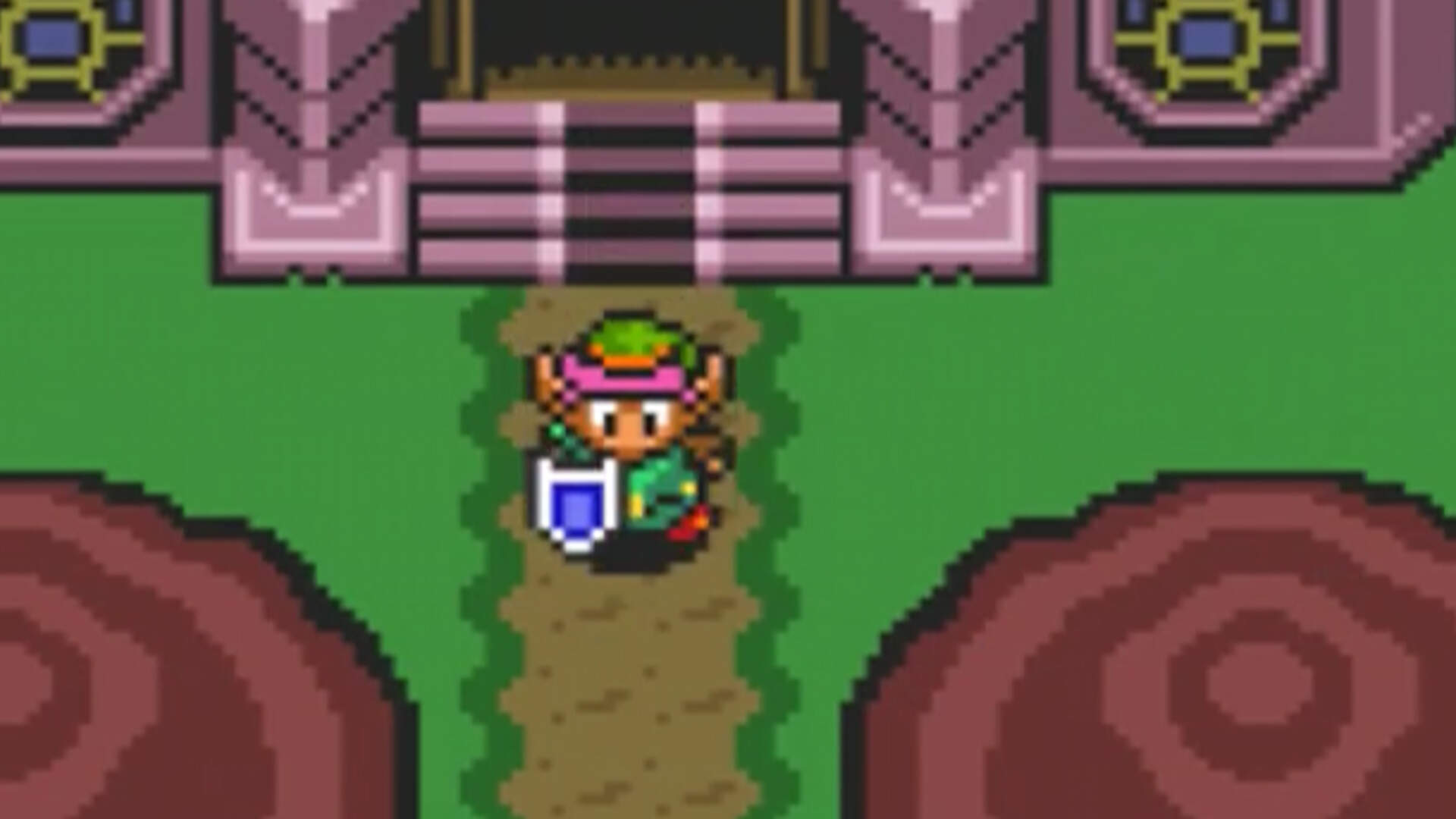
So if all it is is a big green bucket-filled blob of grass, how can we tell this is grass? Well surrounding details imply it. In pixel art, if you see a person standing on green, or on a road surrounding by green, it pretty much gives it away. Other details include the cropped building and the tree tops in front of link. I'm just explaining this so you know that grass doesn't need to be super detailed all the time, but if you want to draw spikier grass read on.
So for this tutorial, I'm going to start out by blobbing some green ellipse shape, this will represent our patchy grass texture. The reason why I'm going with an ellipse instead of a circle is because instead of top down, we're viewing from a 30-degree angle give or take.

Next I want to imply that this is grass we're looking at, so to do this we need grass blades. In my opinion, it's harder to start from the center because you need to understand a bit more about shading, so I'm going to start along the upper edges and draw some blades up grass into the silhouette.

Suddenly, now you can tell this is grass, but we have to shade it. What works for me is I'll start shading the grass blades that we already currently have and work my way in. It's easier for me to experiment with shading and get a feel for the texture this way. What I did here was take a brighter color and dotted it around a bit.
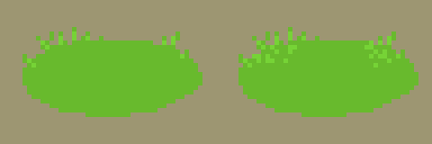
Although the light and shadow is kind of "Boolean" at the moment, at least you can get a feel for the texture by looking at it and you can sense some light and shadow going on. The blades of grass tall enough to poke out exceedingly are exposed to light while the shorter blades just appear as the blobby green. Continue on filling out the rest of the blob with more spikes of grass.
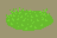
Now I want to make the surface look bumpy and less flat, to do this we can use light and shadow clusters. In general when trying to do this, you just need to know that the ascending areas receive more light and the descending areas receive less light. I'll start by clustering some light for the mounds of grass, but not shadow yet.
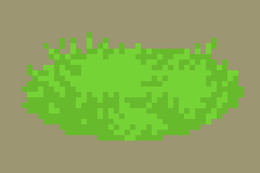
Now you get the impression that the brighter areas are more elevated compared the rest, it becomes a little easier to emphasize where your shadows will go. We can add one or two darker shades to do this.
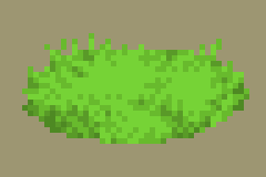
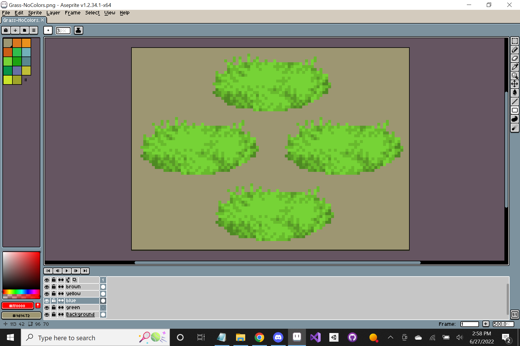
So if you want to stop here that's fine, but now you can experiment with colors. In Aseprite, I duplicated the grass into four other layers so that I can easily edit them individually.
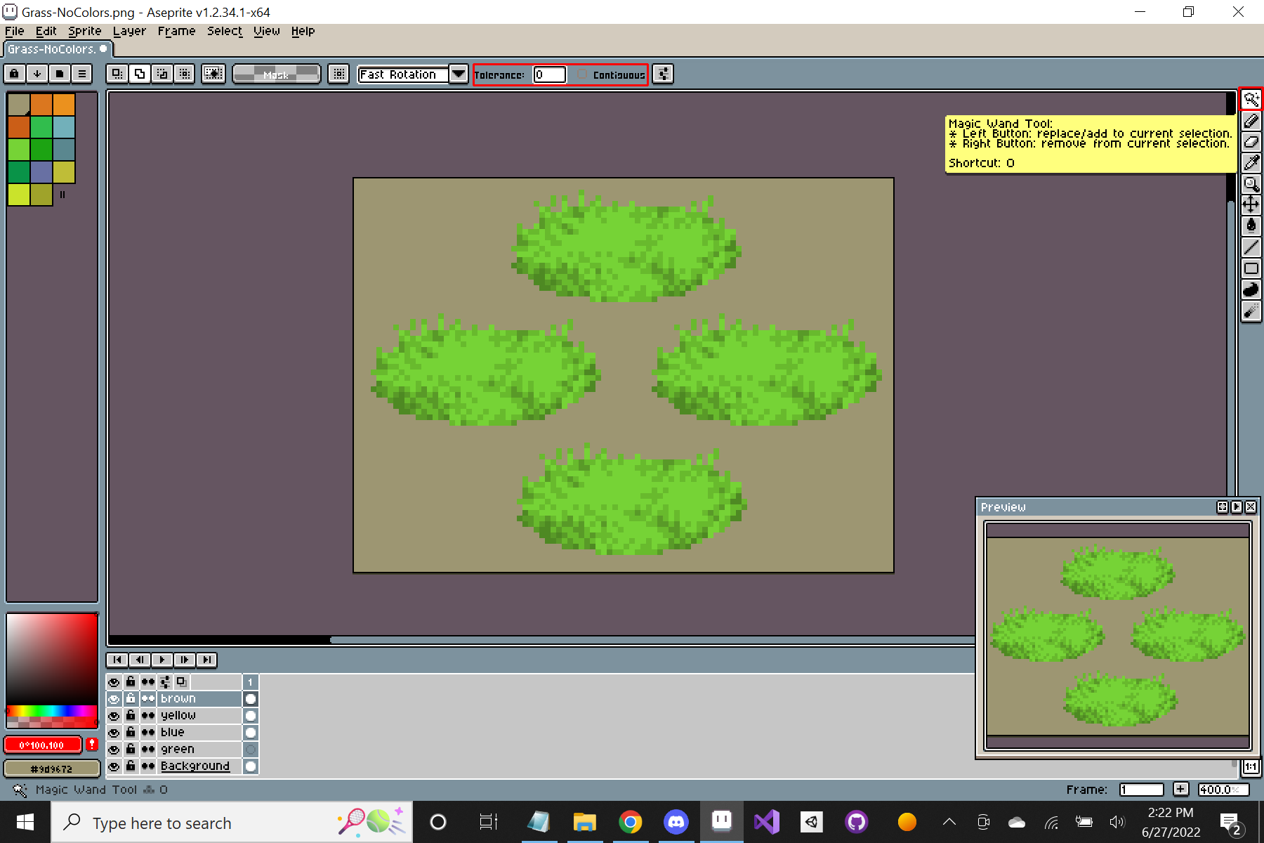
Now find the magic wand tool so that you can select all similar colors and edit them all at once. You can find it in the upper-right of the screen (you may need to replace the currently selected marquee tool). Make sure "continuous" is unchecked and "tolerance" is set to zero. These two parameters can be found on the top-center of the screen. Continuous remaining unchecked will allow you to select all similar pixels to the one you selected rather than by cluster and tolerance determines how similar the colors have to be in order to be selected. It ranges from 0-255. If it's set to zero then the color has to match exactly, that's what we want.
Once the magic wand is selected, you can now click anywhere on your canvas to select all matching pixels. You should see a white-dotted selection. (If you need to deselect, you can press Ctrl+D)
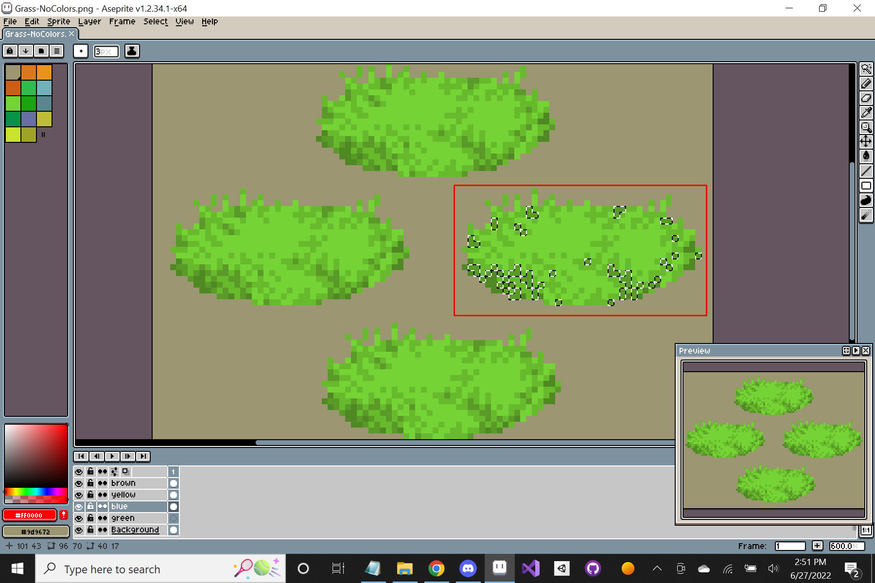
The white-dotted selection represents the pixels I want to edit, now I can edit the selected pixels altogether. You can do this manually by changing your active color and bucket filling (hotkey ",") or you can go to Edit-Adjustments and edit colors that way. I like hue shifting the darker grass colors towards blue but you can do whatever you want so long as the shading looks believable for the most part. After the edits you might end up with something like this.
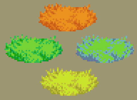
So that's it for the grass tutorial. I hope you found it useful. Eventually, we will get to rocks and trees, etc. so look forward to it but for now, good luck and see you in the next tutorial.

